On this page
Your campaign is live, the traffic is real, and the numbers in your ad platform look healthy. Then you check the landing page, and almost nobody is converting. It's one of the most common questions in marketing forums for a reason: "why isn't my landing page converting" gets asked by founders, PPC managers, and designers alike, often about pages that look perfectly fine at a glance.
The honest answer is that a low-converting landing page is rarely one big, obvious problem. It's usually one or two specific, fixable frictions hiding in a page that otherwise looks finished. This post walks through the seven most common reasons landing pages fail to convert, a short diagnostic checklist you can run against your own page right now, and how to fix each issue once you've found it.
Why isn't my landing page converting?
In the vast majority of cases, it comes down to one of three things: the page doesn't match what the visitor expected when they clicked, the page asks for more trust or effort than it has earned yet, or the visitor has a specific question the page never answers. Everything below is a variation on one of those three root causes.
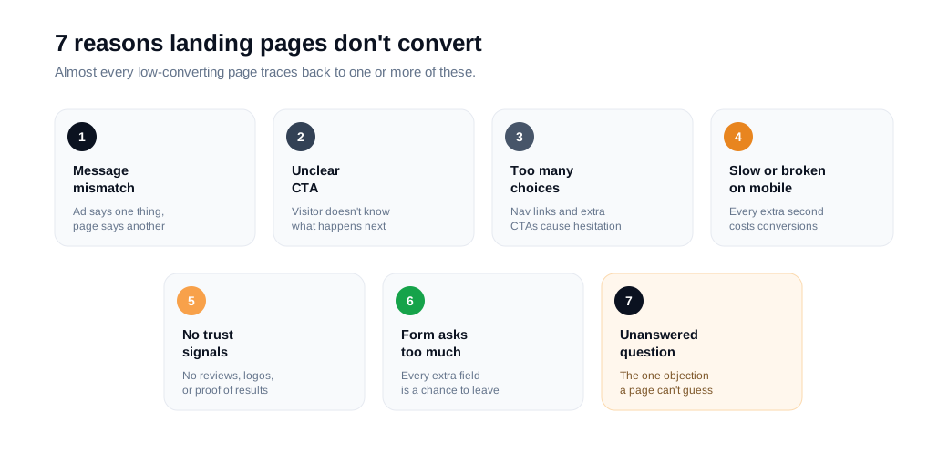
The 7 most common reasons landing pages don't convert
1. Your message doesn't match what brought people here
If your ad promises a 20% discount and the landing page opens with generic brand messaging and no mention of the discount, visitors notice the gap immediately and leave. This is called message match (or "ad scent"), and it's one of the simplest things to get right because it doesn't require a redesign, just consistency.
The fix: Carry the exact headline, offer, and visual style from the ad, email, or search result through to the landing page. If you're running multiple campaigns with different offers or audiences, build a dedicated landing page for each one rather than sending everyone to the same general page. It's more pages to maintain, but a page built for one specific promise will consistently outconvert a page trying to serve five different expectations at once.
2. Visitors don't know what to do next
Generic CTA copy like "Submit," "Learn More," or "Click Here" tells a visitor what to click but not what happens after, or what they get in return. A vague button asks for effort without confirming the payoff, and hesitant visitors default to doing nothing.
The fix: Make the CTA specific to the outcome, not the mechanism. "Get My Free Audit" or "Start My Free Trial" communicates a result; "Submit" communicates paperwork. Keep it to one primary CTA, repeated at the top, middle, and bottom of a longer page, rather than several competing calls to action.
3. Too many choices create hesitation, not consideration
This is Hick's Law in practice: the more options and links you put in front of a visitor, the longer they take to decide, and the more likely they are to leave without deciding at all. A full navigation bar, several outbound links, and three different offers on one page all compete for the same attention a single CTA needs.
The fix: Strip the page down to what actually supports the one conversion goal. HubSpot's own landing page research found that removing external links and navigation lifted conversions on middle-of-funnel pages by 16 to 28%, with a smaller 0 to 4% bump on top-of-funnel pages, since visitors earlier in their research are less bothered by extra options. The lower a visitor is in the funnel, the more a distraction-free page tends to matter.
4. The page is slow or broken on mobile
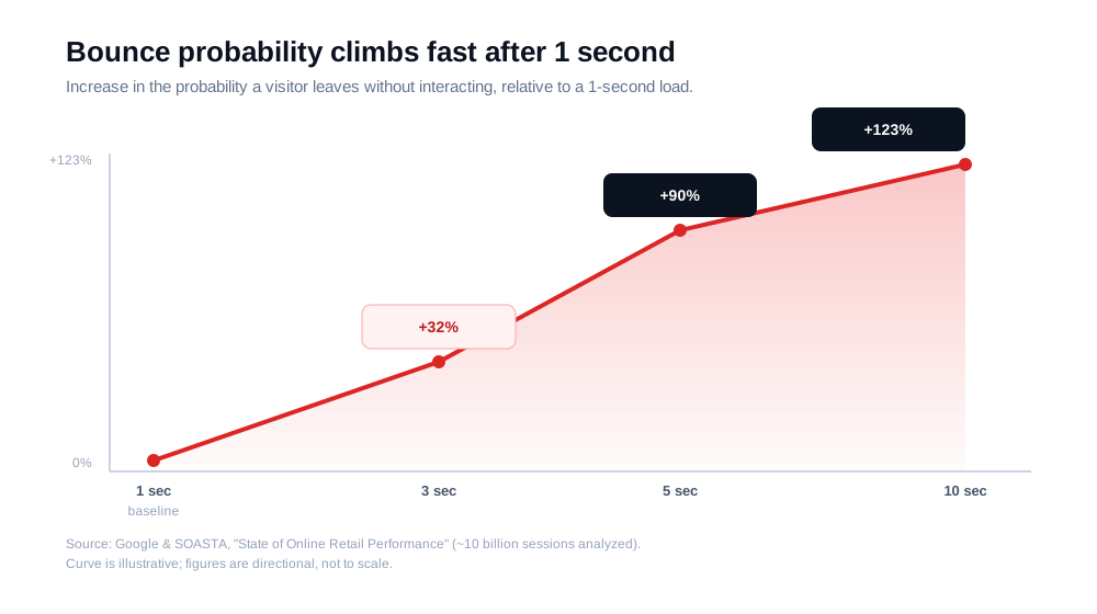
Speed functions as a direct conversion input, not a technical detail you can leave for later. In the jointly published Deloitte and Google "Milliseconds Make Millions" study, which analyzed real data from 37 brands, a 0.1-second improvement in mobile load speed increased retail conversions by 8.4% and lead generation form submissions by 8.3%. Google and SOASTA's earlier "State of Online Retail Performance" analysis of roughly 10 billion sessions found that as load time increases from one second to three seconds, the probability a visitor bounces without interacting rises by 32%. Stretch that to five seconds and it rises by 90%; at ten seconds, by 123%.
The fix: Compress and lazy-load images, cut unnecessary scripts, and test the actual mobile experience yourself on a real connection, not just a fast office Wi-Fi. Since more than half of web traffic is mobile, a page that only feels fast on desktop is failing the majority of your visitors.
5. There's no reason to trust you yet
Asking a stranger to hand over their email, or their money, without giving them a reason to believe you'll deliver is asking a lot. Nielsen's global trust research, based on a survey of 40,000 people, found that 89% most trust recommendations from people they know, and 70% trust online consumer reviews, a channel that grew 15 percentage points in trust over the prior four years. A page with zero third-party validation is asking visitors to trust it more than most people trust an anonymous website by default.
The fix: Add specific, credible social proof near the CTA, not buried at the bottom of the page: customer logos, star ratings from a recognized review platform, or a testimonial that names a real result rather than a vague compliment. Specific numbers ("cut onboarding time by 40%") build more trust than generic praise ("great product!").
6. Your form asks for more than the offer is worth
Every additional field between a visitor and your offer is another small decision, and another small chance they abandon. HubSpot's analysis of more than 40,000 landing pages found that reducing a form from four fields to three lifted conversions by nearly 50%. Separately, Baymard Institute's 2024 study of B2B form users found forms that labeled fields as "optional," rather than marking required fields with an asterisk, converted at a 25% higher rate.
The fix: Ask only for what you genuinely need to deliver the offer. A free guide download doesn't need a phone number; a demo request for an enterprise tool can reasonably ask for more, because the value on offer matches the effort requested. If you need more information eventually, collect it after the first conversion, not before it.
7. A hesitant visitor's question never gets answered
This is the reason most landing page guides miss, because it isn't a design problem at all. A visitor can have a clear message match, a strong CTA, real social proof, and a short form in front of them, and still leave, because they have one specific question the page doesn't answer: does this work for a team our size, does it integrate with what we already use, is the pricing actually what it looks like. A static page can only anticipate so many objections before it turns into a wall of FAQ text that nobody reads.
The fix: Give high-intent visitors a way to ask the actual question instead of guessing which FAQ entry might cover it. This is the specific problem we built Glimpze to solve: a visitor stuck on your pricing or demo page can start a live chat or video conversation right there, get their one blocking question answered, and convert in the same session instead of leaving to "think about it" and never coming back.
A quick landing page diagnostic checklist
Before changing anything, run your page through this list. Every "no" is a candidate for your next test.
- Does the headline match the exact offer in the ad, email, or search result that brought the visitor here?
- Is there exactly one primary call to action, repeated rather than competing with others?
- Have you removed the site navigation and unrelated outbound links from the page?
- Does the page load in under three seconds on a real mobile connection?
- Is credible social proof (logos, ratings, named results) visible without scrolling far?
- Does the form ask only for information the offer actually requires?
- Is there a way for a hesitant, high-intent visitor to get a specific question answered live, rather than guessing from static copy?
How to prioritize what to fix first
You rarely need to fix all seven issues at once, and testing every change simultaneously just makes it impossible to know what actually worked. A practical order, roughly from cheapest and fastest to more structural:
- Message match and CTA clarity first. These are copy changes, not redesigns, and they're usually the highest-impact, lowest-cost fixes available.
- Trust and friction next. Add social proof near the CTA and cut form fields down to the essentials. Both are quick to implement and directly address hesitation.
- Speed and technical issues after that. These take more engineering effort but compound: a faster page makes every other fix perform better too.
- The offer itself last. If the message is clear, trust is established, friction is low, and the page still isn't converting, the underlying offer may not be strong enough, and that's a strategy question, not a landing page tweak.
How to test your fixes properly
Once you've identified a likely cause, resist changing everything at once. Pick the single highest-priority fix, form a specific hypothesis about why it should help, and run an A/B test that changes only that one element. Let the test run until you reach statistical significance rather than calling a winner after a few days of traffic, and keep a record of what you tested and what happened, wins and losses both. A landing page that improves 5% at a time, tested honestly, will outperform one redesigned all at once based on a hunch, because you'll actually know which changes are carrying the result.
Landing page conversion rate: FAQs
What is a good landing page conversion rate?
It depends heavily on industry and traffic source, but cross-industry data gives a useful range: WordStream puts the median around 2.35%, while Unbounce's Conversion Benchmark Report found a 6.6% median across 41,000 dedicated landing pages, with the top quartile starting around 11.4%. Treat these as reference points, not targets. Improving steadily against your own baseline matters more than matching an external average.
How many CTAs should a landing page have?
One primary call to action, repeated at natural points as the visitor scrolls (top, middle, and end of the page), rather than several different offers competing for the same click. Multiple distinct CTAs force a decision the visitor didn't come to make and measurably reduce conversions.
Should a landing page have navigation?
For a dedicated campaign landing page, generally no. Removing site navigation and outbound links keeps visitors focused on the one action the page exists for. HubSpot's research found this matters more for middle-of-funnel pages (16 to 28% lift) than early-awareness pages (0 to 4% lift), so if you keep navigation anywhere, keep it on top-of-funnel content, not conversion-focused campaign pages.
How long should a landing page be?
As long as it needs to be to answer the visitor's real questions, and no longer. A low-consideration offer (a free ebook) needs less convincing than a high-consideration one (an enterprise software purchase), so it can be shorter. Rather than picking a length, structure the page so a visitor can grasp what it is, why it matters, and what to do next within the first few seconds, then let curiosity carry them further down if they need more convincing.
Key takeaways
- A low-converting landing page is rarely one big problem. It's usually one or two specific frictions: a message mismatch, unclear next step, missing trust signal, or unanswered question.
- Message match and CTA clarity are the cheapest fixes with the biggest payoff. Start there before touching design or technical work.
- Speed is a conversion input, not a technical detail. A 0.1-second improvement lifted conversions by 8.3 to 10.1% in Deloitte and Google's joint study; bounce probability rises sharply after just a few seconds of load time.
- Every form field is a small decision that can lose a visitor. Cutting a form from four fields to three lifted conversions nearly 50% in HubSpot's research across 40,000+ landing pages.
- The fix competitors miss is answering the question a page can't anticipate. Giving hesitant, high-intent visitors a live way to ask their actual question recovers conversions a static page would otherwise lose.
TAGS

Written by
Nilas MylerCo-founder & CTO, Glimpze
Nilas is the co-founder and CTO of Glimpze, an inbound sales tool that turns high-intent website visitors into live conversations. A former SEO consultant for some of the largest companies in Denmark, he writes about speed-to-lead, inbound sales, and conversion rate optimization — the technical and operational mechanics of turning traffic into pipeline.


