
On this page
A SaaS company can add logos every quarter and still be shrinking. New customers arrive through the front door while older ones slip out the back, and when nobody counts both flows, the revenue chart looks steady right until a bad renewal quarter proves otherwise.
Customer success metrics exist to count both flows and to catch the leak while it is still small. The right handful of numbers shows which accounts are growing, which are drifting, and how much of this year's revenue will still be on the books next year. Track too many and you bury the signal. Track the wrong ones and you measure comfort instead of risk.
This post covers the core customer success metrics worth tracking, how to measure retention and expansion, the difference between NRR and GRR, how adoption and health metrics fit, where NPS, CSAT, and CES belong, and how to pull it all into a dashboard a team actually uses.
What are the core customer success metrics?
The core customer success metrics fall into five families: retention and revenue, product adoption, customer health, satisfaction, and efficiency, and a working set takes one or two numbers from each rather than ten from one family. The families exist because each answers a different question, and a team that tracks only one is flying with most of its instruments switched off.
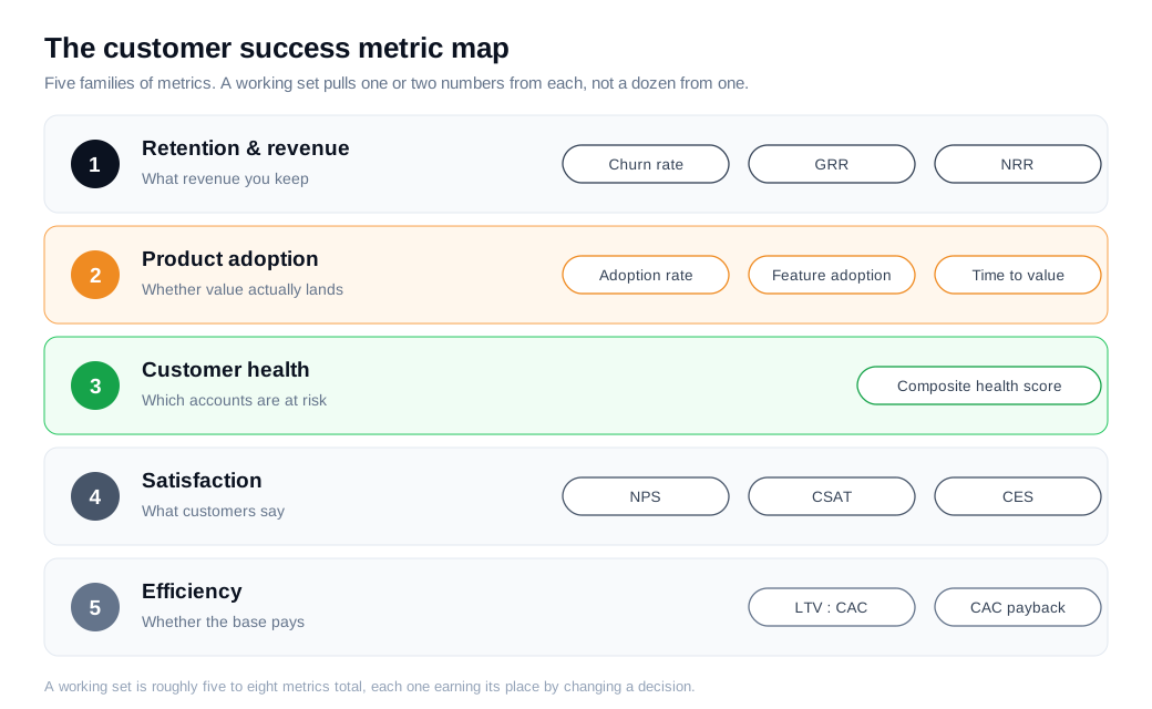
Retention and revenue metrics answer the blunt question of whether the business keeps the money it earns. This family holds churn rate, gross revenue retention, and net revenue retention, and for most SaaS companies it is where the board looks first because it maps directly to the forecast.
Adoption and health metrics look earlier in the story. Product adoption rate, feature adoption, and a composite health score read what customers do inside the product, which is the behavior that predicts a renewal months before the contract date arrives.
Satisfaction metrics capture what customers say. NPS, CSAT, and CES turn survey answers into trackable numbers, and they add the stated view that behavior alone can miss, such as the loyal daily user who is quietly furious about a missing feature.
Efficiency metrics connect success to economics. Customer lifetime value measured against acquisition cost, and how long it takes to earn that cost back, show whether the accounts a team keeps are actually worth keeping. Five families, a handful of numbers, and each one earns its place only by changing a decision someone makes.
How do you track retention and expansion?
You track retention and expansion with three numbers that move together: churn rate, gross revenue retention, and net revenue retention. Churn tells you what you lost, gross retention tells you the floor you kept, and net retention tells you whether expansion from existing customers more than covered the losses.
Churn rate is the most direct of the three. Customer churn is the share of customers who leave in a period, calculated as customers lost divided by customers at the start, so a company that begins the month with 1,000 accounts and ends with 950 has churned 5 percent, as Wall Street Prep lays out. Revenue churn runs the same formula on recurring revenue instead of logos, which matters when a few large accounts carry most of the total.
The two can diverge sharply. If one of three customers leaves and that customer was half your revenue, customer churn reads 33 percent while revenue churn reads 50 percent, and the second number is the one that hurts. For B2B SaaS, an annual churn rate under 5 percent is the common benchmark for healthy, with monthly churn under 1 percent, as NetSuite notes.
Net revenue retention ties it together. NRR measures all recurring revenue from a cohort of existing customers at the end of a period against what they paid at the start, counting expansion, contraction, and churn but no new logos. Above 100 percent means the base grew on its own, and Gainsight puts strong at 110 percent and up, with best in class past 120. The median for venture-backed SaaS sits near 106 percent, and it climbs with deal size, since enterprise accounts run a median around 118 percent while SMB sits near 97.
Here is a worked example. A company starts the year with 100 customers producing 200,000 dollars in monthly recurring revenue. Over the year those same customers add 40,000 in upgrades and new seats, downgrade 8,000 through contraction, and cancel 24,000 through churn.
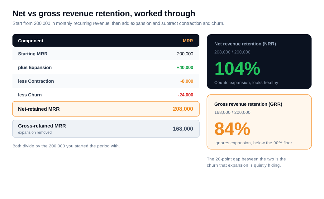
Net revenue retention is (200,000 plus 40,000 minus 8,000 minus 24,000) divided by 200,000, which is 208,000 over 200,000, or 104 percent. Gross revenue retention strips out the expansion: (200,000 minus 8,000 minus 24,000) divided by 200,000, which is 168,000 over 200,000, or 84 percent. The headline NRR of 104 percent looks healthy. The GRR of 84 percent, well under the 90 percent floor most teams target, says the base is leaking and only upsells are hiding it.
What is the difference between NRR and GRR?
The difference between NRR and GRR is expansion: gross revenue retention counts only what you kept and caps out at 100 percent, while net revenue retention adds upsells and cross-sells on top and can climb past 100 percent. Read alone, either one can mislead you.
GRR is the honest floor. Because it ignores expansion, it shows the minimum revenue you would retain if every upsell stopped tomorrow, which makes it the truer measure of whether the core product holds customers. A GRR above 90 percent is the common marker of a healthy base, and anything drifting toward the low 80s is a leak that expansion is currently covering.
NRR is the growth signal, and it can flatter. A team can post 110 percent NRR while quietly losing a fifth of its customers, because a handful of large expansions covers the gap. ChurnZero makes the point plainly: watch the two together, because an NRR of 110 with a GRR of 78 means you are papering over churn with upsells, and that model breaks the moment expansion slows. Track both, and treat a wide gap between them as a warning rather than a win.
How do health and adoption metrics fit?
Health and adoption metrics fit as the leading indicators that move before revenue does, showing whether customers are getting value while there is still time to act. Retention numbers report what already happened; adoption and health point at what is about to.
Product adoption rate is the entry point. It measures the share of users who reach active use of the core features that deliver value, calculated as active users of those features divided by total users, as Appcues describes. The average core feature adoption rate for SaaS sits around 24.5 percent, so a rate in the 20s is normal and anything higher is a genuine advantage.
A quick example makes the stakes concrete. Say 1,000 accounts activated this quarter and 240 of them reached regular use of the core workflow within 30 days. Adoption rate is 240 divided by 1,000, or 24 percent, right at the SaaS average. Lifting that to 350 matters beyond the number itself, because customers who adopt features regularly are about 31 percent less likely to churn, so every point of adoption buys retention downstream.
Feature adoption narrows the lens to a single capability, which tells a product team whether a new release landed or sank. A customer health score then rolls usage, adoption, support activity, and sentiment into one composite figure that ranks accounts by risk, the kind of number that turns a book of 80 accounts into a triage queue instead of a wall of names.
Time to value sits alongside adoption as the onboarding metric that predicts the rest. Time to value is the gap between a customer starting and reaching their first meaningful outcome, and a shorter gap raises satisfaction and cuts early churn, as Rocketlane explains. A customer who hits real value in week one rarely cancels in month three.
How do satisfaction metrics like NPS, CSAT, and CES fit?
Satisfaction metrics fit as the voice-of-customer layer, three surveys that measure loyalty, happiness, and effort, and each answers a question behavior cannot. NPS asks whether customers would recommend you, CSAT asks whether a specific interaction landed well, and CES asks how hard it was to get something done, as QuestionPro breaks down.
Net Promoter Score is the loyalty gauge. It runs from minus 100 to positive 100, and for B2B SaaS a score above 30 is strong while 50 and up is world-class, with successful software companies often landing between 39 and 65. It reads best as a trend over quarters, since a single reading tells you little about direction.
CSAT is the transactional one. It captures satisfaction right after a moment that matters, a support ticket, an onboarding call, or a new feature, usually as the percentage of respondents who rate the experience positively. A CSAT of 75 percent or higher is generally treated as strong and 85 percent as excellent.
CES measures friction, and it is often the most actionable of the three. A high customer effort score means people are struggling to get value, and effort is a well-documented driver of churn. Cutting that effort is concrete work, and an AI chat assistant that answers a setup question in the moment removes exactly the friction CES is built to catch. Run the three together and you cover immediate happiness, journey friction, and long-term loyalty at once.
How do you build a customer success dashboard?
You build a customer success dashboard by choosing five to ten goal-based metrics, splitting them into leading and lagging indicators, and attaching an owner and a play to each, so a red cell turns into action rather than a frown. A board crowded with vanity metrics measures activity, while a focused one measures whether customers are winning.
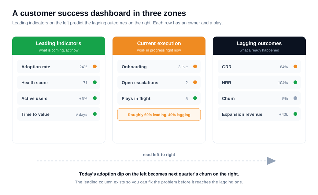
Start with the split between leading and lagging. Lagging indicators like churn, NRR, and revenue confirm what already happened and are essential for the forecast, but by the time they move, the outcome is set. Leading indicators like adoption, health scores, and product engagement signal what is coming and leave room to intervene, as SuccessCoaching frames the distinction. A common working balance runs roughly 60 percent leading to 40 percent lagging, with two or three leading indicators feeding each lagging outcome.
Then keep the set small and owned. HubSpot's guidance is to track five to seven core metrics tied to the current stage of the business rather than everything measurable, because a metric nobody owns and nobody acts on is decoration. Each number on the board should have a person responsible, a threshold that trips a color, and a defined play when it does.
A practical layout has three zones. Leading indicators sit on the left: adoption rate, health score, active users, time to value. Current execution sits in the middle: onboarding progress, open escalations, plays in flight. Lagging outcomes sit on the right: GRR, NRR, churn, expansion revenue. Read left to right, the board tells a story, since today's adoption dip on the left is next quarter's churn on the right, and the whole reason for the leading column is to fix the problem before it reaches the lagging one.
Metrics rank the queue; people work it. The dashboard shows a customer success team where the risk sits and how much runway is left, and reaching a drifting account in the moment, with a live chat session or a quick call rather than a next-week email, is often what turns a red cell green. Used that way, a handful of well-chosen numbers is most of what separates a base that renews itself from one that quietly leaks.
Key takeaways
- Track a handful across five families, retention and revenue, adoption, health, satisfaction, and efficiency, rather than a dozen metrics from one family, so each number changes a decision.
- Retention is the core trio, churn for what you lost, gross revenue retention for the floor you kept above 90 percent, and net revenue retention for whether expansion covered the losses, with 110 percent and up counted as strong.
- Read NRR and GRR together, because a healthy NRR can hide a leaking base, and a wide gap between the two warns that upsells are papering over churn.
- Lead with adoption and health, since a product adoption rate near the 24.5 percent SaaS average and a short time to value predict renewals months before the contract date.
- Layer the survey metrics, NPS for loyalty, CSAT for specific moments, and CES for effort, to add what customers say to what they do.
- Build a small, owned dashboard, five to ten metrics split roughly 60/40 leading to lagging, each with an owner, a threshold, and a play, so a red cell becomes action.

Written by
Nilas MylerCo-founder & CTO, Glimpze
Nilas is the co-founder and CTO of Glimpze, an inbound sales tool that turns high-intent website visitors into live conversations. A former SEO consultant for some of the largest companies in Denmark, he writes about speed-to-lead, inbound sales, and conversion rate optimization — the technical and operational mechanics of turning traffic into pipeline.


