
On this page
- What is a North Star metric?
- What makes a good North Star metric?
- How do you choose the right one?
- Why shouldn't revenue be your North Star metric?
- What are good SaaS examples of North Star metrics?
- How do you align teams around it?
- How is a North Star metric different from a KPI or an OKR?
- Key takeaways
- Sources
A product team can ship features every week, watch signups climb, and still lose customers faster than it wins them. The dashboards look busy. The business quietly stalls.
A North Star metric is the fix for that noise. It names the one number that captures the value customers actually get, so product, marketing, sales, and success can steer toward the same target instead of optimizing separate corners of the same map.
This guide covers what a North Star metric is, what separates a good one from a bad one, how to choose yours, why revenue makes a poor choice, the metrics real SaaS companies steer by, how to align teams behind the number, and how it differs from a KPI or an OKR.
What is a North Star metric?
A North Star metric is the single measure that best captures the core value your product delivers to customers, chosen so that moving it reliably grows the business over time. Everything else on the dashboard sits below it.
Growth marketer Sean Ellis coined the term around 2010, borrowing the name from Polaris, the star sailors steered by for centuries. The framework spread widely after 2017, when the product analytics company Amplitude published its North Star Playbook and turned a catchy phrase into a working method that most product teams now reference, as Amplitude lays out in its guide to finding one.
The important word is value. A North Star metric measures what customers get from the product, framed as an action they take: a message sent, a night booked, a project shared. It sits upstream of revenue, close to the moment of value, so it tends to move before the money does.
That timing is the point. When your product bets are working, the North Star climbs first, and revenue follows a quarter or two later. When they stall, the North Star flattens early and gives you a warning while there is still time to react. The framework pairs that one headline metric with a small set of input metrics, the levers each team can pull to move it.
What makes a good North Star metric?
A good North Star metric expresses customer value, works as a leading indicator of revenue, and can be moved by the teams that own it. Amplitude packages those traits into a six-point checklist that is worth running any candidate through before you commit, described in its breakdown of what makes a good versus bad North Star metric.
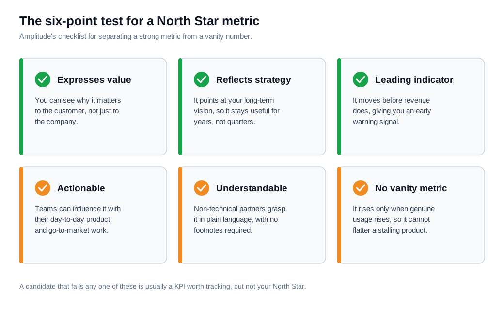
Run through the six traits. The metric expresses value, so anyone can see why a customer would care. It reflects your strategy and long-term vision. It is a leading indicator, moving ahead of revenue rather than reporting the past. It is actionable, meaning teams can influence it with their daily work. It is understandable in plain language to a non-technical partner. And it avoids the vanity trap.
The vanity trap deserves attention because it catches so many teams. Total registered users is the classic example. That number only ever rises, so it always looks like progress even when active usage is collapsing underneath it. A metric that cannot fall cannot warn you about anything.
The best candidates balance breadth and depth at once. Breadth alone, such as raw account count, misses whether anyone is getting value. Depth alone, such as sessions per power user, misses whether the base is growing. A metric like weekly active teams captures both, which is why it holds up as products scale.
How do you choose the right one?
You choose your North Star metric by naming the moment your product delivers its core value, then finding the measurable action that captures that moment and predicts whether a customer sticks around. Work from customer value backward, never from a revenue target forward.
Start with the aha moment, the early action that separates users who retain from users who churn. Facebook's growth team famously found that new users who reached a certain number of friends within their first days were far more likely to stay, a pattern documented in Mode's look at how Facebook found its aha moment. Find your equivalent by comparing the early behavior of customers who renewed against those who left, and the action that reliably splits the two groups points straight at your metric.
Then list candidates, and test each against the six-trait checklist. Keep the one that best combines customer value with a business outcome.
Here is a worked example. Say you run a project management tool and you are weighing four candidates against roughly 10,000 accounts.
- Total signups sat at 42,000 all-time. It only climbs, tells you nothing about value, and fails the vanity test.
- MRR was $180,000. It matters, but it reports last month and lags the behavior that drives it, so it is a poor steering signal.
- Weekly active users came to 14,500. Closer, because it tracks usage, though a single person poking at the app in isolation does not capture what the product is for.
- Weekly active projects with three or more collaborators came to 3,200. Analysis showed accounts that reached this state renewed at more than double the base rate.
The fourth wins. It expresses the real value, which is teams collaborating, not individuals logging in. It leads revenue, because collaborative projects this quarter predict retained accounts next quarter. Teams can move it through onboarding, product, and outreach. And it can fall, so it will warn you when something breaks. That last candidate becomes the North Star, and the other three become supporting metrics beneath it.
Why shouldn't revenue be your North Star metric?
Revenue makes a poor North Star metric because it is a lagging indicator that reports what already happened, and it tells you little about whether customers are getting enough value to stay. By the time revenue moves, the behavior that caused it is weeks or months behind you, which leaves nothing to steer with. Amplitude draws the same line in its explainer on leading versus lagging indicators.
There is a deeper reason. Revenue is the price your customers pay, and a North Star metric measures the value they receive in return. Steer by the price and you push teams toward extracting more this quarter, even when the value is thinning. Steer by the value and revenue tends to follow, because customers who keep getting value keep paying and expand over time. Investors at Stage 2 Capital make the same case in their argument that revenue is a dangerous North Star metric.
Revenue also hides the story a good metric tells. A SaaS company that hits $100,000 in MRR from one enterprise deal is in a very different position from one that reaches the same $100,000 from 200 small accounts. The headline number is identical. The health underneath it is not, and revenue alone cannot show you the difference.
WeWork is the cautionary case. In 2018 the company booked around $1.8 billion in revenue while losing roughly $1.9 billion, and it leaned on a metric it called "community-adjusted EBITDA" that stripped out marketing, executive pay, and other real costs, as Finimize recounts in its WeWork cautionary tale. A revenue line in the billions sat on top of a business burning cash, and the invented metric flattered it rather than exposing it. A North Star metric is meant to keep you honest, so revenue and any dressed-up version of it belongs on the finance dashboard, not at the top of the tree.
What are good SaaS examples of North Star metrics?
The strongest SaaS examples all measure repeated, valuable usage rather than raw size: Slack tracks messages sent, Airbnb nights booked, Spotify time spent listening, HubSpot weekly active teams, and Shopify active merchants. Each one describes a customer getting value, and each sits upstream of the revenue it drives.
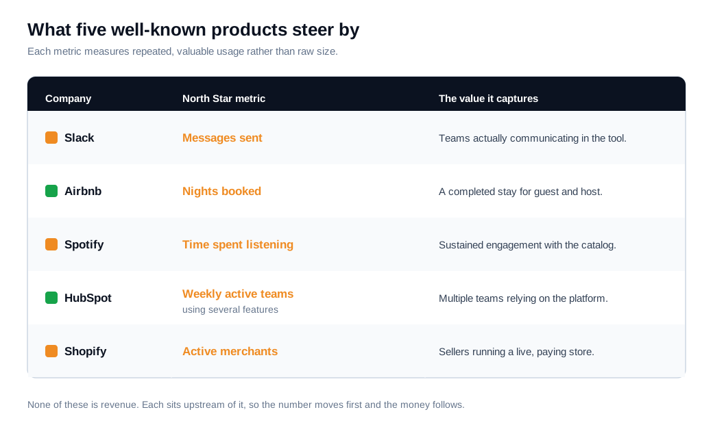
Slack steers by messages sent, because a team that is messaging inside the tool is a team getting value from it. Early on the company found that teams tended to stick once they crossed roughly 2,000 messages, which made message volume both a health signal and an onboarding target. Airbnb uses nights booked, a single event that means a guest found a place and a host earned money. Spotify tracks time spent listening, which rises only when the catalog and recommendations are genuinely holding attention.
HubSpot's example shows why depth matters. The company settled on weekly active teams using several features, after finding that individual user activity did not predict retention well while teams relying on multiple features did, a story told in HelloMrLead's write-up of the Slack and HubSpot North Star metrics. Shopify's active merchants follows the same logic, counting sellers actually running a store rather than everyone who ever registered.
Notice the shared trait across all five. None of them is revenue, and none is a pure vanity count. Each captures a moment of real use that a customer would recognize as valuable, which is exactly what keeps the number honest as the company grows.
How do you align teams around it?
You align teams around a North Star metric by breaking it into a handful of input metrics, giving each team ownership of one input, and running a regular cadence where every team's goals ladder up to the same number. The metric on its own is a slogan. The input tree is what turns it into work.
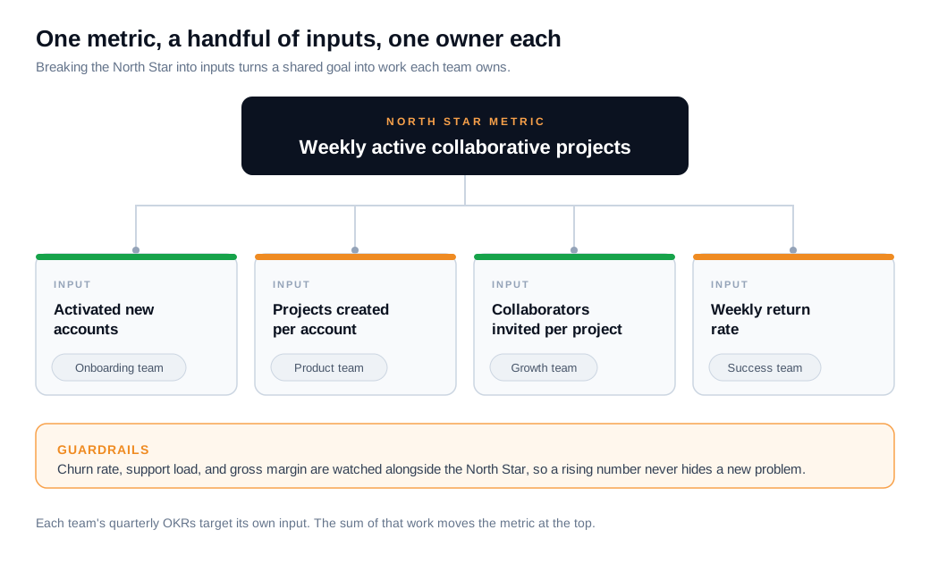
Map three to five inputs that together produce the metric, then assign each to a clear owner. For the project tool above, the inputs might be activated new accounts (onboarding), projects created per account (product), collaborators invited (growth), and weekly return rate (success). Each team sets quarterly OKRs against its own input, and the combined effect moves the North Star, a structure Product School describes in its guide to the benefits and challenges of a North Star metric.
Run it on a cadence. Review the North Star and its inputs weekly at the team level, cohort and retention economics monthly at leadership level, and revisit the definition and targets each quarter. Pair the metric with guardrails, such as churn, support load, and gross margin, so a team cannot juice its input in a way that quietly damages the business. The guardrails are what stop a good number from hiding a new problem.
One of the most common inputs is activation, the share of new accounts that reach first value quickly. A large slice of the traffic that becomes those accounts is high-intent visitors comparing options right now, and reaching them in the moment matters. Answering a pricing-page question through live chat or a quick call, rather than a form and a next-day email, moves more of them into an activated state, and building that fast follow-up into an inbound sales motion feeds the same input the whole team is trying to lift. Speed on the way in shows up in the North Star on the way out.
How is a North Star metric different from a KPI or an OKR?
A North Star metric is the one overarching measure of product value, a KPI is any operational number a team tracks, and an OKR is the goal-setting system teams use to move those numbers over a set period. They work at different levels, and a healthy company uses all three together.
The North Star sits at the top, and there is only one. The input metrics beneath it are KPIs, and so are dozens of other numbers a business monitors, from page load time to trial conversion rate. A KPI answers "how is this specific thing doing," while the North Star answers "are we creating the value that makes the business durable."
OKRs are the mechanism that connects the two. Each quarter a team picks an objective and sets key results that usually target its input metric, such as lifting activated new accounts from 40 percent to 55 percent. When every team's OKRs point at an input that feeds the North Star, the goal-setting system and the metric tree reinforce each other. The North Star names the destination, the input KPIs show the levers, and OKRs commit each team to moving a specific lever this quarter.
Key takeaways
- A North Star metric is one number that captures customer value, framed as an action customers take, and it sits upstream of revenue so it moves before the money does.
- A strong candidate passes a six-point test, expressing value, reflecting strategy, leading revenue, staying actionable and understandable, and never behaving like a vanity metric.
- Choose it by working backward from the aha moment, finding the early action that separates retained customers from churned ones, then testing candidates against that checklist.
- Revenue is the wrong North Star, because it lags the behavior that drives it and measures the price customers pay rather than the value they receive, which can hide a failing business.
- The best SaaS examples measure repeated valuable use, from Slack's messages sent to HubSpot's weekly active teams, and none of them is a raw size count or a revenue line.
- Alignment comes from an input tree, where a handful of inputs each have an owner, quarterly OKRs target those inputs, and guardrails stop any team from gaming the headline number.
TAGS

Written by
Nilas MylerCo-founder & CTO, Glimpze
Nilas is the co-founder and CTO of Glimpze, an inbound sales tool that turns high-intent website visitors into live conversations. A former SEO consultant for some of the largest companies in Denmark, he writes about speed-to-lead, inbound sales, and conversion rate optimization — the technical and operational mechanics of turning traffic into pipeline.


