
On this page
- What is cohort analysis in SaaS?
- What are the main types of cohort analysis?
- How do you build a cohort chart?
- What does cohort retention reveal?
- What is revenue cohort analysis and the net MRR retention smile?
- How do you act on cohort insights?
- What tools do you need to run cohort analysis?
- Key takeaways
- Sources
Your subscription dashboard says monthly customer retention is 92% and holding steady. That one number can describe two completely different businesses. In the first, every monthly batch of new customers settles onto a stable base and stays there. In the second, a strong cohort from two years ago is quietly propping up the average while every recent batch leaks faster than the one before it. The blended figure looks calm right up until the older customers age out and the floor drops.
Cohort analysis is what closes that blind spot. It splits your customers into groups based on when they signed up, then follows each group forward on its own line, so you can compare the customers you won in March against the ones you won in January. A blended metric tells you where the business is today. Cohorts tell you where it is heading.
This post covers what cohort analysis is, the main types you will use, how to build a cohort chart step by step, what the retention curve reveals, how revenue cohorts and net MRR retention change the picture, how to act on what you find, and the tools that build the tables for you.
What is cohort analysis in SaaS?
Cohort analysis in SaaS is a method that groups customers who share a starting condition, most often the month they first subscribed, then tracks how a metric like retention or revenue changes for each group over time. A cohort is simply that group: everyone who started under the same conditions in the same window.
The reason it beats a single blended number is timing. A company-wide churn or retention figure mixes brand-new customers with ones who have been paying for years, and the mix shifts every month. As Stripe describes it, cohort analysis tracks groups of customers who started under the same conditions so you can watch how their behavior changes over time, which surfaces patterns that aggregate metrics hide. ChartMogul frames the same idea: instead of staring at high-level churn or retention, you zone in on specific months in the customer lifetime and focus your retention work there.
Put plainly, cohorts answer a question a dashboard cannot. Are the customers we are winning now better or worse than the ones we won last quarter? That is the question that predicts next year's revenue, and a single average will never show it.
What are the main types of cohort analysis?
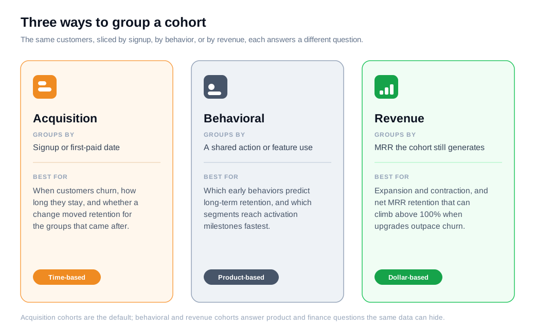
There are three types of cohort analysis you will use in SaaS: acquisition cohorts, behavioral cohorts, and revenue cohorts. Each groups the same customers a different way to answer a different question.
Acquisition cohorts group customers by when they signed up or first paid. This is the classic time-based view, and it is the one most people mean when they say cohort analysis. Appcues notes that acquisition cohorts help you find out when users churn, how long they stay engaged, and whether a product change moved retention for the groups that came after it.
Behavioral cohorts group customers by what they did, such as everyone who used a particular feature or completed a key action in their first week. These are better for product questions, like which early behaviors correlate with long-term retention. Userpilot points out that behavioral cohorts tied to early activation are often the strongest predictor of whether a customer sticks around.
Revenue cohorts track dollars instead of headcount. Rather than counting how many customers remain, they measure how much monthly recurring revenue a cohort still generates, which lets expansion and contraction show up in the same view. That difference matters enough to get its own section below.
How do you build a cohort chart?
You build a cohort chart by laying your cohorts down the rows, putting time-since-signup across the columns, and filling each cell with the retention rate for that group at that point in its life. Read across a row to watch one cohort age, and read down a column to compare every cohort at the same stage.
The steps are consistent whatever tool you use:
- Pick the question. "Did our onboarding change improve month-three retention?" is answerable. "Is retention good?" is not.
- Choose the cohort grouping and interval. ChartMogul offers five intervals: day, week, month, quarter, and year. Monthly signup cohorts are the standard starting point for most SaaS.
- Define the metric per cell. Customer retention is the share of a cohort still subscribed. In ChartMogul's own example, if 30 customers start the month and 29 renew, the retention rate is 96.67%.
- Set the time frame and fill the grid, one row per signup month and one column per month since signup.
- Read the patterns down and across, then form a hypothesis you can test.
Here is a worked example. Say you group by signup month and track customer retention. Every cohort starts at 100% in month zero by definition. Your January cohort of 400 customers retains 82% by month one, 74% by month two, and flattens near 68% by month four. The February cohort of 420 retains 85%, then 77%, then 72%. March retains 86%, then 80%. Reading down the month-one column (82%, 85%, 86%, 88%, 90%) tells a clear story: each new cohort is holding better than the last, which is exactly what you want to see after an onboarding fix.
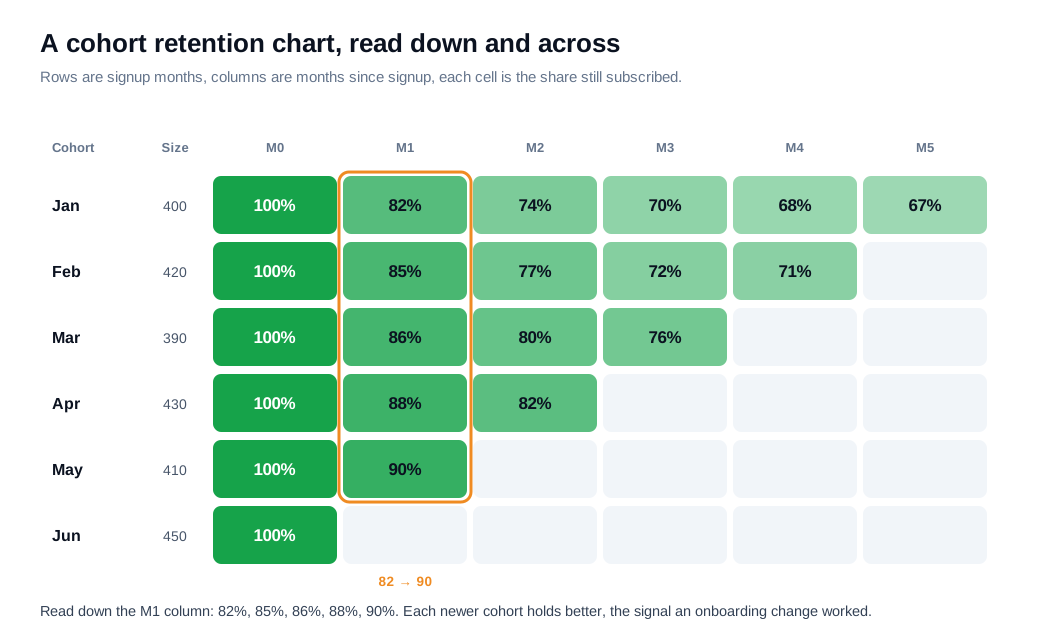
The triangular shape is the point of the whole exercise. Because day zero is always the join date, the chart lines every cohort up at the same starting line and lets you compare groups that signed up months apart on equal footing. Older cohorts have more columns of history, and the newest cohort has only its month-zero cell so far.
What does cohort retention reveal?
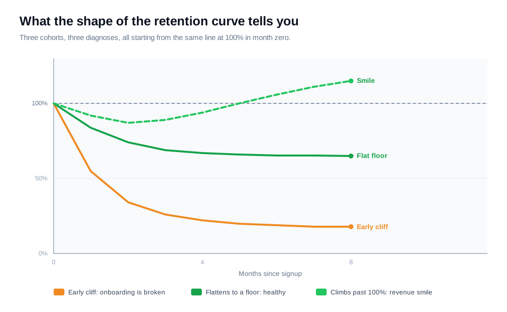
Cohort retention reveals the shape of the customer relationship: where customers drop off, whether retention settles at a stable floor, and whether a product or pricing change actually moved the number for the groups that came after it. The shape of the curve is the diagnosis, and a few shapes recur.
A sharp drop in the first month or two points at activation and onboarding. Customers signed up, never reached the product's value, and left. Userpilot describes this shape as the signal to fix the first-run experience before touching anything else.
A steady, gentle decline that never flattens means customers get some value but not enough to keep paying indefinitely. The work there is expanding the value customers get over their tenure, which onboarding alone will not solve.
A curve that flattens is the healthy pattern. When a cohort's retention stops falling and holds along a horizontal line, that line is your retention floor, the loyal base that stays. Strong SaaS products tend to see the curve flatten within the first several months.
A cliff at month 12 usually reflects annual contracts coming up for renewal rather than a sudden product failure. Reading the calendar into the curve keeps you from chasing the wrong cause.
The other thing cohorts reveal is whether a change worked. Ship a new onboarding flow in April, and you can compare every cohort before April against every cohort after it at the same point in their life. That before-and-after read is impossible with a blended number, because the blended number folds both groups together and hides the difference.
What is revenue cohort analysis and the net MRR retention smile?
Revenue cohort analysis tracks the recurring revenue a cohort generates rather than the count of customers in it, which is why net MRR retention can climb above 100% while customer retention never can. A customer either stays or leaves, so headcount retention caps at 100%. Dollars can grow.
Net MRR retention (also called net revenue retention or net dollar retention) measures how a cohort's revenue changes after expansion, contraction, and churn. ChartMogul explains that net MRR retention rises above 100% when expansion and reactivation revenue outweighs the revenue lost to downgrades and cancellations. When a revenue cohort dips early from churn and then climbs back up past its starting value, the curve makes a shape people call the smile.
A worked example makes it concrete. A cohort of customers starts at $10,000 in MRR in month zero. By month six, cancellations and downgrades have pulled $1,500 out of that base, which would leave $8,500. But upgrades and seat expansion from the customers who stayed have added $2,700. The cohort now generates $11,200, so its net MRR retention is 112%. The same cohort's customer count retention might be 84% over that span. One number counts people, the other counts money, and expansion is the reason they diverge.
That gap is where the best SaaS businesses live. A cohort that loses a fifth of its logos while growing its revenue is a business that can compound even if it never adds a new customer.
How do you act on cohort insights?
You act on cohort insights by finding the single biggest drop-off period, forming a specific hypothesis about its cause, shipping one targeted change, then watching whether the cohorts that start after the change hold better than the ones before it. A cohort chart is a diagnosis, and the action is a controlled experiment you read in the next few rows.
Start where the leak is largest. If the steepest drop is in the first 30 to 90 days, the problem is almost always onboarding and early value, since a large share of SaaS churn happens in that first stretch. Amplitude's guidance on cohort analysis is to segment the drop-off, isolate the behavior that separates retained cohorts from churned ones, and build onboarding around getting new customers to it.
Some of that work is human. The customers who stall halfway through setup, or linger on a pricing page mid-trial, are the most valuable and most fragile group in any cohort, and reaching them in the moment converts interest that an email would let cool. A live chat message or a short call at the point of friction does more for an early cohort than a drip campaign, which is the core of a modern inbound sales motion built on speed. When the sticking point is easier to show than to describe, a quick screen share or video call walks the customer past it in minutes.
Then close the loop. Tag the cohort that started after your change, watch its curve against the earlier cohorts at the same age, and keep the changes that bend the line upward. If a cliff sits at the annual renewal mark, the fix lives in the quarter before renewal rather than the week of it. Cohorts tell you what to fix and when the fix has to land.
What tools do you need to run cohort analysis?
You can run a basic cohort analysis in a spreadsheet, but subscription and product analytics tools build the tables automatically from your billing or event data, which is what most teams use once they pass a few hundred customers. The method is the same either way, and the tooling just removes the manual grid-building.
For revenue and retention cohorts pulled straight from billing, subscription analytics platforms like ChartMogul and Baremetrics assemble the customer and net MRR retention tables for you. For behavioral cohorts tied to in-product actions, product analytics tools like Amplitude group users by event and chart the curves. A spreadsheet is fine for a first pass or a small book of business, and it forces you to understand the calculation before you trust a dashboard to do it. What matters is the discipline of grouping by start date and reading each cohort on its own line, whatever tool builds the grid.
Key takeaways
- Cohorts beat blended numbers. A single retention figure mixes new and old customers and hides whether recent groups are getting better or worse, while cohort analysis follows each signup group forward on its own line.
- Pick the cohort type to match the question. Acquisition cohorts track retention over time, behavioral cohorts link early actions to loyalty, and revenue cohorts follow the dollars.
- The chart is rows of cohorts and columns of time. Group by signup month, put months-since-signup across the top, and fill each cell with the retention rate, with day zero always at 100%.
- The curve shape is the diagnosis. A sharp early drop points to onboarding, a steady decline points to weak ongoing value, a flattening curve marks your retention floor, and a month-12 cliff usually means annual renewals.
- Revenue cohorts can exceed 100%. Net MRR retention above 100% means expansion from retained customers outweighs churn, the smile curve that lets a business grow without new logos.
- Act, then read the next rows. Fix the biggest drop-off, then compare the cohorts that start after the change against the ones before it to confirm the fix worked.
TAGS

Written by
Daniel SemeckyCo-founder & CEO
Daniel is the co-founder and CEO of Glimpze. He spends his days talking to revenue teams about how to catch high-intent visitors before they bounce, and writes about inbound sales, lead conversion, and building a motion where marketing and sales actually share a number.


