
On this page
Most teams can feel when something on their site is off. Visitors bounce on the pricing page, the signup form loses people halfway down, and the mobile conversion rate trails desktop by a margin nobody can quite explain. What they usually lack is a defensible account of where the friction actually lives and which problem to fix first.
A website UX audit turns that vague sense into an evidence-backed list. You gather the data, evaluate the interface against principles that have held up for decades, rank what you find, and hand your team a queue of changes with a reason attached to each one. Done properly it is repeatable, and it is cheap relative to the revenue it quietly protects.
This post covers what a UX audit is, why it pays off, what belongs on the checklist, which data to review, how to run a heuristic evaluation, how to turn findings into prioritized fixes, and how often to repeat the process.
What is a website UX audit?
A website UX audit is a structured review of your site that identifies where real users struggle to reach their goals, ranks those problems by severity, and recommends specific fixes. It combines quantitative behavior data (what people do) with expert evaluation against established usability principles (why they do it), so the output is a prioritized list rather than a pile of opinions.
The deliverable is a report rather than a rebuild. You produce a set of documented issues, each with a screenshot, a severity rating, and a recommended change. Some will be one-line CSS fixes and others will be the case for a larger project. The audit names and ranks the problems, and leaves the building to a separate backlog.
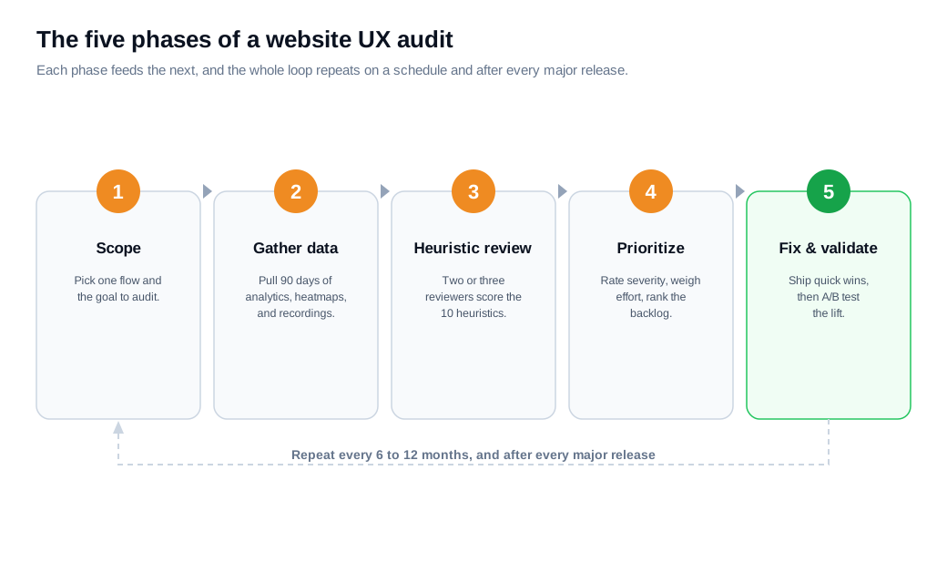
That distinction matters because redesigns are expensive and often replace known problems with unknown ones. An audit is the cheaper, earlier step that tells you whether you need a redesign at all, or whether a dozen targeted fixes would recover most of the lost conversions. Guides from HubSpot and Maze describe the same core loop: scope the audit, gather evidence, evaluate against principles, prioritize, and validate the fixes.
Why does a website UX audit matter?
A UX audit matters because small, fixable friction points compound into lost revenue at every stage of the funnel, and an audit is the most reliable way to find them before they cost a sale. Each ambiguous label, redundant form field, or dead end taxes a visitor's patience, and patience is the budget you are spending down.
The bottom-of-funnel numbers make the cost concrete. The Baymard Institute puts the average documented cart abandonment rate at 70.22%, drawn from 50 separate studies, and a large share of that is design rather than lack of intent. Baymard also finds the average checkout shows 23.48 form elements when a well-built flow needs closer to 12 to 14, and that many checkouts could cut the fields shown by 20 to 60% without losing anything.
The upside is documented too. Forrester's report The Six Steps For Justifying Better UX found that sites built on strong design systems converted at markedly higher rates, a figure often cited as up to a 400% lift in visit-to-lead conversion. Treat the exact multiple as directional, since it depends heavily on the starting point, but the pattern is consistent across the research: reducing friction moves conversion.
These are ecommerce and enterprise figures, and the mechanism generalizes. Every site has a primary action, and every extra obstacle between arrival and that action leaks some of the traffic you already paid to acquire.
What does a UX audit checklist include?
A UX audit checklist covers the handful of areas where friction reliably hides: navigation and structure, content clarity, forms and conversion flows, mobile responsiveness, accessibility, performance, and the feedback the interface gives when something goes wrong. Working through them in order keeps the review systematic instead of drifting to wherever your eye happens to land.
Navigation and information architecture come first. Check that menu labels describe what sits behind them, that the current location is obvious, and that a first-time visitor can predict where to click to reach a given goal.
Content and clarity come next. Every key page should answer, above the fold, what this is, who it is for, and what to do next. Vague headlines, internal jargon, and walls of text bury the one line the visitor actually needed.
Forms and conversion flows are where money leaks fastest. Count the fields, mark which are genuinely required, confirm that errors appear inline with a fix rather than after submission, and make sure the primary button is visible without scrolling.
The rest of the list is mobile, accessibility, performance, and feedback. Confirm tap targets are large enough and layouts hold on small screens, check pages against WCAG basics for color contrast and keyboard access, measure load times, and verify the interface confirms actions and recovers gracefully when a user makes a mistake.
What data should you review?
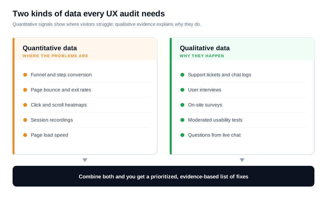
You should review two kinds of data: quantitative signals that show you where the problems are, and qualitative evidence that shows you why. The quantitative side tells you which pages and steps are bleeding, and the qualitative side tells you what to change. Skip either and you are guessing.
On the quantitative side, start with funnel and page analytics: conversion by step, drop-off rates, page-level bounce and exit rates, time on task, and how all of it differs by device and traffic source. Then layer on behavioral tools. Heatmaps show where people click and how far they scroll, and session recordings let you watch real journeys and catch rage clicks, hesitation, and the exact form field where people abandon. A common rule of thumb is to pull at least 90 days of data so seasonality and low-traffic pages do not mislead you.
On the qualitative side, the richest sources are already sitting in your business. Support tickets and chat logs name the confusing workflows in the customer's own words. User interviews and short surveys surface expectations you cannot infer from clicks alone. A handful of moderated usability tests, where you watch someone attempt real tasks, will expose problems no dashboard reports.
Your live conversation channels double as a listening post here. The questions that come into live chat are a running log of where your interface fails to answer on its own, and if you run proactive outreach nudges, the pages where you have to step in most often map straight onto your worst friction. Both turn everyday support volume into audit input at no extra cost.
How do you run a heuristic evaluation?
You run a heuristic evaluation by having two or three reviewers independently inspect the interface against a fixed set of usability principles, then pooling their findings into one deduplicated, severity-rated list. It is the expert-judgment core of an audit, and it is fast and cheap because it needs no participant recruiting.
The standard rulebook is Jakob Nielsen's 10 usability heuristics: visibility of system status, match between the system and the real world, user control and freedom, consistency and standards, error prevention, recognition rather than recall, flexibility and efficiency of use, aesthetic and minimalist design, help users recognize and recover from errors, and help and documentation. Each reviewer walks the key flows and notes every place the design breaks one of these rules.
Use more than one reviewer, because a single evaluator misses most of the problems. Nielsen's research on heuristic evaluation found that one evaluator catches only about 35% of the usability issues in an interface, while three to five reviewers, pooling their independent findings, reach roughly 75%. Different reviewers notice different things, so the aggregation is where the value comes from.
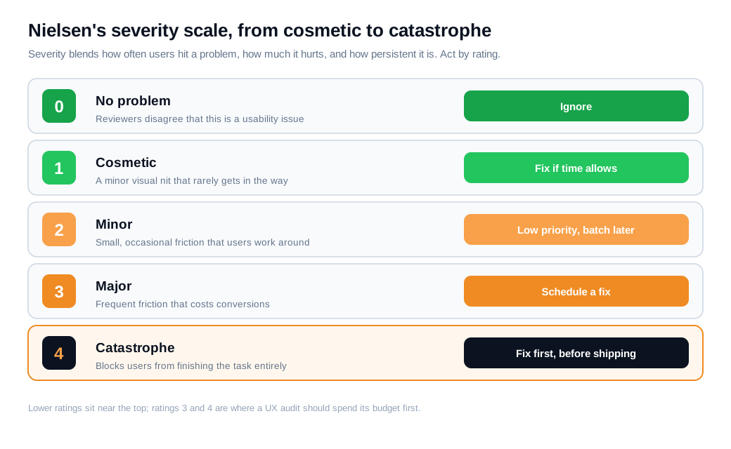
Rate every issue for severity so the list can be prioritized later. Nielsen's severity scale runs from 0 to 4 and blends three factors: how often users hit the problem, how much it hurts when they do, and whether it is a one-time stumble or a repeated obstacle. A 0 is not a real problem, a 2 is a minor issue, and a 4 is a catastrophe you fix before anything else ships.
How do you turn findings into fixes?
You turn findings into fixes by scoring each issue on severity and effort, sorting them into an impact-versus-effort matrix, and moving the results into a prioritized backlog where every item has an owner and a success metric. Severity tells you what hurts most, and effort tells you what you can afford now. Plotting the two together sorts the list for you.
The Nielsen Norman Group's guide to prioritization methods describes the impact-effort matrix as one of the fastest ways to do this. High-impact, low-effort issues are quick wins you ship this week. High-impact, high-effort issues are the big bets you schedule and resource. Low-impact items sink to the bottom of the backlog, and the high-effort, low-impact quadrant is where you say no.
Here is the arithmetic on an ordinary case. A B2B SaaS pricing page draws 20,000 visits a month, 5% of visitors start the demo-request form (1,000 starts), and 55% finish it (550 demos). The audit flags the form: it asks for 11 fields, including a "company revenue" dropdown that session recordings show 30% of people abandon on, and the submit button just says "Submit." Removing three low-value fields and relabeling the button to "Book my demo" is a classic quick win, high impact and an afternoon of work.
Say that lifts form completion from 55% to 64%. That is 640 demos a month, 90 more than before, from one small change the audit surfaced and severity-ranked as urgent. Treat the lift as an estimate and confirm it with an A/B test, but the ranking that put it first came straight from severity weighed against effort.
Two habits keep the backlog honest. Attach a metric to each fix so you can tell later whether it worked, and validate on the live site instead of assuming. Lab testing only catches the problems you thought to test for, so pair it with real behavior in production and offer help at the moment someone stalls. A well-timed proactive nudge on the step where your data shows people quitting turns a detected problem into a saved conversion while the permanent fix waits its turn in the queue.
How often should you run a UX audit?
You should run a full UX audit once or twice a year, plus a focused mini-audit whenever you ship a major flow, watch a key metric drop, or enter a new market. A site is never static, and every release and content change can introduce friction the last audit could not have seen.
The practical model has two layers. Continuous monitoring runs in the background, where analytics alerts, session recordings, and recurring support themes flag problems as they emerge. Periodic deep audits, scheduled on the calendar, step back and evaluate the whole experience against principles rather than reacting to a single metric.
Small and frequent beats large and rare. Audit one flow, fix what you found, then re-audit the new version, because your fixes will occasionally introduce problems of their own, and a fresh pass is how you catch them before your visitors do.
Key takeaways
- A UX audit diagnoses; the building is a separate step. It pairs behavior data with expert evaluation to produce a prioritized list of problems, each carrying a severity rating and a recommended fix, which you then hand to a backlog.
- The payoff is recovered conversion. Baymard documents roughly 70% cart abandonment and checkouts with nearly twice the fields they need, and Forrester ties stronger UX to materially higher conversion rates.
- Review both kinds of data. Quantitative signals (funnels, heatmaps, session recordings) show where visitors struggle, and qualitative sources (support tickets, interviews, usability tests) explain why they do.
- Heuristic evaluation is the cheap core. Two or three reviewers scoring the interface against Nielsen's 10 heuristics catch about 75% of issues, far more than any single reviewer working alone.
- Prioritize by severity and effort. Score each finding, plot impact against effort, ship the quick wins first, and attach a success metric so you can prove the change actually worked.
- Audit small and often. A full pass once or twice a year, plus a mini-audit after every major release, keeps new friction from piling up unseen.
TAGS

Written by
Nilas MylerCo-founder & CTO, Glimpze
Nilas is the co-founder and CTO of Glimpze, an inbound sales tool that turns high-intent website visitors into live conversations. A former SEO consultant for some of the largest companies in Denmark, he writes about speed-to-lead, inbound sales, and conversion rate optimization — the technical and operational mechanics of turning traffic into pipeline.


