
On this page
Your homepage is the page most people see first and the one you have the least control over. Visitors arrive from ads, search, a link a colleague forwarded, or a name on a business card, each carrying a different question. In the time it takes to read this sentence, most of them have already sized up whether your site looks like it belongs to a company worth their attention. A 2006 study by Gitte Lindgaard found that people form a stable opinion of a web page's visual appeal in about 50 milliseconds, faster than a deliberate thought.
That first impression buys you a few seconds, and what you do with them decides whether the visitor scrolls or leaves. A high converting homepage earns the scroll by answering three questions fast: what is this, is it for me, and what do I do next. Everything else on the page either supports those answers or gets in their way.
This post covers the elements a homepage needs, how to write a value proposition, how above-the-fold design drives action, how fast the page has to load, the mistakes that quietly cost conversions, and how to test changes instead of arguing about them.
What elements does a homepage need?
A high converting homepage needs a short, ordered set of elements: a headline that names the offer, a value proposition that says who it helps and why, one clear primary action, a supporting visual, a trust cue or two, and structured sections below the fold that answer the questions a visitor asks next. The order matters as much as the list, because people read top to bottom and leave the moment the page stops earning the next scroll.
Think of the homepage as a stack of answers. The hero at the top handles "what is this and is it for me." The section under it shows proof, a logo row, a testimonial, or a hard number, so the claim does not rest on your word alone. The next sections break the offer into concrete benefits, handle the obvious objections, and repeat the call to action once the visitor has enough context to say yes. A single, repeated primary action beats a page that scatters five competing buttons, because every extra choice splits attention and slows the decision.
Trust cues do quiet, heavy work. Baymard Institute's mobile homepage research found that 42% of mobile homepages risk setting the wrong expectations for what the company actually offers, which means close to half of sites lose people who never grasped the pitch. Recognizable customer logos, a plain guarantee or security line, and real testimonials with names and faces all lower the felt risk of clicking.
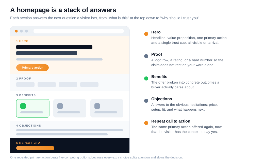
None of this requires a cinematic hero video or a clever animation. It requires that a stranger landing cold can, within a few seconds, name what you sell, decide whether it fits, and see the one thing you want them to do next.
How do you write a homepage value proposition?
You write a homepage value proposition by stating the end benefit in one plain sentence, then explaining who it is for and why it beats the alternative, in language your customers already use. The goal is recognition, so a visitor thinks "that is me, and that is the thing I need" without translating marketing speak first.
Conversion researcher Peep Laja of CXL lays out a structure that fits the top of most homepages. Lead with a headline that names the end benefit in one line. Follow it with a two or three sentence sub-headline that explains what you offer, for whom, and why it is useful. Add three bullets covering the key benefits or features. Then show a hero shot that reinforces the message, because an image registers faster than a paragraph.
The usual failure is vagueness. "Quality solutions for modern teams" could describe a payroll app or a plant nursery, so it communicates nothing. Compare it with a line that names the job: "Turn your website visitors into booked sales calls." The second version tells a specific person that a specific outcome is on offer. Concrete claims also give you something to prove further down the page, which vague ones never do.
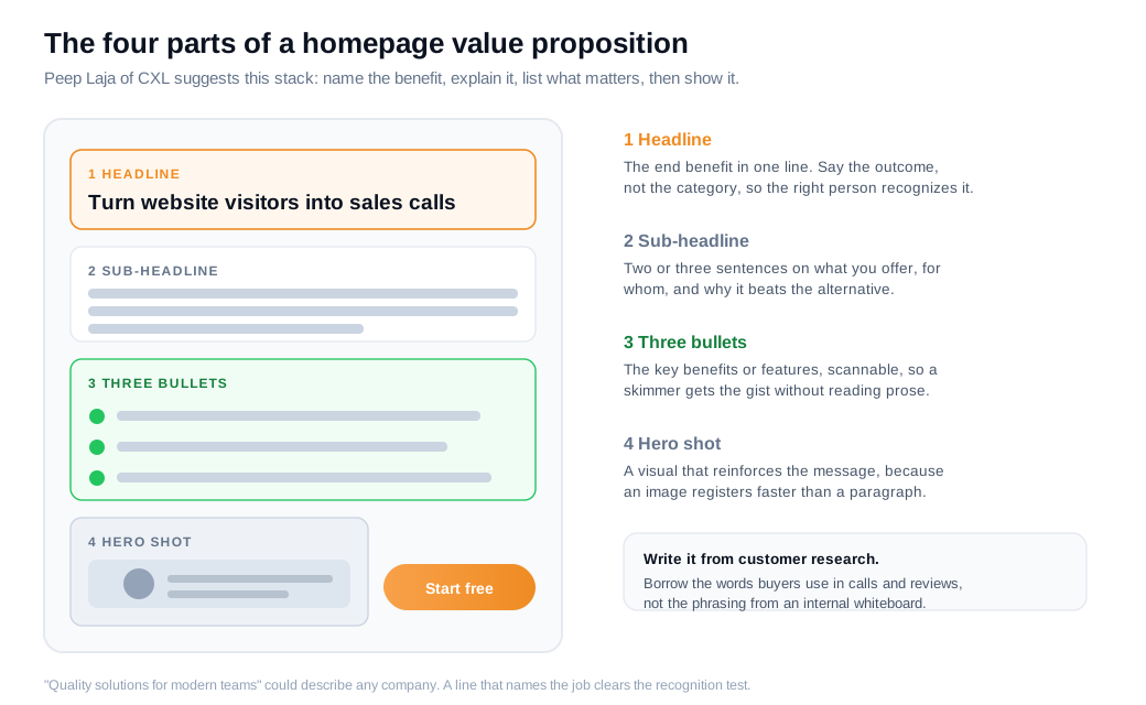
Write the value proposition from customer research rather than a whiteboard brainstorm. Read your sales call notes, support tickets, and review sites, and borrow the words real buyers use to describe the problem. When your headline echoes the sentence a prospect would say out loud, it clears the recognition test that every other homepage element depends on.
How does above-the-fold design drive action?
Above-the-fold design drives action because the first screen collects the majority of a visitor's attention and sets the frame for everything below it. Nielsen Norman Group's eye-tracking research found that people spend about 57% of their page-viewing time above the fold and roughly 74% within the first two screenfuls, so the space visible on arrival carries most of the weight.
People do scroll, and they scroll willingly when the top of the page gives them a reason to. The point is that the first screen has to do the recruiting. Lindgaard's 50-millisecond finding and the attention data pull in the same direction: you get one fast impression to look credible and one short window to make the offer legible before a visitor decides whether the rest is worth their time.
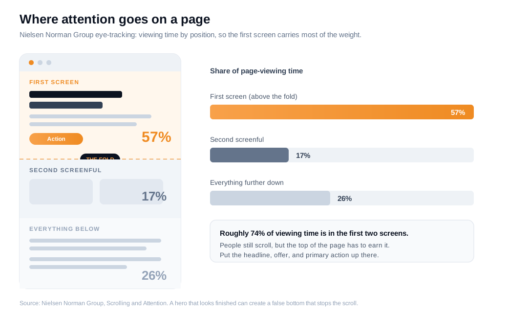
Put your strongest work in that space. The headline and value proposition belong there, along with the primary call to action and one trust cue. Keep the hero focused on the offer instead of a stock photo that says nothing. Let the next section peek above the fold so the visitor can see there is more, since a hero that looks finished can create a false bottom that stops the scroll early. On mobile, where the fold is smaller and traffic is often larger, this discipline matters more.
A homepage cannot answer every question in one screen, which is why a persistent live chat entry point earns its place in the hero. A visitor who is ready right now gets a way to ask instead of hunting for a contact page.
How fast does a homepage need to load?
A homepage needs to load fast enough that speed never becomes the reason someone leaves, which in practice means getting the first meaningful content on screen within about two seconds. Portent analyzed over 100 million pageviews and found that ecommerce conversion rates were highest for pages loading in the first one to two seconds and fell sharply after that, dropping by roughly 0.3 percentage points for each additional second of load time.
The math is unforgiving because it multiplies against every visitor. In Portent's own illustration, 1,000 visitors to a $50 product converting at 3.05% (a one-second load) produce about $1,525 in sales, while the same traffic at a four-second load, converting at 0.67%, produce about $335. Same page, same offer, most of the revenue lost to a slow start.
Speed problems on a homepage usually trace to a few culprits: oversized hero images, render-blocking scripts, third-party tags, and fonts that load late and shift the layout as they arrive. Compress and correctly size images, defer non-critical scripts, and test on a mid-range phone over a real mobile connection rather than your office wifi. Every element you add to the hero should have to justify the milliseconds it costs.
What are the most common homepage mistakes that cost conversions?
The most common homepage mistakes are burying the value proposition, offering too many competing actions, writing in the company's language instead of the customer's, and letting the page load slowly. Each one is easy to miss from the inside, because the team that built the page already knows what the company does and forgets that the visitor does not.
A short field guide to the recurring offenders:
- A vague or missing value proposition. If a first-time visitor cannot say what you do after five seconds, the headline is decorating rather than working.
- Too many calls to action. Five equal buttons is the same as no priority. Choose the one action that matters most and make it the obvious next step.
- Company jargon. "Synergistic solutions" and "next-generation platform" describe nothing a buyer searches for. Use the words from your sales calls.
- Weak or absent proof. Claims with no evidence read as marketing noise. One real testimonial, a logo row, or a specific number does more than three adjectives.
- A slow, heavy hero. A giant background video that delays the headline trades your first impression for a loading spinner.
- No path for the undecided. Plenty of visitors are not ready to buy yet, and a page with only a hard "Buy now" abandons the ones who still have a question.
For that last one, watching where visitors stall tells you which mistake you actually have. When analytics show people scrolling the homepage repeatedly without clicking anything, a well-timed proactive nudge can catch the hesitation in the moment rather than letting the page carry the whole burden.
How do you test homepage variants?
You test homepage variants by changing one meaningful element at a time, splitting traffic evenly between the versions, and running the test until it reaches a pre-calculated sample size instead of stopping the moment one side looks ahead. The homepage touches nearly every visitor, so a disciplined test protects you from shipping a change that only looked like a winner.
Start by deciding the single metric that counts, usually the primary conversion such as a signup, a demo request, or a purchase, rather than a vanity click. Nielsen Norman Group's A/B testing guidance is blunt about the trap: stopping a test at the first sign of significance is one of the most reliable ways to ship a false result, because early data swings hard. Calculate the sample size in advance from your baseline rate and the smallest lift worth caring about, then let the test run its course, ideally covering at least one to two full weeks so it absorbs the day-of-week swings in behavior.
Here is an illustrative worked example. Say your homepage draws 40,000 visitors a month and converts 3% of them into demo requests, or 1,200 requests. You rewrite the headline to name the outcome instead of the category, and you want to detect a lift of at least half a percentage point. A sample-size calculation for that baseline and effect calls for roughly 30,000 visitors per variant, which your traffic reaches in a little over six weeks split across two versions. If the new headline lifts conversion from 3.0% to 3.6%, that is 240 extra demo requests a month, and at a 20% close rate, about 48 more customers a year from one sentence, with no new traffic bought. The figures are illustrative, though the pattern is what real tests keep showing.
When a test comes back flat, the numbers tell you what happened but not why. Session recordings and a short round of user testing fill that gap, and for teams running inbound sales, a live conversation with a visitor on the homepage often surfaces the exact confusing word or missing proof point that no amount of reshuffling would have fixed.
Key takeaways
- A homepage is a stack of answers. Lead with a headline, value proposition, one primary action, and a trust cue, then use the sections below to prove the claim and handle objections.
- Write the value proposition in the customer's words. A one-line benefit headline, a short sub-headline, three bullets, and a hero shot beat vague slogans that could describe any company.
- The first screen carries most of the attention. NN/G found 57% of viewing time sits above the fold, so the headline, offer, and primary action belong there.
- Speed is a conversion lever. Portent's data across 100 million pageviews shows conversion falling as load time climbs, so treat every heavy hero element as a cost.
- Cut competing actions and jargon. One clear next step and plain language outperform five buttons and slogans no buyer would ever type into search.
- Test one change at a time to a pre-set sample size. Pick the real conversion metric, calculate the sample in advance, and never stop at the first hint of significance.
TAGS

Written by
Nilas MylerCo-founder & CTO, Glimpze
Nilas is the co-founder and CTO of Glimpze, an inbound sales tool that turns high-intent website visitors into live conversations. A former SEO consultant for some of the largest companies in Denmark, he writes about speed-to-lead, inbound sales, and conversion rate optimization — the technical and operational mechanics of turning traffic into pipeline.


