
On this page
A visitor reads your whole page, nods along with every line, and reaches a button that says "Submit." Then they close the tab. The button was not why they came. It was the last thing standing between interest and action, and it lost.
Call-to-action buttons are the smallest surface on a page and one of the most tested. A handful of documented experiments have moved click-through rates by double digits from a single word or a color swap. This post covers what actually makes a CTA convert, how button copy changes clicks, whether color and placement matter, how many CTAs a page should have, and how to A/B test buttons without fooling yourself.
What makes a call-to-action button convert?
A call-to-action button converts when it answers three questions at the moment of the click: what will happen, why it is worth doing, and whether it is safe to do. Miss any one of those and a visitor who was ready to act hesitates, and hesitation on the web usually means leaving.
Think about the difference between "Submit" and "Get my pricing." The first names a mechanical task and hides the outcome. The second names the outcome the visitor actually wanted, phrases it in their voice, and implies a low-risk next step. Both buttons do the same thing technically. Only one of them tells the visitor what they are getting.
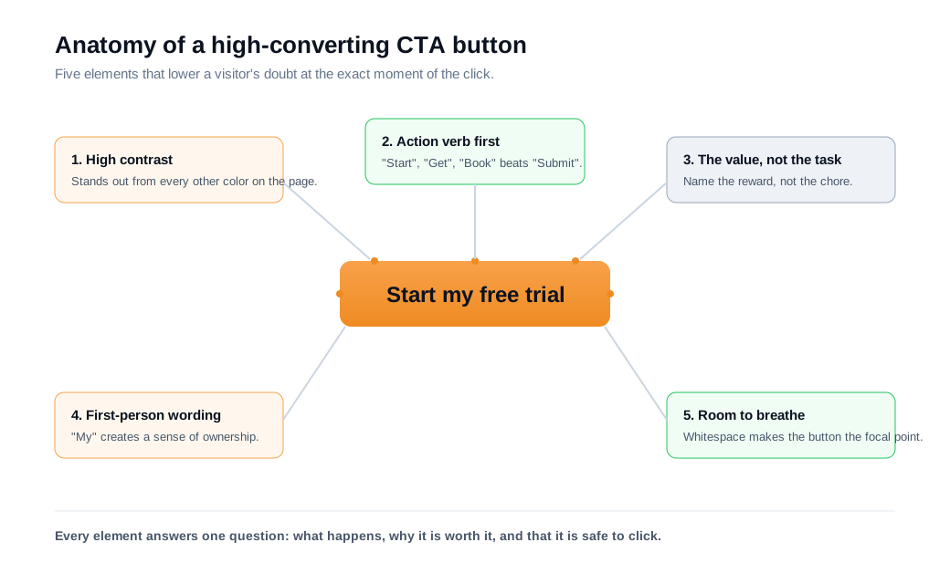
Relevance is the multiplier on all of it. When HubSpot analyzed more than 330,000 calls to action over six months, personalized CTAs converted 202% better than generic ones that showed the same message to everyone. A button aimed at where the visitor actually is in their decision beats a one-size-fits-all button, because it reads as written for them rather than at them.
The rest of this post breaks the button into the levers you can actually pull: the words on it, its color and contrast, where it sits on the page, how many of them you use, and how to test any change so you keep the wins and drop the noise.
How does button copy affect clicks?
Button copy affects clicks because it is the last thing a visitor reads before deciding, so specific, value-loaded, first-person wording consistently beats generic labels like "Submit" or "Click here." The copy is where the visitor makes up their mind, which is why a few words carry so much weight relative to their size on the page.
The cleanest illustration is a pronoun test run by conversion researcher Michael Aagaard for Unbounce. Changing the button from "Start your free 30 day trial" to "Start my free 30 day trial" lifted the click-through rate by 90% over a three-week test. Nothing else changed. First-person wording makes the visitor picture the action as their own, and that small shift in ownership showed up as a large shift in clicks.
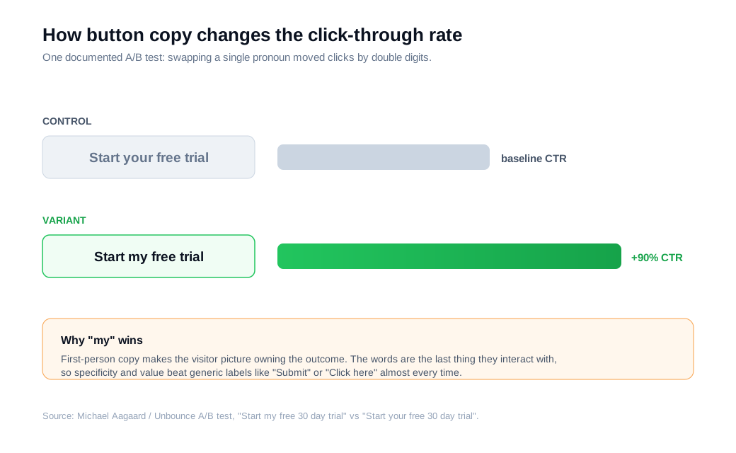
Aagaard's broader rule is worth memorizing: the more value and relevance you can pack into the button copy, the more clicks you tend to get. That points to a few reliable moves.
Lead with an action verb that names the reward. "Get my report," "Book a demo," and "Start my trial" all pair a verb with the thing the visitor wants. Compare that to "Submit," "Register," or "Learn more," which describe effort without a payoff.
Keep it short and concrete. A button is not the place for a sentence. Two to five words that name the outcome will almost always outread a longer label that hedges.
Reduce the perceived cost right on the button or next to it. Words like "free," "instant," and "no card needed" pull weight because they answer the objection forming in the visitor's head before they can act on it.
Do color and contrast matter for CTA buttons?
Color matters for CTA buttons mainly as a contrast tool, so the button that wins is usually the one that stands out most from everything around it. There is no single shade that converts best on every page, despite how often you will see one claimed.
The famous example is a HubSpot test where a red button beat a green button by 21% across more than 2,000 visits. It gets quoted as proof that red wins. The real lesson sits in the page design: the surrounding page was built around green, so the green button blended in while the red one jumped out. Contrast did the work, and the color was just the vehicle for it.
Practically, that means picking one accent color reserved for your primary action and keeping it off everything else. If your links, headers, and icons are all the same blue as your button, the button has nothing to stand against. Give the button size, weight, and whitespace so the eye lands on it without effort. A CTA surrounded by clutter loses even when the color is right.
Shape and legibility matter for the same reason. A button should look clickable at a glance, with enough padding that the label breathes and enough contrast between the text and the fill to stay readable on a phone in daylight. None of this is exotic. It is the difference between a button the eye finds instantly and one it has to hunt for.
Where should you place a CTA on the page?
Place the CTA wherever the visitor has enough information to say yes, which is above the fold for simple, familiar offers and lower on the page for complex ones that need explaining first. Placement is a judgment about readiness, and readiness depends on how much the visitor needs to understand before they act.
A well-known ContentVerve test, published on Unbounce, makes the point. For a landing page selling a service that took some explaining, moving the opt-in below the fold, after the supporting argument rather than before it, beat the above-the-fold control by 304%. The visitors were not ready to commit at the top of the page. They became ready once the page had made its case, and the button worked far better when it met them at that moment.
The takeaway is not that below the fold always wins. A returning customer clicking "Buy" on a product they already know does not need three scrolls of persuasion first. The rule is to place the ask at the point of conviction, then repeat it. On a long page, one CTA at the top for people who arrive ready and another after the proof for people who needed convincing covers both.
Timing on the page matters as much as vertical position. Some of the highest-intent moments happen when a visitor is stuck on a specific objection right before the button, the kind of question a static page cannot answer. Giving those visitors a way to ask in the moment, through live chat on the page instead of a form and a wait, catches intent that a button alone would lose. For inbound sales teams, that in-the-moment answer is often the difference between a click and a bounce.
How many calls to action should a page have?
A page should have one primary action, repeated as often as the layout needs, so the visitor never has to choose between competing buttons. Every additional primary CTA competing for attention splits the decision and slows it down, which is the opposite of what a button is for.
This is sometimes framed through attention ratio: the number of things a visitor can click versus the number of things you want them to click. A focused landing page with one goal and one repeated button has a clean ratio. A page with a "Buy now," a "Watch the video," a "Download the guide," and a newsletter box all styled as bright buttons has a messy one, and the visitor resolves that mess by clicking nothing.
Secondary actions are fine as long as they look secondary. A muted "See how it works" link under a solid "Start my trial" button gives the not-yet-ready visitor an option without stealing focus from the main path. The primary action stays visually dominant, and everything else defers to it.
How do you A/B test CTA buttons the right way?
You A/B test a CTA button by changing one element at a time, splitting traffic evenly, and running the test until it reaches a pre-set sample size and statistical significance instead of stopping when the number looks good. The discipline is what separates a real result from a lucky streak.
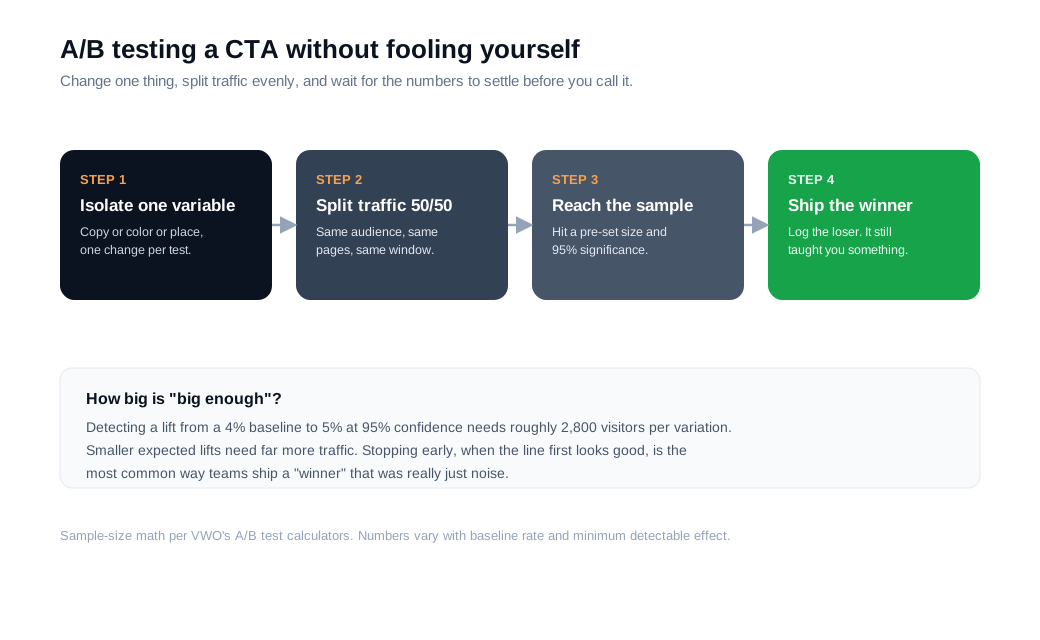
Change one thing per test. If you rewrite the copy, recolor the button, and move it in the same experiment, a win tells you the combination worked but not which part mattered. Isolating a single variable is the only way the result teaches you something you can reuse.
Size the test before you launch it. Using the sample-size math built into VWO's A/B testing calculators, detecting a lift from a 4% baseline to 5% at 95% confidence needs roughly 2,800 visitors per variation. Smaller expected lifts need far more traffic. Decide that number up front so you know when you are actually done.
Do not peek and stop early. Checking a test and killing it the moment it looks like it is winning is one of the most common ways teams fool themselves, because early leads swing wildly and often vanish with more data. Let the test hit its planned sample size and run for at least one full business cycle so weekday and weekend behavior both show up.
Here is a worked example. Say a pricing page gets 6,000 visitors a month and the current "Sign up" button converts 4% of them to trials, which is 240 trials. You hypothesize that value-first, first-person copy will do better, so you test "Start my free trial" against it. At a 4% baseline, you need about 2,800 visitors per variation, so 5,600 total, or roughly a month of this page's traffic to reach a reliable read. If the variant lands at 5% and the result is significant, that is 300 trials a month, 60 more than before, and 720 more over a year from one copy change. If it comes back inconclusive, you have not lost anything except the test window, and you move to the next hypothesis with a cleaner idea of what your visitors respond to.
Key takeaways
- A CTA converts when it answers three things at the click: what happens, why it is worth it, and that it is safe, and personalized CTAs outperformed generic ones by 202% in HubSpot's data.
- Copy carries more weight than its size suggests. Value-loaded, first-person wording like "Start my free trial" beat "your" by 90% in an Unbounce test, so lead with a verb and name the reward.
- Color works through contrast, not any magic shade. Red beat green by 21% in HubSpot's test mainly because the page was green, so reserve one accent color for the primary action.
- Place the ask at the point of conviction. Simple offers can sit above the fold, but a complex offer's CTA beat its above-the-fold control by 304% when it followed the argument.
- Keep one primary action and test one variable at a time. Size the experiment first, run it to significance, and resist stopping early when an incomplete lead looks like a win.
TAGS

Written by
Nilas MylerCo-founder & CTO, Glimpze
Nilas is the co-founder and CTO of Glimpze, an inbound sales tool that turns high-intent website visitors into live conversations. A former SEO consultant for some of the largest companies in Denmark, he writes about speed-to-lead, inbound sales, and conversion rate optimization — the technical and operational mechanics of turning traffic into pipeline.


