
On this page
A visitor lands on your homepage from a search result. In the first second, before they touch the scroll wheel, they see one screen of your site and decide whether to keep reading or hit back. That one screen is your above-the-fold content, and it carries more of the visit than any other part of the page.
Most teams spend weeks polishing sections that a shrinking share of visitors ever reach, then fill the top of the page with a stock photo and a tagline nobody can decode. The visitor who arrived ready to act cannot tell what you sell in the two seconds they give you, so they leave. Fixing that rarely costs money. It costs attention to the right piece of screen.
This post explains what above-the-fold content is, where the fold falls on real devices, what belongs in that first screen, how it changes engagement, the mistakes that quietly cost conversions, and how to test your own layout instead of guessing.
What is above-the-fold content?
Above-the-fold content is everything a visitor sees in the browser window the moment a page loads, before they scroll. Anything they have to scroll down to reach sits below the fold.
The term is older than the web. It comes from newspapers, where the most important story ran on the top half of the front page, above the physical crease, because that was the only part visible when the paper sat folded on a newsstand. Websites borrowed the idea for the first viewport, the area framed by the browser window when a page opens. As Optimizely's glossary describes it, this is the prime real estate every visitor is guaranteed to see.
That first screen is your only guaranteed impression. Below it, the audience thins with every pixel. So above-the-fold content is doing two jobs at once: it has to communicate value fast, and it has to convince people the rest of the page is worth their scroll.
Where does the fold fall on today's devices?
The fold falls at a different height for every visitor, so treat it as a range across your audience rather than a fixed line. The exact point where it lands depends on screen size, resolution, browser toolbars, and even zoom level.
As a rough guide, a widescreen desktop might show around 1,000 pixels of page height before the fold, a typical laptop closer to 550 to 700 pixels, and a phone anywhere from 300 pixels up to 900 or more depending on the model and the browser chrome. Tablets sit in between and flip with orientation.
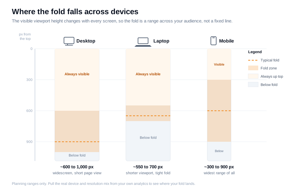
The practical takeaway is that you cannot design for one fold. You design for where the fold tends to land across the real mix of devices your visitors bring, and you find that mix in your own analytics rather than assuming it. A site with 70% mobile traffic has a completely different fold from one that skews desktop, and building for the wrong one buries your best content out of sight for most of the audience.
What belongs above the fold?
The content that belongs above the fold is whatever a visitor needs to answer three questions in a couple of seconds: what is this, is it for me, and what do I do next. In practice that maps to five elements: a clear headline, a value proposition, a primary action, one trust cue, and a supporting visual.
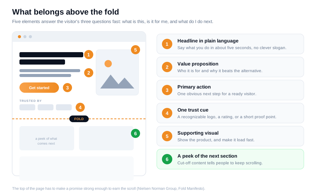
Here is what each element does:
- A headline in plain language. A visitor should understand what you do within about five seconds, without decoding a clever slogan. State the offer, not a mood.
- A value proposition. One line on who it is for and why it beats the alternative they are weighing. This is the sentence that earns the scroll.
- A primary action. One obvious next step for a ready visitor, whether that is a signup, a demo request, or a way to start a conversation. Keep it to a single main action so it does not compete with itself.
- One trust cue. A recognizable customer logo, a rating, or a short proof point, placed to reinforce the offer rather than clutter it.
- A supporting visual. An image or short product view that shows the thing instead of describing it. Make it load fast, since it usually anchors the screen.
The guidance from Nielsen Norman Group's Fold Manifesto is that the top of the page has to make a promise strong enough to earn the scroll. People continue down a page when what they can already see suggests the rest is worth their time. So leave a sliver of the next section peeking above the fold as a signal that more content follows.
For high-intent pages, put the primary action in that first screen. If someone reaches your pricing page from a branded search, they already know what they want, and making them hunt for the button adds friction for nothing. A live chat entry point in the hero gives a ready visitor a way to ask their one question and act in the moment, which often does more than another paragraph of copy.
How does above-the-fold content affect engagement?
Above-the-fold content affects engagement more than any other zone because that is where the majority of attention concentrates, so it disproportionately decides whether a visitor engages or bounces. Eyetracking makes the pattern concrete.
In Nielsen Norman Group's 2018 eyetracking study, which analyzed roughly 130,000 fixations across 120 participants, users spent about 57% of their page-viewing time above the fold. The original research write-up adds sharper detail: participants spent more than 42% of their viewing time on the top 20% of a page and more than 65% on the top 40%, regardless of page length. The 100 pixels just above the fold were viewed 102% more than the 100 pixels just below it, and the first two screenfuls together held 74% of viewing time.
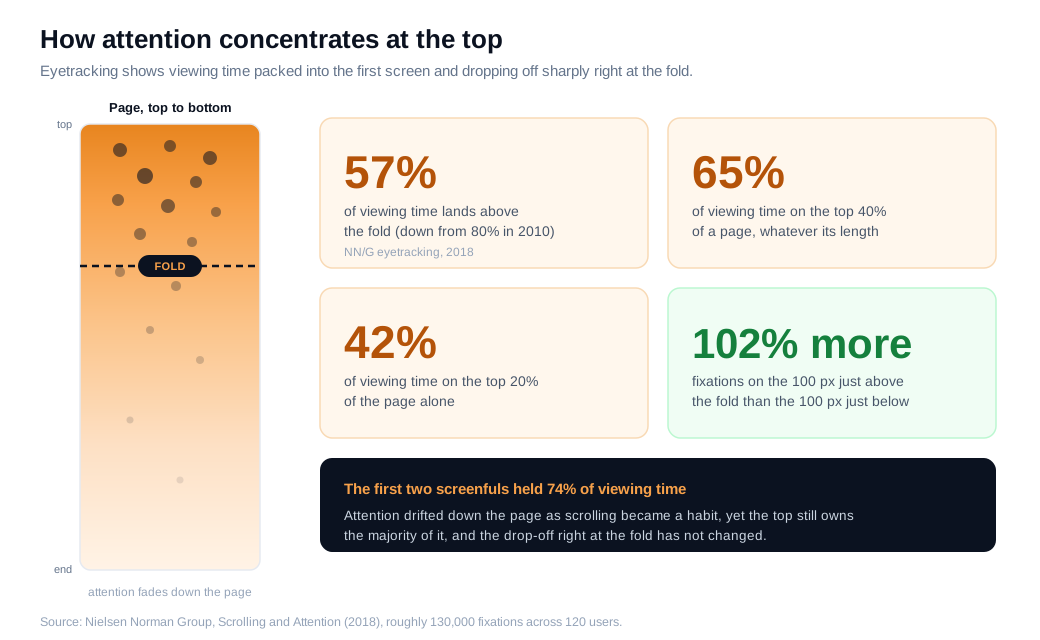
Attention did drift down the page over time. The same team measured 80% above the fold in 2010, so scrolling has become more of a habit. The drop-off at the fold held steady all the same, and the top of the screen still owns the majority of attention.
Speed is the other half of engagement, and it hits the fold first. Google and SOASTA analyzed around 900,000 mobile ad landing pages across 126 countries and found that for 70% of them, the visual content above the fold took nearly seven seconds to display, as reported by Think with Google. Google's separate mobile research, in The Need for Mobile Speed, found that 53% of visits are abandoned when a page takes longer than three seconds to load. A hero that renders slowly loses a large share of visitors before they read a word.
Put numbers on it. A SaaS homepage draws 30,000 visitors a month. Analytics shows the fold lands near 720 pixels for the median visitor, and the primary demo button sits at 1,150 pixels, below the fold for most people. A scroll map confirms that 48% of visitors never reach it. The team moves the button and a one-line value proposition up into the first 700 pixels so every visitor sees them, and clicks to the demo form rise from 1.8% to 2.6%. On 30,000 visitors that is about 240 extra demo starts a month, from relocating an element that was already on the page. Those figures are illustrative, but they mirror the direction the attention data keeps pointing.
What are the most common above-the-fold mistakes?
The most common above-the-fold mistakes all share one root: they waste the screen that gets the most attention. A few show up again and again.
The first is the false bottom. A hero section that fills the viewport and looks visually finished, with a big image and generous whitespace, can trick people into believing the page ends there. Nielsen Norman Group calls this the illusion of completeness, and in one usability study 75% of users did not realize they could scroll and never found what the company did. The fix is small: let cut-off content peek above the fold so people can see there is more.
The second is the vague headline. If the top of the page describes a feeling instead of an offer, a visitor cannot answer "is this for me" and leaves. Say what you do in words a first-time visitor already knows.
The third is the rotating carousel. Sliders that auto-advance through several messages tend to underperform a single static hero, because visitors rarely engage past the first slide and the competing calls to action dilute each other. GTmetrix also notes they slow the page, which compounds the speed problem above. One clear message usually beats five that fight for the same space.
The fourth is a fold eaten by chrome. Oversized sticky navigation bars, cookie banners, and promo strips can push your real content off the first screen, especially on mobile where the viewport is already short. What counts is the content the visitor actually sees, so measure the fold after those elements load, not before. A well-timed proactive outreach nudge can help a stalling visitor, but it cannot rescue a hero that never showed the offer in the first place.
How do you test above-the-fold layouts?
You test above-the-fold layouts by measuring where the fold actually lands for your visitors, watching how far they scroll, and running controlled A/B tests on placement rather than trusting a best-practice slogan. Three tools do most of the work.
Start with analytics. Your platform already knows the screen resolutions and device types your real audience brings, which tells you where the fold tends to fall for them, the only fold that matters for your page. Segment desktop and mobile, since their folds differ enough that one layout rarely serves both well.
Add a scroll map. A scroll map shows how far down the page people get, and most tools draw an average fold line for desktop and mobile so you can see what the typical visitor sees before scrolling. As Contentsquare explains, that average fold is the practical boundary for deciding what has to be visible immediately. If a critical element sits in a band only a fifth of visitors reach, the map makes it obvious in one glance.
Then run an A/B test on placement. Change one thing, the position of the element you care about, split traffic evenly, and let the test run until it reaches statistical significance instead of calling it the moment one side edges ahead. Fire any scroll-tracking on fixed pixel depths rather than percentages, so your measurements stay consistent across the many screen sizes in your audience.
Numbers tell you where people stall, but not why. Session recordings, on-page surveys, and a live conversation on a high-intent page fill that gap. For an inbound sales team, one exchange with a stuck visitor often reveals the objection that no amount of repositioning was ever going to fix, which is the fastest way to learn what your fold is missing.
Above-the-fold content FAQs
How many pixels is above the fold?
There is no single pixel count, because the fold changes with every device and browser. A common planning range is roughly 600 pixels of visible height on a laptop and up to 1,000 on a widescreen desktop, with mobile viewports varying widely once the browser chrome is counted. Rather than pick one number, pull the device and resolution data from your own analytics and design for where the fold lands for the bulk of your visitors.
Should the call to action be above the fold?
For simple, high-intent offers, yes, put the primary action where the most eyes are. A returning buyer, a branded search visitor, or a one-click signup should not have to hunt for the button. For complex or expensive offers that need convincing, the main action can sit lower, after the proof and detail that a cautious buyer needs, though a lightweight way to ask a question still belongs up top. Match the placement to how much your visitor already knows, then test it.
Does above-the-fold content still matter now that everyone scrolls?
Yes, it still matters, because attention stays heavily weighted toward the top even though scrolling is now a habit. Nielsen Norman Group's eyetracking puts 57% of viewing time above the fold, down from 80% in 2010 but still the majority, and the sharp drop-off right at the fold has not changed. People scroll more freely, and the top of the page is still where you win or lose most of them.
Key takeaways
- Above-the-fold content is the first screen a visitor sees before scrolling. It is your only guaranteed impression, so it has to show value fast and earn the scroll.
- The fold is a range, not a line. It shifts with device, resolution, and browser, so design for where it lands across your real audience and confirm that mix in your analytics.
- Five elements belong up top. A plain headline, a value proposition, a primary action, one trust cue, and a fast-loading visual, with a peek of the next section to signal more.
- Engagement concentrates at the top. NN/G eyetracking puts 57% of viewing time above the fold and 65% in the top 40% of the page, and 53% of mobile visitors leave a page that takes over three seconds to load.
- Avoid the false bottom and the rotating hero. A screen that looks finished stops people scrolling, and carousels underperform a single clear message while slowing the page.
- Test, do not guess. Combine analytics, a scroll map with its average fold line, and a single-variable A/B test, and talk to stalling visitors to learn the why a heatmap cannot show.
TAGS

Written by
Nilas MylerCo-founder & CTO, Glimpze
Nilas is the co-founder and CTO of Glimpze, an inbound sales tool that turns high-intent website visitors into live conversations. A former SEO consultant for some of the largest companies in Denmark, he writes about speed-to-lead, inbound sales, and conversion rate optimization — the technical and operational mechanics of turning traffic into pipeline.


