On this page
- What are the most common sales analytics mistakes?
- How does dirty data mislead you?
- Why is correlation not causation dangerous?
- Why do vanity metrics lead to bad decisions?
- How do averages and aggregates hide the truth?
- How does survivorship bias skew your win/loss analysis?
- How do you build trustworthy analytics?
- Key takeaways
- Sources
A sales VP opens the Monday dashboard and sees paid-search win rate climbing three months in a row. She shifts budget toward it. The next quarter, blended win rate falls and the forecast misses. Nothing on the dashboard was false. The number was real, the trend was real, and the decision it produced was still wrong.
That is the uncomfortable part of sales analytics. A clean chart can carry a broken conclusion, and a confident wrong answer costs more than admitting you do not yet know. Most bad calls do not come from missing data. They come from data that was dirty, sliced the wrong way, or read as a cause when it was only a coincidence.
This post walks through the sales analytics mistakes that steer teams into bad decisions: dirty data, vanity metrics, correlation mistaken for causation, averages that hide their own segments, survivorship bias in win/loss reviews, and short-term noise read as a trend. Then it covers how to build analytics your team can actually trust.
What are the most common sales analytics mistakes?
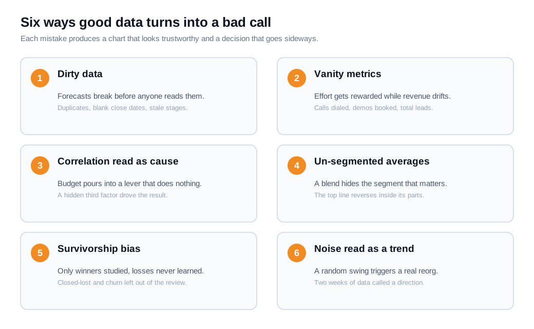
The most common sales analytics mistakes are trusting dirty data, tracking vanity metrics, confusing correlation with causation, reading aggregates without segmenting, letting survivorship bias shape win/loss analysis, and mistaking short-term noise for a trend. Each one produces a chart that looks trustworthy and a decision that goes sideways.
They share a root cause. In most teams the numbers are collected accurately enough; the interpretation is where things break. NetSuite's rundown of common data-analysis errors makes the same point, listing poor source quality, missing context, and confirmation bias among the failures that turn analysis into misdirection, in its guide to data mistakes.
That is why buying a better dashboard rarely fixes the problem. A prettier chart built on a duplicate-ridden pipeline, or read without segmenting, just delivers the wrong conclusion faster. The six mistakes below are the ones that most often convert good-looking data into a bad call, roughly in the order they show up in a sales org.
How does dirty data mislead you?
Dirty data misleads you because every metric downstream inherits the errors in the records beneath it, so a forecast built on duplicate accounts, missing close dates, and stale stages is wrong before anyone interprets it. The chart looks authoritative. The inputs were rotten.
The cost is not small. Gartner has estimated that poor data quality costs organizations an average of $12.9 million a year, a figure widely cited from its research and summarized by Dataversity, and Gartner's own guidance on data quality ties those losses to weaker decisions and lower trust in analytics. In a sales context the damage is specific: duplicate opportunities inflate pipeline, blank close dates break the forecast, and opportunities parked in a stage nobody updates quietly age into fiction.
Here is a worked example. Suppose your CRM shows $16 million of open pipeline against a $5 million quarterly target, so coverage reads 3.2x, comfortably above the common 3x rule of thumb, and the team decides it does not need to hire. Then someone finds that 8 percent of those opportunities are duplicates, the same inbound leads logged twice by two reps. Real pipeline is $14.7 million and true coverage is 2.9x. The dashboard said you were covered. You were short, and the gap surfaces as a missed quarter.
Most dirty data enters at the point of capture, which is where it is cheapest to fix. Enforcing required fields, deduping on a schedule, and logging inbound conversations automatically instead of by hand does more for accuracy than any visualization layer. Capturing intent cleanly at the source, for instance through live chat that records who engaged and on which page, keeps the record honest before it ever reaches a report.
Why is correlation not causation dangerous?
Correlation mistaken for causation is dangerous because it hands you a lever that does nothing, so you pour budget or headcount into a factor that never drove the result. The two numbers move together, you assume one causes the other, and the intervention built on that assumption fails.
The classic illustration is ice cream sales and shark attacks, which rise and fall together because both track summer swimming; dessert has nothing to do with the sharks. Harvard Business Review's warning on spurious correlations shows how easy it is to find two lines that track each other by pure coincidence, and Built In's explainer on why correlation is not causation walks through the confounding variables that produce false links.
Sales analytics is full of these traps. A team notices that territories with more reps produce more revenue and concludes that adding reps drives sales, so it staffs up everywhere. The real driver was market size: the big metros already had the demand, which is why they got the reps in the first place. Add reps to a thin market and revenue does not follow. The correlation was real and the causal story was invented.
The fix is to test the cause instead of assuming it. Before you scale a tactic that merely correlates with wins, run it against a hold-out, a matched group, or a small controlled experiment, and see whether the outcome moves when the input does. If you cannot run a clean test, at least name the confounder you are worried about and check whether it explains the pattern on its own.
Why do vanity metrics lead to bad decisions?
Vanity metrics lead to bad decisions because they always look good and never tell you what to change, so a review feels productive while the numbers that move revenue drift unwatched. A metric is actionable when a move in it triggers a specific decision. A metric is vanity when it makes you feel informed without informing anything.
Secoda draws the line cleanly in its comparison of vanity versus actionable metrics: vanity metrics reflect activity but do not explain outcomes, while actionable metrics connect behavior to a business result you can act on. Calls dialed, demos booked, emails sent, and total leads all count as activity. They rise reliably, they never deliver bad news, and they are easy to collect, which is exactly why dashboards fill up with them.
The trouble starts when a vanity metric becomes a target. Reward reps for calls dialed and you will get more calls, many of them to bad-fit prospects who inflate the number and shrink the win rate. The activity chart climbs while the pipeline quietly gets worse. Pair every activity count with the outcome it is supposed to produce, such as calls-to-meetings or leads-to-closed-won, so the number you celebrate is tied to money rather than motion.
How do averages and aggregates hide the truth?
Averages and aggregates hide the truth because a single blended number can point the opposite direction from every subgroup inside it, a reversal statisticians call Simpson's paradox. Read only the top-line figure and you can confidently choose the worse option.
The textbook case is the 1973 University of California, Berkeley admissions data, where the aggregate showed men admitted at a higher rate than women and looked like clear bias, yet within almost every individual department the rates were similar or favored women, as Statology explains. Women had applied in larger numbers to the most competitive departments, which dragged their overall rate down. The aggregate and the segments told opposite stories, and only the segments were actionable.
The same reversal shows up in sales. Take two reps, each worked 100 leads last quarter. Warm inbound leads close far more easily than cold outbound ones.
Rep A closed 45 percent of warm leads and 15 percent of cold. Rep B closed 40 percent of warm and 10 percent of cold. Rep A is the better closer in both segments. Yet Rep A was handed mostly cold leads (80 of 100) and Rep B mostly warm (80 of 100), so Rep A's blended win rate is 21 percent and Rep B's is 34 percent. The blended number says coach out Rep A. Do that and you lose your stronger closer over an artifact of lead mix.
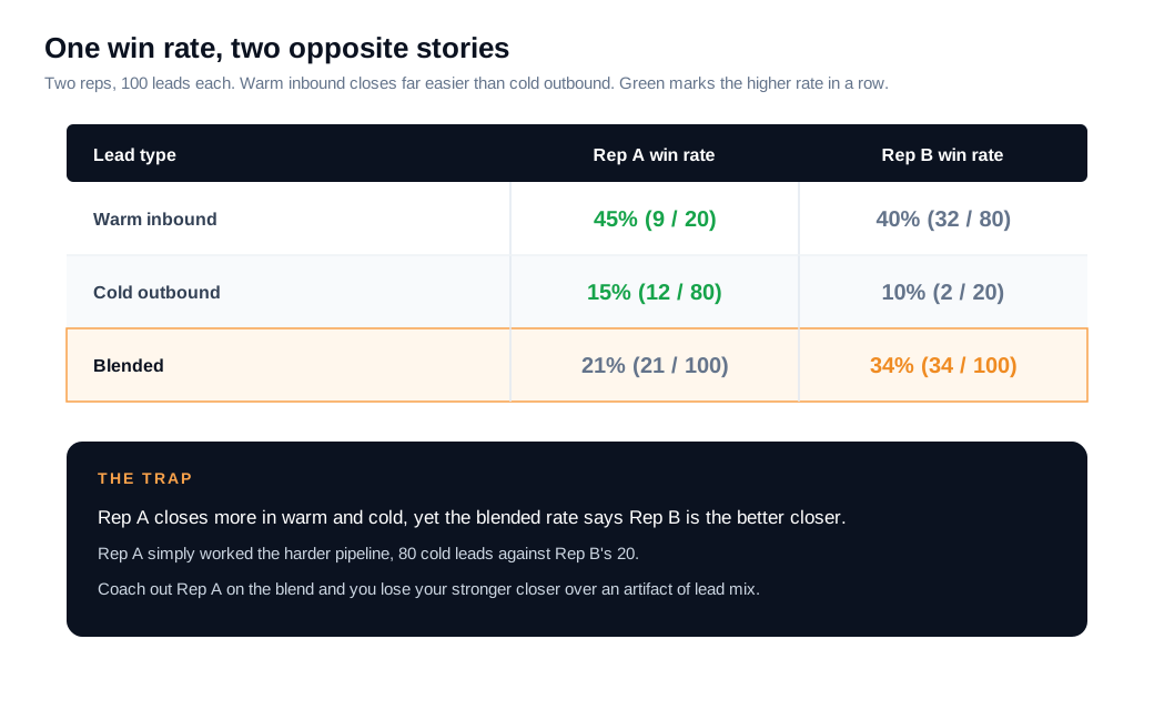
The habit that protects you is simple. Before you act on any aggregate, ask what variable, if you split by it, could flip the conclusion, then run that stratified cut before reporting. Mixpanel makes the same case for segmenting data by default rather than trusting a blend. A win rate, conversion rate, or cycle length reported without a segment is a number waiting to mislead you.
How does survivorship bias skew your win/loss analysis?
Survivorship bias skews win/loss analysis because you study the deals and customers that stuck around and quietly ignore the ones that vanished, so your conclusions describe survivors and miss what actually killed the rest. You optimize for the deals you can see and stay blind to the pattern in the ones you lost.
The origin story is a World War II aircraft study. Analysts mapped the bullet holes on bombers that returned and proposed adding armor where the holes clustered, on the wings and fuselage. The mathematician Abraham Wald pointed out the flaw: they were only looking at planes that made it home, so the armor belonged where the survivors had no holes, on the engines and cockpit, because the planes hit there never came back, as recounted in this history of Wald's insight. The damage that matters is on the aircraft you never see.
Sales teams repeat this pattern constantly. You study closed-won deals to learn what works and skip the closed-lost, so you copy habits that correlate with easy wins rather than hard ones. You survey current customers about product fit and never hear from the churned ones whose reasons for leaving are the point. You analyze leads that filled the form and ignore the majority who bounced. Each cut looks rigorous and quietly excludes the evidence that would change your mind.
The correction is to build the missing data back in on purpose. Run structured loss reviews alongside your win reviews. Interview churned accounts as well as healthy ones. Track the visitors who left without converting alongside the ones who did. The lost deals hold the lessons your won deals cannot.
How do you build trustworthy analytics?
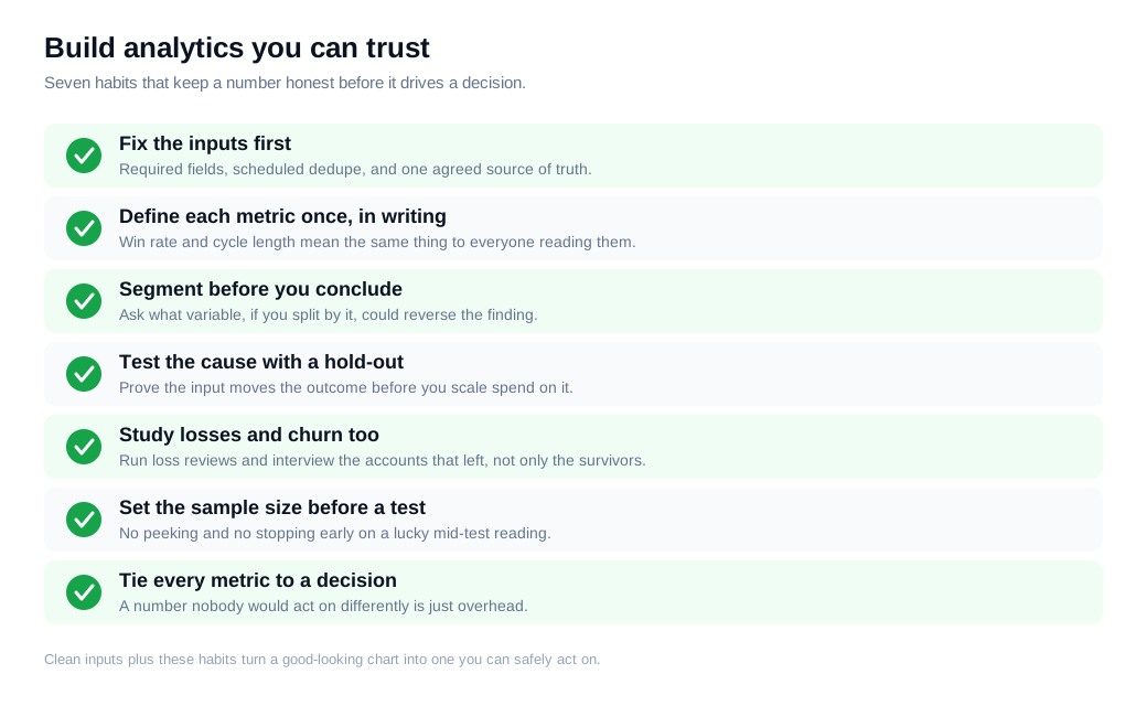
You build trustworthy analytics by fixing the inputs first, defining each metric once, segmenting by default, testing causes before you spend on them, and tying every number to a decision it can actually change. Trust is a process you apply before a chart drives anything. The chart itself carries none of it.
Start with clean inputs, because every mistake above gets worse on messy data. Enforce required fields, dedupe on a schedule, and give the team one agreed source of truth so two dashboards cannot report two different pipelines. Then write each metric definition down once, so win rate and cycle length mean the same thing to everyone reading them.
Two habits do most of the remaining work. Segment before you conclude, asking what split could reverse the finding. And test causes with a hold-out or controlled experiment before you scale them. When you do run a test, set the sample size in advance and let it finish, because checking a live experiment repeatedly and stopping the moment it looks significant pushes the real false-positive rate well above the nominal 5 percent, toward 20 percent or more, as Convert's guide to test significance explains. Peeking manufactures winners that do not survive contact with the next quarter.
Finally, tie every metric to a decision. A number nobody would act on differently is overhead. This discipline matters most where speed turns data into action, such as an inbound sales motion that flags which visitors deserve a live conversation right now, because a trustworthy signal acted on quickly is worth more than a perfect report delivered too late.
Key takeaways
- Bad decisions usually come from interpretation rather than missing data. The numbers are often collected fine; dirty inputs, un-segmented reads, and false causes are where analysis goes wrong.
- Dirty data corrupts everything downstream. Poor data quality costs organizations an average of $12.9 million a year by Gartner's estimate, so fix capture, dedupe, and required fields before you trust a forecast.
- Treat correlation as a hypothesis rather than a lever. Test a cause with a hold-out or controlled experiment before you move budget or headcount toward it.
- Aggregates can point the wrong way. Simpson's paradox means a blended win rate can reverse inside its segments, so segment before you act and ask what split could flip the conclusion.
- Study your losses as much as your wins. Survivorship bias hides the deals and customers that left, so run loss reviews and churn interviews to learn what won deals cannot teach.
- Trust is a process. Clean inputs, one metric definition, default segmentation, real causal tests, no peeking, and a decision attached to every number.
TAGS

Written by
Daniel SemeckyCo-founder & CEO
Daniel is the co-founder and CEO of Glimpze. He spends his days talking to revenue teams about how to catch high-intent visitors before they bounce, and writes about inbound sales, lead conversion, and building a motion where marketing and sales actually share a number.


