
On this page
A VP of sales opens Monday's dashboard. Calls logged: 1,240. Pipeline: up 12 percent. Three deals sit in the "commit" column with green checkmarks. Everyone nods, the meeting ends, and the week rolls on. Two weeks later the quarter closes 18 percent under forecast, and nobody in the room can point to the moment the number went wrong.
The report was not lying. It was counting things that felt like progress while skipping the two or three numbers that actually predicted the miss. That is the gap most sales reporting falls into. The data is clean, the charts are tidy, and the meeting still ends without a single decision anyone can act on.
This guide covers what separates a report people act on from one they skim: what belongs in a good sales report, which metrics to track, how often to send it and to whom, how to catch vanity metrics before they mislead you, how to structure reporting so it changes behavior, and the mistakes that quietly make reports useless.
What makes a good sales report?
A good sales report answers one clear question, backs the answer with a small set of trustworthy numbers, and tells the reader what to do next. Everything else on the page is decoration. If a manager can read the report and not know what to change, it failed, no matter how many charts it holds.
Three properties do most of the work. The first is focus. Strong reports track a limited set of KPIs tied to pipeline health, forecasting, and rep performance, rather than every field the CRM can export. Guides from Salesforce and Forecastio both land on the same point: a report overloaded with metrics hides the one number that matters. Pick the few that map to a decision and cut the rest.
The second is accurate data, which sounds obvious and is where most reports break. The report is only as good as the CRM under it, and CRM hygiene is chronically poor because sellers spend well under half their week actually selling, with much of the rest lost to admin and manual updates, per Salesforce's State of Sales research. Dirty inputs produce confident, wrong conclusions. It shows up at forecast time: fewer than half of sales leaders and sellers say they have high confidence in their own forecast accuracy, according to Gartner. Regular data checks and documented, shared definitions are what keep a report honest.
The third is structure that leads to a decision. A good report combines the data with a short reading of what it means and a recommendation, as Qobra's guide frames it. The reader should not have to reverse-engineer the story from a grid of cells. State the finding, show the number, name the action.
What metrics belong in a sales report?
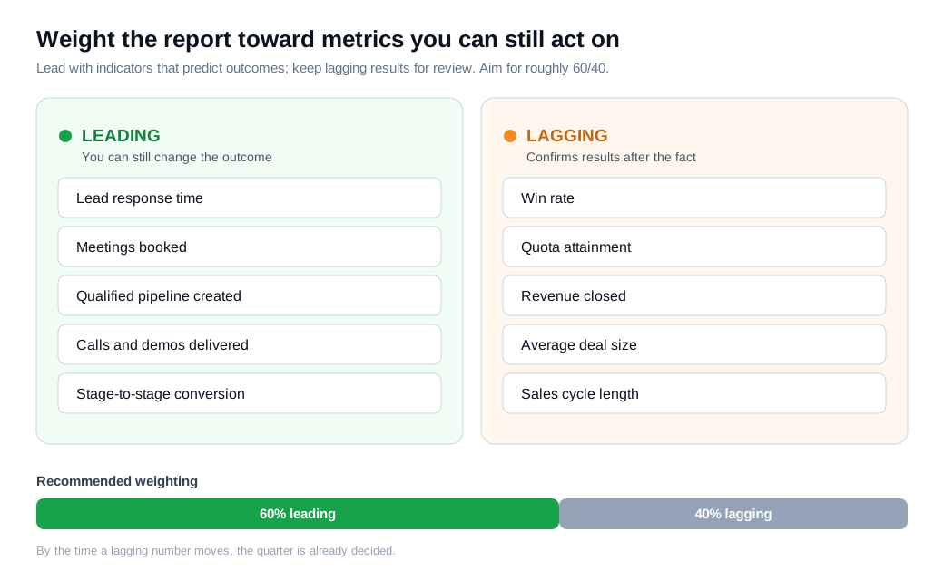
A sales report should carry a small mix of leading and lagging indicators, weighted toward the leading ones you can still act on. Lagging indicators (closed revenue, win rate, quota attainment, average deal size) report the past. Leading indicators (activity, meetings booked, pipeline created, lead response time) predict the future while there is still time to change it.
Both matter, and the balance is the point. Monday.com's reporting guidance suggests roughly a 60/40 split, tilted toward the leading indicators, because by the time a lagging number moves the quarter is already decided. A report stuffed only with win rate and revenue tells you the game is lost after the whistle. Response time is the clearest leading example: how fast a rep reaches an inbound lead predicts whether that lead ever converts, which is why teams that treat inbound sales seriously watch speed-to-lead every day, not at quarter end.
Pipeline coverage shows why a single metric can mislead without its context. Coverage is total pipeline value divided by the revenue target, and the inherited rule of thumb says aim for 3x. That number is a relic of an era of 33 percent win rates. Today the average B2B win rate sits near 21 percent across all opportunities and around 29 percent for qualified ones, per Landbase's 2026 benchmarks, so a blanket 3x leaves most teams short.
Here is the math. A rep carries a $250,000 quarterly quota and the team's qualified win rate is 25 percent. The 3x rule says build $750,000 in pipeline. Divide the quota by the win rate instead, $250,000 ÷ 0.25, and the real requirement is $1,000,000, a 4x ratio. A report showing 3x coverage looks healthy while sitting 25 percent short of what the quarter actually needs. The correction is to set coverage from each team's own win rate rather than a universal multiplier, a point Fullcast makes at length.
How often should you report?
Report at the speed each audience can act: daily for reps, weekly for managers, monthly and quarterly for leadership. The frequency should match how fast the reader can do something with the number, so reporting drives behavior instead of just recording it, as SalesScreen puts it. Reporting faster than anyone can act creates anxiety. Reporting slower than the behavior it measures produces history.
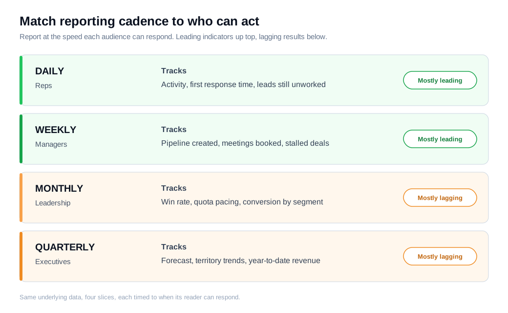
The content changes with the cadence. Put leading indicators in the daily and weekly layers where a rep or manager can still influence them: calls made, meetings set, response times, new pipeline added, deals stuck in a stage too long. Keep the lagging indicators, win rate, quota attainment, forecast, in the monthly and quarterly views, where they inform strategy rather than today's actions.
A worked cadence looks like this. Reps get a short daily snapshot of yesterday's activity and any leads still waiting for a first touch. Managers run a weekly pipeline review that flags every deal without movement in ten days. Leadership reads a monthly report on win rate by segment and quota pacing, and the executive team looks at a quarterly forecast and territory trend. Same underlying data, four different slices, each timed to when its reader can respond.
How do you avoid vanity metrics?
Avoid vanity metrics by testing every number against two questions: can someone change it on purpose, and does changing it move revenue? A metric that fails either test looks impressive and teaches you nothing. Baremetrics and Amplitude both draw the line the same way: actionable metrics tie to a decision, while vanity metrics mostly make a slide look good.
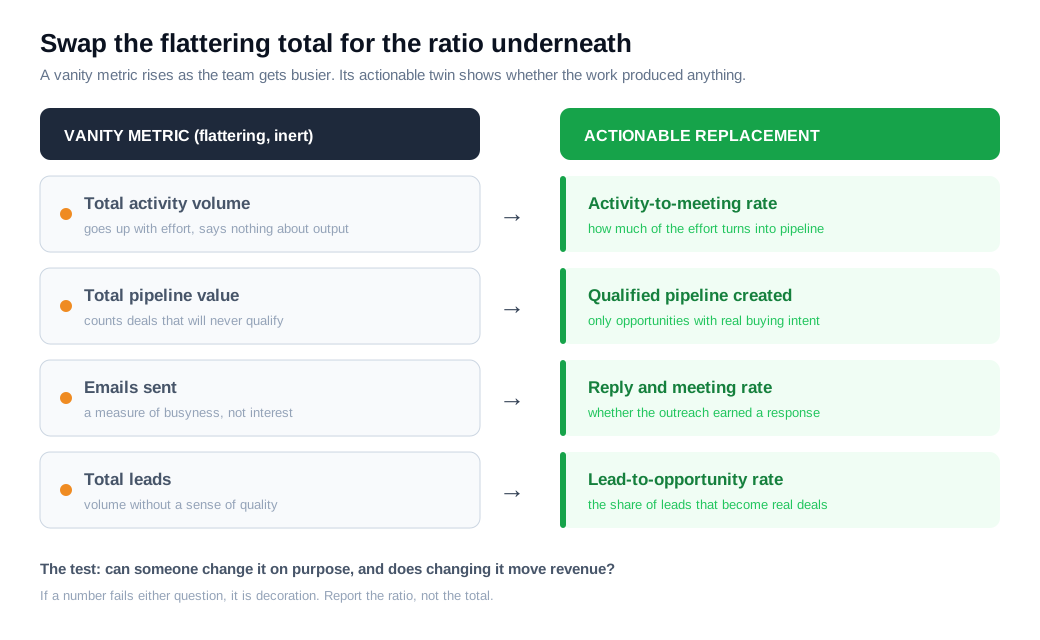
The usual offenders are totals with no denominator. Total activity, total pipeline, total emails sent, total leads. Each goes up as the team gets busier, which is why they feel like progress. None tells you whether the work produced anything. Their actionable counterparts add the ratio that turns effort into outcome: activity-to-meeting rate instead of raw activity, qualified pipeline created instead of total pipeline, reply rate instead of emails sent, lead-to-opportunity conversion instead of lead count.
A short example makes the difference concrete. Two reps each log 200 calls a week, so an activity report ranks them equal. Add the next step and the tie breaks. Rep A books 20 meetings from those calls (a 10 percent rate) and Rep B books 6 (a 3 percent rate). The vanity metric, call volume, hid a three-fold gap in effectiveness that the conversion rate exposes in one line. Coach on the ratio, not the total, and the report starts pointing at real problems.
How do you make reports drive action?
Make reports drive action by pairing every metric with context, an owner, and a next step, then reviewing them in a meeting built to produce decisions. A number on its own invites a nod. A number next to "down 8 percent versus last month, owned by the East team, action: review stalled deals Thursday" invites a response.
Three habits separate a report that changes behavior from one that documents it. First, add a short "what changed and what we will do" note beside the data, the narrative that helps a reader interpret the number instead of guessing at it. Second, tailor the slice to the audience, since a rep, a manager, and an executive each need a different cut of the same data to act. Third, build in visibility and recognition. Showing a rep where they stand against the team, and naming the wins out loud, is part of what makes reporting move people rather than just inform them, as SalesScreen notes.
Walk one line through the loop. A weekly report shows that leads from the website are taking an average of nine hours to get a first reply, well past the window where inbound interest cools. Context: last month it was two hours. Owner: the SDR manager. Next step: turn on instant alerts so a rep gets pinged the moment a high-intent visitor arrives, a fix that a fast live chat channel and tighter routing and notifications handle directly. The following week the report shows the same metric back under an hour. That is a report doing its job: it surfaced a leak, assigned it, and the next edition confirmed the fix.
What are the most common sales reporting mistakes?
The most common sales reporting mistakes are tracking too many metrics, building on dirty CRM data, changing definitions midstream, reporting only lagging indicators, and shipping numbers with no owner or next step. Each one produces a report that looks professional and quietly misleads.
Too many metrics buries the signal, so a reader skims instead of deciding. Dirty data makes every downstream number suspect, which is why hygiene comes before dashboards. Shifting definitions, counting a "qualified lead" one way in March and another in April, turns a trend line into a measure of your own inconsistency rather than performance. A lagging-only report tells you the quarter is lost after it is too late to save it. And a metric with no owner is a fact nobody is responsible for, so it never turns into an action. Fix these five and most reporting problems resolve on their own.
Sales reporting FAQs
What is the difference between a sales report and a sales dashboard?
A dashboard is a live, always-on view of current metrics, while a report is a periodic, curated read of those metrics with analysis and a recommendation attached. The dashboard shows the state of things right now. The report tells a specific audience what changed, why, and what to do about it, which is why a good report includes a human's interpretation and a dashboard usually does not.
How many metrics should a sales report have?
Aim for a handful of metrics per report, typically five to nine, chosen because each maps to a decision the reader can make. Fewer forces you to prioritize the numbers that matter, and a shorter report is far more likely to be read and acted on than a twenty-tile grid that gets skimmed and closed.
What should a weekly sales report include?
A weekly sales report should center on leading indicators a manager can still influence: new pipeline created, meetings booked, deals that have not moved in a set number of days, lead response time, and current pipeline coverage against target. Keep win rate and quota attainment for the monthly view, since they move too slowly to drive a weekly decision.
Key takeaways
- A good report ends in a decision. Focus on a few trustworthy KPIs, add a short reading of what they mean, and name the next step, or the report is just a chart nobody acts on.
- Weight metrics toward leading indicators. Lagging numbers confirm the past while leading ones like response time and qualified pipeline still let you change the outcome, so tilt the mix roughly 60/40 toward what you can act on.
- Match cadence to the speed of action. Daily for reps, weekly for managers, monthly and quarterly for leadership, with each layer carrying the metrics its reader can actually move.
- Test every metric against two questions. If nobody can change a number on purpose and changing it does not move revenue, it is a vanity metric, so replace the total with the ratio underneath it.
- Give every number an owner and a next step. Context, an owner, and an action turn a metric from a nod into a response, and the next edition of the report should confirm the fix.
- Set pipeline coverage from your own win rate. The blanket 3x rule assumes a win rate most teams no longer have, so divide quota by your real win rate to find the coverage the quarter needs.
TAGS

Written by
Daniel SemeckyCo-founder & CEO
Daniel is the co-founder and CEO of Glimpze. He spends his days talking to revenue teams about how to catch high-intent visitors before they bounce, and writes about inbound sales, lead conversion, and building a motion where marketing and sales actually share a number.


