On this page
A visitor lands on your page with real intent. They clicked an ad, read a headline, and got far enough to matter.
Then the hero image hangs for four seconds, the menu label they need is buried under a word only your team uses, and a full-screen pop-up asks for their email before they have read a single line. They hit back. You never find out they were there.
That is the quiet cost of bad UX. It rarely announces itself in a revenue meeting, and the people it drives off leave no message. They just stop showing up in the conversion numbers, and the gap looks like a traffic problem when it is really an experience problem.
This post covers the mistakes that cost the most, how slow pages and confusing navigation push people out, why intrusive pop-ups and bloated forms backfire, why phones make all of it worse, and a repeatable way to find and fix the worst offenders on your own site.
What are the most common website UX mistakes?
The most common website UX mistakes cluster in a handful of predictable places: slow pages, confusing navigation, intrusive pop-ups, forms that ask for too much, and layouts that fall apart on a phone.
None of them is exotic. Each one adds a little effort or doubt at a moment when the visitor was already deciding whether to stay.
Timing is what makes them expensive. Research by Lindgaard and colleagues, published in Behaviour & Information Technology, found that people form an opinion about a web page in about 50 milliseconds, faster than a conscious thought.
A cluttered or slow first impression starts the visit at a deficit that the rest of the page has to climb out of.
Trust forms almost as fast. In a Stanford study of how people judge a site's credibility, 46.1% of participants cited the overall visual design, layout, typography, and color, as the basis for their assessment, ahead of the actual content.
When the design signals "not credible" in the first second, visitors act on that before they ever read your value proposition.
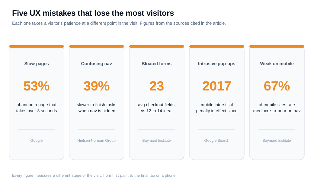
The rest of this post takes the biggest offenders one at a time, with the numbers behind each and the fix that removes it.
How do slow load times drive visitors away?
Slow load times drive visitors away because waiting is friction a visitor feels immediately, and the odds that they leave climb sharply with every extra second.
Google's mobile research, published as The Need for Mobile Speed, found that 53% of visits are abandoned when a page takes longer than three seconds to load. More than half your mobile traffic can walk away before the content ever appears.
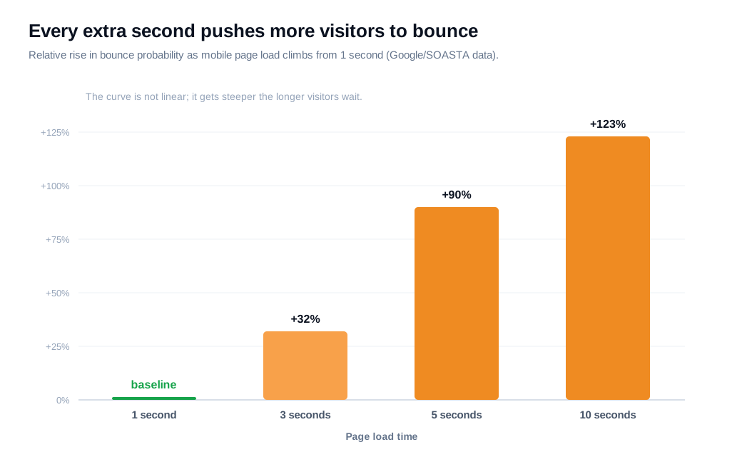
The curve is steep and it accelerates. Google and SOASTA analyzed real field data and found that as page load goes from one second to three, the probability of a bounce rises 32%. From one to five seconds it rises 90%, and from one to ten seconds it rises 123%, a pattern the Milliseconds Make Millions report documents.
Each second you shave off matters more than the last.
The effect runs all the way to revenue. A Portent study of 94 million page views across 10 ecommerce sites found that each additional second of load time between zero and five seconds cut conversion by an average of 4.42%, and that a site loading in one second converted 32% higher than one loading in three.
The Deloitte and Google study behind Milliseconds Make Millions ran the test in the other direction across 37 brand sites and more than 30 million sessions: a 0.1-second improvement in load time lifted retail conversions by 8.4% and average order value by 9.2%.
Put numbers on it. Say a B2B site gets 40,000 visits a month and converts 3% of them into a trial, which is 1,200 trials, at a load time of about 3.5 seconds.
Engineering trims the hero image, defers a heavy script, and pulls load down to 1.5 seconds. Using Portent's roughly 4.42% lift per second, two faster seconds points to an 8 to 9% relative gain, so the trial rate moves to about 3.26%.
That is roughly 1,305 trials, about 105 more a month, from work that touched no copy and bought no extra traffic. Treat the figure as an estimate and confirm it with a before-and-after test, but the direction is not in doubt.
How does confusing navigation hurt?
Confusing navigation hurts because a visitor who cannot find what they came for does not dig, they leave. The menu is the map of your site, and when the map is unreadable, most people give up rather than study it.
The Baymard Institute benchmark of leading US and European sites found navigation performance mediocre to poor on 58% of desktop sites and 67% of mobile sites, and reported that 95% of ecommerce sites fail to highlight the visitor's current location in the main navigation.
Two patterns cause most of the damage.
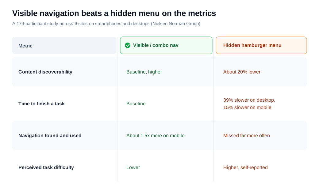
The first is hiding the menu behind an icon. In a study of 179 participants across six sites, the Nielsen Norman Group found that a hidden hamburger menu cut content discoverability by about 20% compared with visible or combination navigation, and that tasks ran 39% slower on desktop and 15% slower on mobile when the menu was hidden.
People also missed the navigation more often and rated the tasks harder.
The second pattern is vague labels. The Nielsen Norman Group's work on information architecture shows that link and category names with low information scent, weak verbs like "Learn," "Explore," or "Partner," get clicked far less because they give no clear sense of what lies behind them.
"Solutions" and "Resources" feel tidy to the team that built them and mean nothing to a first-time visitor. Labels that name the thing, "Pricing," "Live demo," "API docs," let people scan and go.
The fix is dull and effective. Keep primary navigation visible on desktop, use plain labels that match how visitors describe what they want, show them where they are, and keep the tree shallow so nothing important sits three levels deep.
Why do intrusive pop-ups and long forms make visitors leave?
Intrusive pop-ups and long forms make visitors leave because both demand something before the visitor has any reason to give it.
A full-screen overlay that lands the moment someone arrives blocks the content they came for and asks for an email they have no motive to share yet. Google has treated this as a UX problem since January 2017, when it began demoting mobile pages whose content is hidden behind intrusive interstitials on entry.
When the platform that sends you traffic penalizes a pattern, that is a strong signal the pattern annoys people.
Timing separates a useful prompt from a costly one. A small banner, an exit-intent offer, or a message that appears after someone has read a section can help. An overlay that fires on arrival mostly buys you a spike in bounces.
If you want to reach someone at the right moment, a behavior-based nudge does the job without hijacking the screen, which is the idea behind proactive outreach: show help or an offer when a visitor's actions suggest they want it, not the instant they land.
Forms fail the same way, by asking for more than the moment justifies. Baymard's checkout research found the average US checkout shows 23.48 form elements when a well-built flow needs roughly 12 to 14, and that users are consistently overwhelmed when they face a wall of fields.
Its cart abandonment data attributes a large share of lost orders to a checkout that is too long or complicated, a friction that has nothing to do with price. Every field you cannot justify is a small tax on completion.
Cut the form to what you truly need at this step, defer the rest to later, mark required versus optional clearly, and validate inline so errors surface as people type rather than after they submit. A shorter form that converts beats a thorough one nobody finishes.
Do UX mistakes cost more on the mobile experience?
Yes. The same UX mistakes cost more on mobile because the screen is smaller, the connection is often slower, and patience runs thinner.
A cramped tap target, a menu folded behind an icon, or a pop-up that covers a phone screen does more harm on a device where every pixel is contested. Baymard's benchmark shows the gap directly: it rated navigation mediocre to poor on 67% of the mobile sites it tested against 58% on desktop, and Google's interstitial penalty applies to mobile search results specifically.
Mobile also concentrates the speed penalty. The three-second abandonment threshold and the rising bounce curve above both come from mobile field data, where slow networks and heavy pages collide.
If you audit one surface first, make it the phone, on a real cellular connection rather than office wifi, because that is where most of your traffic and most of your friction now live.
How do you find and fix UX issues?
You find and fix UX issues by letting data show where people struggle, watching real visitors to learn why, fixing the cheapest high-impact problems first, and confirming each change with a measurement.
Guessing at redesigns is slow and hard to learn from. A tight loop compounds.
Start with your analytics funnel. Map a key flow, from landing to done, and find the step with the steepest drop-off, because that fall points straight at your worst experience problem.
Then watch what the numbers cannot explain: session recordings and heatmaps let you see real visitors hesitate, mis-tap, rage-click, or quit on a specific field, which turns a drop-off percentage into a concrete cause.
Test with real people to catch what analytics miss. Jakob Nielsen's research, summarized in the classic Why You Only Need to Test with 5 Users, showed that five participants typically surface about 85% of a site's usability problems, because the same issues recur fast.
Hand five people a real task, ask them to think aloud, and stay quiet while they work.
Rank what you find by impact against effort, and fix the high-impact, low-effort problems first. A blank required dropdown that only errors after submit is a one-line fix on a high-intent page; a full checkout rebuild is a big bet you schedule.
Ship one change at a time and, where traffic allows, run an A/B test so you know the fix earned the lift rather than assuming it.
The last step is to give a stuck visitor a way out that is not the back button. Even a clean page leaves some people with a question it does not answer, and a question with no outlet becomes a bounce.
Adding live chat to your highest-intent pages lets a visitor ask the thing a confusing form or a thin pricing table raised, and get an answer in the moment instead of leaving to compare options.
For an inbound team, catching one hesitating high-intent visitor that way often returns more than any single layout tweak, and it doubles as a live feed of the exact questions your UX is failing to answer.
Key takeaways
- The costly mistakes are ordinary. Slow pages, hidden or vaguely labeled navigation, on-arrival pop-ups, bloated forms, and weak mobile layouts account for most of the visitors who leave without a word.
- Speed decides the visit before content loads. 53% abandon a page slower than three seconds, bounce probability climbs 32% from one to three seconds, and Portent measured a 4.42% conversion drop per added second.
- Navigation is a map people will not study. Hidden menus cut discoverability about 20% and slow tasks up to 39%, and low-scent labels like "Solutions" get skipped, so keep it visible, shallow, and plainly named.
- Do not demand before you offer. On-arrival interstitials draw a Google penalty and a bounce spike, and checkouts average 23 fields against an ideal of 12 to 14, so time your prompts and cut every field you cannot justify.
- Mobile magnifies every error. Baymard rates navigation worse on mobile (67%) than desktop (58%), and the speed penalties above come from mobile field data, so audit the phone first on a real connection.
- Fix in a loop, from evidence. Use funnel data and session recordings to find problems, five-user tests to explain them, impact-versus-effort to rank them, and an A/B test to confirm the lift.
TAGS

Written by
Nilas MylerCo-founder & CTO, Glimpze
Nilas is the co-founder and CTO of Glimpze, an inbound sales tool that turns high-intent website visitors into live conversations. A former SEO consultant for some of the largest companies in Denmark, he writes about speed-to-lead, inbound sales, and conversion rate optimization — the technical and operational mechanics of turning traffic into pipeline.


