On this page
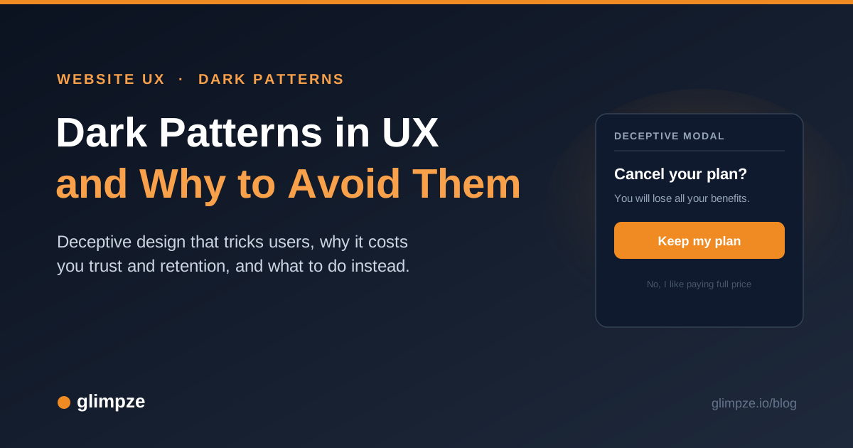
A visitor tries to cancel a subscription. The cancel link hides three menus deep, the button that keeps the plan glows blue while the one that ends it sits gray and small, and a final screen asks "Are you sure you want to give up all your benefits?" with a decline option worded "No, I would rather pay full price."
Nothing on the page is broken. Every button works exactly as designed, and the design is the problem.
These are dark patterns, interface choices built to push people toward decisions that serve the business over the person making them. A dark pattern can lift a metric this quarter. It also teaches customers that your product treats them as marks, and that lesson costs far more than the short-term number returns.
This post covers what dark patterns are, the examples you will recognize, how common they are across the web, why they erode trust and retention, whether they are legal, and how to design honest alternatives that still move conversions.
What are dark patterns in UX?
Dark patterns are user interface choices designed to trick, coerce, or steer people into actions they would not take if the options were presented clearly.
British UX researcher Harry Brignull coined the term in 2010 and launched a site, darkpatterns.org (now deceptive.design), to catalogue, name, and publish real examples so the tactics had labels people could point at.
The Nielsen Norman Group now uses the phrase "deceptive patterns" for the same idea and defines it plainly: a deceptive pattern is a design choice that benefits the business by tricking users into decisions they would not otherwise make (NN/g).
The mechanism relies on how people actually read screens. Brignull's point was that visitors skim rather than read every word, and a page can be built to look like it says one thing while it quietly does another.
The line between persuasion and manipulation is the line that matters. Good persuasion makes an honest choice easy to see and easy to take. A dark pattern does the reverse: it hides the choice you would prefer, wears down your attention, or dresses up the profitable-for-the-company option as the only sensible path.
The test is simple. If a design depends on the user not noticing something, it is a dark pattern.
What are common examples of dark patterns?
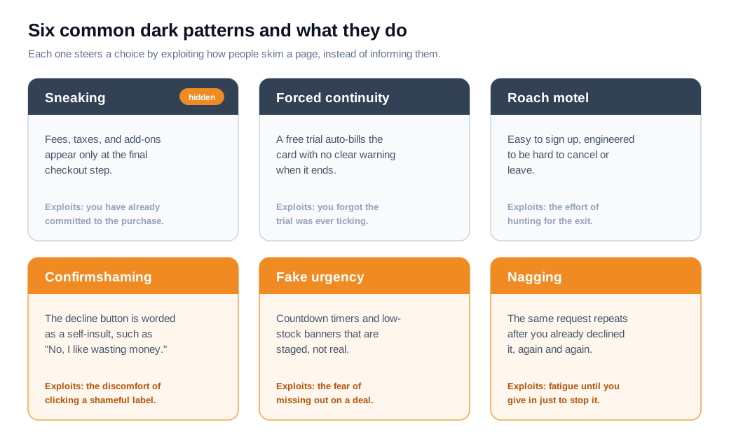
The most common dark patterns fall into a handful of named types that almost every internet user has hit without knowing the name. Brignull's original taxonomy and the categories later used by regulators cover the same recurring tricks.
- Sneaking hides costs or commitments until it is too late to back out comfortably. The classic form is drip pricing, where handling fees, service charges, or "processing" costs appear only at the final checkout step. A related move is sneak into basket, where a site auto-adds an item or a warranty and leaves you to notice and remove it.
- Forced continuity turns a free trial into a paid subscription with no clear warning, then bills the card on a recurring schedule.
- The roach motel is its close relative: a flow that is easy to enter and deliberately hard to leave. The name comes from an old cockroach-trap ad: guests check in but they do not check out.
- Confirmshaming guilts the user into staying opted in by wording the decline option as a self-insult, such as "No thanks, I like wasting money."
- Fake urgency and fake scarcity manufacture pressure with countdown timers that reset on reload and low-stock or high-demand banners that fire on a schedule rather than reflecting real inventory.
- Nagging repeats a request the user already declined, and misdirection uses preselected checkboxes or a loud button next to a hidden one to route attention where the company wants it.
How common are dark patterns online?
Dark patterns are widespread, and the largest study to measure them found them on roughly one in nine shopping sites.
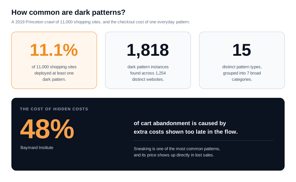
In a 2019 crawl of about 11,000 e-commerce sites and 53,000 product pages, Princeton researchers Arunesh Mathur and colleagues identified 1,818 dark pattern instances spread across 1,254 distinct websites, which is about 11.1% of the sites they checked (arXiv). They sorted the instances into 15 types and 7 broader categories.
The specific tricks they caught match the list above:
- Countdown timers advertised a "limited-time" price that quietly reset every time a page reloaded.
- Low-stock and high-demand messages ("65 people in your area bought this today") appeared on a recurring schedule rather than tracking real behavior.
- Hidden fees inflated the final total after the shopper had committed.
Treat 11% as a floor rather than a ceiling. The study used an automated crawler, so it could only detect patterns a script could recognize, and it found that more popular sites tended to feature more dark patterns, not fewer.
The tactics that require a human to spot, a manipulative cancellation flow buried five screens deep, went uncounted. The honest reading is that deceptive design is common enough that most people meet it weekly.
Why do dark patterns damage trust and retention?
Dark patterns damage trust and retention because a customer who realizes they were tricked stops believing anything the interface tells them, and that suspicion follows them into every future interaction.
A metric can rise the day you ship the trick. The people it captured are worth less over time, and some of them become active detractors.
The research is consistent on the direction. A survey of consumer reactions found that perceived exposure to dark patterns significantly lowers trust, loyalty, and purchase intention, because people who feel manipulated form a negative view of the brand and are less likely to buy again or recommend it.
Reported figures put hard numbers on the reaction: one analysis found that 43% of people stopped buying from a retailer after running into a dark pattern, and 47% said they would never deal with a brand again after a difficult unsubscribe experience (diva-e).
Hidden costs, one of the most common patterns, carry a measured price at the checkout itself. The Baymard Institute found that "extra costs too high," meaning shipping, tax, and fees surfaced late, was the single biggest reason for cart abandonment and drove 48% of abandoned carts (Baymard). A fee you reveal at the last step annoys the shopper and sends them away with the sale unfinished.
Here is the arithmetic on an ordinary case. A subscription tool runs a 14-day free trial and converts it two ways.
The manipulative version auto-charges the card when the trial ends, buries the cancel button five clicks deep, and greets anyone who finds it with "No thanks, I would rather pay more elsewhere." Out of 1,000 trials a month it books 300 first payments, a 30% conversion that looks excellent in the dashboard.
Then reality arrives. Roughly 35% of those charges get disputed, refunded, or churned within 90 days once people notice, leaving about 195 real customers, plus a trail of one-star reviews and chargeback fees.
The honest version asks for explicit opt-in before the first charge and makes canceling a single click. It converts fewer trials at the gate, say 22%, or 220 first payments. Because those people chose the plan on purpose, around 90% are still paying after 90 days, about 198 customers.
The clean flow keeps more real customers than the trick did, with no refunds, no disputes, and no reputational bill. Treat the percentages as estimates and confirm them against your own cohort data, because the exact numbers depend on your product. The direction holds across the literature: a decision made under deception rarely survives contact with the customer's full attention.
Are dark patterns illegal?
Dark patterns are increasingly illegal, and regulators on both sides of the Atlantic now treat the worst of them as unfair or deceptive practices that carry nine and ten-figure penalties.
In its 2022 staff report Bringing Dark Patterns to Light, the US Federal Trade Commission described how deceptive design obscures and subverts consumer choice, and it grouped the tactics into categories that include creating false beliefs (fake countdown timers), hiding information (drip pricing), and leading to unauthorized charges (recurring billing set up without real consent).
The enforcement has teeth. In 2023 the FTC finalized an order requiring Fortnite maker Epic Games to pay $245 million for using a "counterintuitive, inconsistent, and confusing" button layout that charged players for purchases they never meant to make.
In September 2025 the FTC secured a $2.5 billion settlement with Amazon, which the agency alleged had enrolled millions of people in Prime without clear consent and forced them through a cancellation flow so convoluted (five pages on desktop, six on mobile) that staff nicknamed it "The Iliad." The deal included a $1 billion civil penalty and $1.5 billion in refunds to roughly 35 million customers.
Europe has moved further into explicit prohibition. The EU Digital Services Act, fully in force from February 2024, bans dark patterns on online platforms outright, and the GDPR already blocks manipulated consent through its rules on freely given, informed agreement. In the United States, California's privacy law defines dark patterns and states that consent obtained through one does not count as consent.
One caveat worth noting: the FTC's specific "click to cancel" rule was vacated by a federal appeals court in mid-2025 on procedural grounds, so the general deception statutes, rather than that single rule, remain the enforcement tool. The trend line points one way, toward less tolerance and larger fines.
How do you design ethical alternatives to dark patterns?
You design ethical alternatives by making the honest choice the easy one: show full costs upfront, give opt-in and opt-out equal visual weight, let people leave as smoothly as they joined, and use urgency only when it is real.
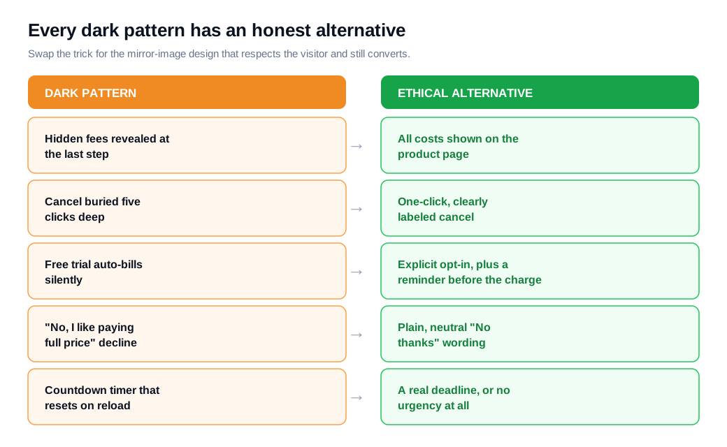
Each dark pattern has a straightforward mirror image that respects the user and still performs:
- Replace hidden fees with total-cost transparency. Show shipping, tax, and any service charge as early as the product page or the first cart view, so the number at checkout is the number the shopper already saw.
- Replace the roach motel with symmetric flows. If signing up takes one screen, canceling should take about one screen, and a visible, plainly labeled cancel path beats a hunt through settings.
- Replace forced continuity with a clear opt-in before the first charge and a reminder email before a trial converts.
Fix the wording and the layout too:
- Neutral microcopy retires confirmshaming. A decline button reads "No thanks," not an insult.
- Visual parity means the accept and decline options share the same size, color, and prominence, so attention is guided by relevance rather than by a loud button beside a hidden one.
- Leave checkboxes unticked by default and let people choose.
- Reserve urgency and scarcity for cases where they are true, an actual deadline or a genuinely limited stock count, because a timer that resets on reload is a promise you are visibly breaking.
Genuine help is the ethical counterpart to nagging. A pop-up that reappears after the user dismissed it three times is a dark pattern; an offer of assistance that is easy to see and easy to close is not.
A tool like live chat lets a visitor ask the question a confusing page raised instead of guessing or leaving, and a well-timed proactive nudge that offers real help on a step where your data shows people stalling stays honest as long as it answers a question rather than manufacturing pressure and stays trivially dismissible.
The distinction is whether the design serves the visitor's goal or only yours.
The business case for the honest version is the part teams underestimate. Companies that strip out dark patterns and build transparent flows tend to see customers return, engage, and recommend the product more, which is the compounding kind of growth a one-quarter conversion trick cannot buy.
Ethical design and conversion are the same project when you measure over a full customer lifetime rather than a single session.
Key takeaways
- Dark patterns are engineered deception. They are interface choices that trick, coerce, or steer people into actions they would avoid if the options were clear, and the giveaway is any design that depends on the user not noticing something.
- The common types have names. Sneaking and hidden fees, forced continuity, the roach motel, confirmshaming, fake urgency, and nagging cover most of what users actually encounter online.
- They are everywhere. A Princeton crawl found dark patterns on about 11% of 11,000 shopping sites, and that figure is a floor because automated detection misses the human-spotted tricks like buried cancellation flows.
- The damage outlasts the win. Perceived manipulation lowers trust, loyalty, and repeat purchase, roughly 43% of people abandon a retailer after a dark pattern, and hidden costs alone drive 48% of cart abandonment.
- Regulators are enforcing. The FTC won $245 million from Epic and $2.5 billion from Amazon, the EU Digital Services Act bans dark patterns outright, and California treats manipulated consent as no consent at all.
- Ethical design still converts. Show costs upfront, keep opt-in and opt-out symmetric, allow one-click cancellation, use real urgency only, and offer genuine help instead of nagging, and you keep more real customers over their lifetime.
TAGS

Written by
Nilas MylerCo-founder & CTO, Glimpze
Nilas is the co-founder and CTO of Glimpze, an inbound sales tool that turns high-intent website visitors into live conversations. A former SEO consultant for some of the largest companies in Denmark, he writes about speed-to-lead, inbound sales, and conversion rate optimization — the technical and operational mechanics of turning traffic into pipeline.