
On this page
A shopper who reaches your checkout has already done the hard part. They found a product, decided they wanted it, and started handing over their details. That visitor is worth far more than the average person browsing your homepage, because they have moved from interest to intent.
Then most of them leave. Across the industry, roughly seven in ten online carts are abandoned before purchase, and the reasons cluster around a short list of specific, fixable problems. The Baymard Institute estimates that the average large store could lift its conversion rate by about 35% by fixing checkout issues alone, which on your current traffic is revenue you already earned and then lost at the register.
This post covers what makes shoppers quit at checkout, how many steps and fields a checkout should have, which payment options lift conversion, how to build trust into the flow, how to help a shopper who stalls, and how to test every change so you keep only the ones that pay.
What causes checkout drop-off?
Checkout drop-off is caused mostly by surprise costs and avoidable process friction, not by shoppers losing interest in the product. By the time someone reaches checkout they have already shown they want the item, so the losses at this stage are largely self-inflicted by the store.
The single biggest trigger is unexpected cost. In Baymard's survey of shoppers who abandoned an order they had intended to complete, 48% pointed to extra costs (shipping, taxes, and fees) that were too high or shown too late. That one reason outweighs every other by a wide margin, and it is a design choice, since the store decides when to reveal the full price.
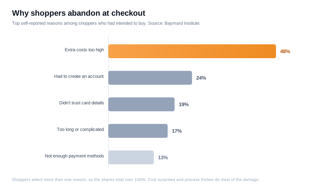
The rest of the list is friction the store controls. About 24% left because the site forced them to create an account before buying. Others quit because they did not trust the page with their card details, because the checkout ran too long or felt too complicated, or because their preferred payment method was missing. Shoppers pick more than one reason, so the shares add past 100%, but the pattern holds: cost surprises and process friction do most of the damage.
Mobile makes all of it worse. Thumb typing, small tap targets, and a keyboard that hides half the screen amplify every extra field and every late fee, which is why the same store usually loses a bigger share of phone shoppers than desktop shoppers. There is also a timing problem underneath the list. Asking for a phone number, an account password, or full billing details before the shopper trusts you raises the perceived risk of the whole transaction. The fix is to remove the easy objections first, show the true total early, and ask only for what the order genuinely requires.
How many checkout steps are ideal?
There is no magic number of steps, but a good checkout asks for the fewest fields the order truly needs, which for most stores is about 8 rather than the 11 the average site collects. Baymard's field-level research found the typical checkout runs 5.1 steps and 11.3 form fields, while most orders can be completed with roughly 8 fields once you drop the ones that are optional or duplicated.
Steps matter less than what sits inside them. Baymard's usability testing found that shoppers navigate a multi-step checkout without much trouble as long as each step is clear, and that the real friction comes from what they have to do at each step rather than the number of screens. A one-page checkout and a four-step checkout can convert equally well when both are lean, so the wins come from cutting fields, not from cramming everything onto a single URL.
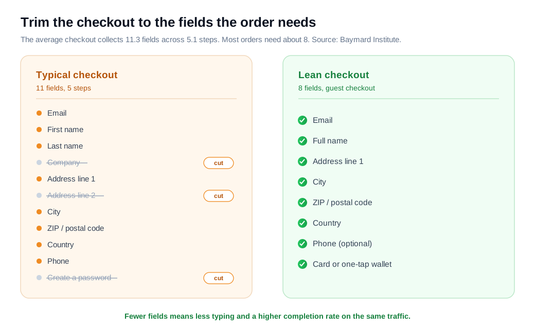
Look at where the extra fields hide. A second address line, a company field, a separate billing address that repeats the shipping address, a "confirm email" box, and a forced password are all candidates to cut, make optional, or fill in automatically. Turn on browser autofill and address auto-complete so the fields that remain take a tap instead of a paragraph of typing.
Here is the arithmetic on an ordinary store. Say 6,000 shoppers begin checkout each month and 60% finish, which is 3,600 orders. Trimming the form from 11 fields to 8, allowing guest checkout, and surfacing shipping on the cart page lifts completion to 66%. You now ship 3,960 orders from the same traffic, an extra 360 orders a month with no additional ad spend. At an $80 average order value, that is roughly $345,000 in added revenue a year.
What payment options improve conversion?
The payment options that improve conversion most are the ones your shoppers already use, especially one-tap digital wallets and, for the right basket, buy-now-pay-later. When a shopper can pay with Apple Pay or Google Pay in a single tap, they skip the card number, the expiry date, and the billing address, which removes most of the typing that mobile checkouts lose people to.
Stripe measured this directly. In a controlled holdback experiment across its checkout, surfacing at least one relevant payment method beyond cards raised revenue by about 12% and conversion by about 7.4% on average, and businesses that added three methods (a wallet, a buy-now-pay-later option, and a bank redirect, for example) saw a bigger lift than those that added only one. Stripe also reports that showing a wallet earlier in the flow through an express checkout button can roughly double conversion for that path compared with burying it at the end.
Work the numbers on a mid-sized store. Take 8,000 monthly checkout starts converting at 62%, which is 4,960 orders. It adds Apple Pay and Google Pay as express buttons at the top of checkout plus one buy-now-pay-later option. Applying Stripe's roughly 7.4% conversion lift as an illustration, completion rises to about 66.6%, or 5,325 orders, which is around 365 additional orders a month from a payments change alone.
Two cautions keep this from backfiring. More payment methods help only when they fit your customers, so match them to your market rather than adding every logo you can find. And weigh the processing fees on options like buy-now-pay-later against the incremental orders they bring, because the goal is net revenue, not a longer row of buttons.
How do you build trust and reassurance into checkout?
You build trust into checkout by making the page feel safe and predictable at the exact moments a shopper hesitates: near the card field, at each error, and around the final total. Payment security is a recurring top reason people abandon, so visible reassurance where the money changes hands does real conversion work.
Baymard's checkout research found that most large stores under-communicate at checkout, with the large majority failing to provide adequate messaging throughout the flow. That gap is an opportunity. A short line explaining why you need a phone number, a security note beside the card field, and a clear returns or guarantee statement near the pay button all answer the silent questions that otherwise send a shopper to a competitor for reassurance.
Error handling is the other half of trust. Inline validation that flags a mistyped card in the moment, with a message that says exactly what to fix, keeps people moving, while a generic "something went wrong" after they hit submit tends to send them away. Keep the shopper on the page, show the running total including shipping and tax so nothing jumps at the last step, and place recognizable security badges next to the fields that feel risky.
None of this requires a redesign. It is a single pass over the checkout to add plain-language reassurance and precise error messages where the friction actually lives, which is usually the card and address fields.
How do you help a shopper who stalls at checkout?
You help a stalling shopper by answering their specific question in the moment, before they leave the page to find the answer somewhere else. A recovery email the next day is useful, but it always arrives slower than resolving the doubt while the person is still on the checkout with their card half entered.
Think about what actually freezes a high-value checkout: an unclear delivery date, a sizing or compatibility question, a returns worry, or a payment that keeps failing. A shopper stuck on any of those is showing strong intent right now. A tool like live chat that appears when someone hesitates on the checkout page, or a proactive nudge triggered by that hesitation, lets a rep or an assistant clear the blocker in seconds. For an expensive or complex order, a quick video call or screen share can walk a shopper through a stuck payment or compare two options in real time.
This is where inbound sales teams recover the most revenue on an ecommerce site. They treat a stalled high-intent checkout as a live signal rather than a lost cause, and reach out while the intent is warm instead of filing it away for an email sequence. Keep it low-key and genuinely helpful, since the goal is to answer the question, not to hard-sell, and shoppers reward the store that removes the last bit of doubt at the moment it matters. Tools such as Glimpze exist to catch that moment.
How do you test checkout changes?
You test checkout changes with a controlled A/B test: split traffic between the current checkout and one changed version, decide the sample size before you start, and only trust the result once it reaches statistical significance. Guessing whether a change helped is how stores ship redesigns that quietly lower conversion.
Set the test up in the right order. Pick one change and one primary metric (checkout completion rate is the usual choice), estimate how large a lift would be worth shipping, then calculate the sample size that lift requires at 95% confidence and 80% power before launching. Shopify's guide to statistically significant testing makes the same point: deciding the required number of visitors up front is what keeps you from calling a random blip a win. Most checkout tests need at least a couple of weeks and a full business cycle of traffic to settle, so run each one long enough to cover both weekdays and weekends rather than stopping the moment the line looks good.
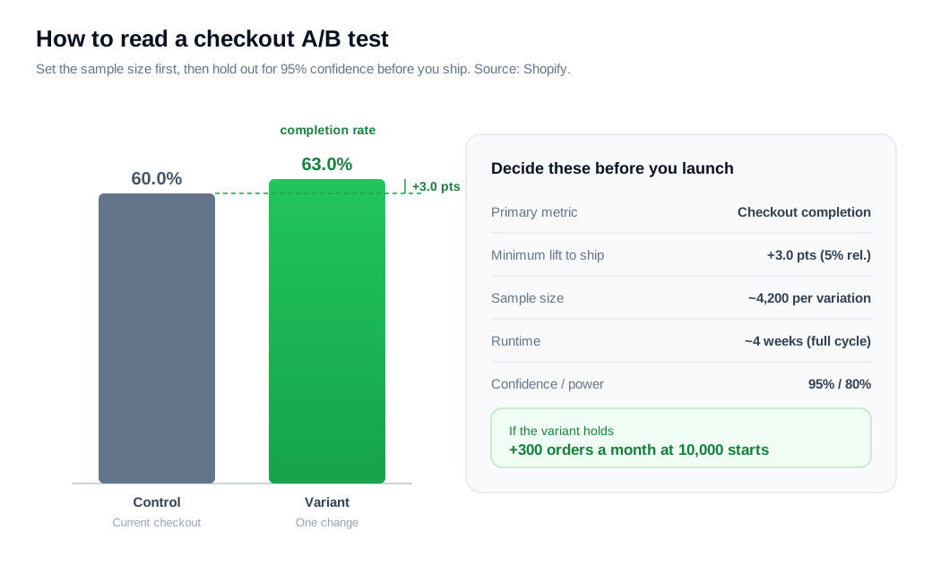
Work an example. A store sends 10,000 checkout starts a month, split evenly between control and variant, and the control completes at 60%. To detect a lift to 63% (a 3-point, or 5% relative, improvement) at 95% confidence and 80% power, a sample-size calculator asks for roughly 4,200 sessions per variation, which this store reaches in about four weeks. If the variant holds at 63% when the test ends, that is 3 more completed checkouts per 100 starts, or about 300 extra orders a month once you roll it out to all traffic.
One discipline separates testing that compounds from testing that spins. Change one thing at a time, keep the winners, drop the losers, and always remeasure against your own baseline rather than an industry average. The gains come from running that loop on your weakest checkout step over and over.
Key takeaways
- Surprise cost is the number one killer. With 48% of checkout abandoners citing extra costs, showing shipping, tax, and the running total early removes the single biggest reason people quit.
- Cut fields before you fuss over steps. The average checkout collects about 11 fields when 8 will do, and a one-page or multi-step flow converts about the same once each step is lean.
- Offer the payment methods your shoppers use. Surfacing relevant wallets and buy-now-pay-later options, especially early through express buttons, lifted conversion in Stripe's own testing.
- Reassure where the money changes hands. Plain-language security notes, clear error messages, and a visible full total answer the doubts that otherwise send shoppers off to compare.
- Catch stalls in the moment. Live help that resolves a delivery, sizing, or payment question at checkout beats any next-day recovery email.
- Prove every change with a real test. Set the sample size first, run to 95% confidence across a full business cycle, keep the winners, and remeasure against your own baseline.

Written by
Nilas MylerCo-founder & CTO, Glimpze
Nilas is the co-founder and CTO of Glimpze, an inbound sales tool that turns high-intent website visitors into live conversations. A former SEO consultant for some of the largest companies in Denmark, he writes about speed-to-lead, inbound sales, and conversion rate optimization — the technical and operational mechanics of turning traffic into pipeline.


