On this page
Two apps launch the same week and both report the same headline: 38% of new users are still active after 30 days. On a board slide, they look identical. Chart the full curve behind that single number and they split in two. The first app's line falls fast for a couple of weeks, then levels off and holds a steady base month after month. The second keeps sliding, 38% now, 31% next month, drifting toward zero. Same day-30 figure, two very different companies.
The retention curve is the chart that exposes that gap. It follows one group of users from their first day and plots what share of them are still active at each point after, so you can watch the drop-off happen and, more usefully, see where it stops. A single retention percentage is a snapshot. The curve is the trajectory, and the trajectory is what tells you whether you have a business.
This post covers what a retention curve is, how to calculate one, the shapes you will run into, how to read a curve that flattens, what a good curve looks like by business model, and the specific inputs that lift the whole line.
What is a retention curve?
A retention curve is a chart that plots the percentage of an original group of users who are still active over time, measured from a shared starting point such as signup, first purchase, or first use. The horizontal axis is time since that start, in days, weeks, or months. The vertical axis is the share of the original group that is still active at each point.
Every retention curve begins at 100% on day zero, because on day zero the whole group is, by definition, present. From there it can only fall or hold, since a user who left cannot lower the count twice. Amplitude describes the curve as the view that answers a question no single number can: who is still using the product after day 1, week 1, or month 1, and does that share keep dropping or settle down.
The word doing the work is "active." A retention curve is only as honest as the action you count as active. Sequoia's guidance on retention is to define a meaningful event first, whether that is logging in once a month, running a five-minute session, making a purchase, or sending a message, because a curve built on trivial logins will look healthier than the product actually is. Decide what active means, then measure against it.
The curve is built from a cohort, meaning a group that shares a start window, which is why it beats a blended retention figure. A company-wide retention number mixes brand-new users with ones who have paid for years, and the mix shifts every month. The curve holds one group still and watches it age.
How do you calculate a retention curve?
You calculate a retention curve by taking one cohort, the users who started in the same window, then computing the share of them still active at each interval after day zero and plotting those points in order. The arithmetic per point is simple: active users at interval N, divided by the cohort's day-zero size, times 100.
The one real decision is how you count a return, and the analytics tools give three standard methods. Mixpanel's documentation on retention types lays them out clearly. N-day retention (also called classic or bracket retention) counts users who come back on exactly day N, for example precisely on day 7. Unbounded retention (also called rolling retention) counts users who return on day N or any day after, which always reads higher and is more forgiving of infrequent use. Bracket retention lets you define your own windows, such as day 0, then days 1 to 7, then days 8 to 30, which suits products people use weekly rather than daily.
Which method fits depends on your product's natural rhythm. A daily habit like a messaging app is fair game for N-day retention. A tool someone touches every couple of weeks, like an invoicing product, will look broken under strict N-day counting and far truer under bracket or unbounded retention. Pick the method that matches how a healthy user actually behaves, then hold it steady so the curve stays comparable over time.
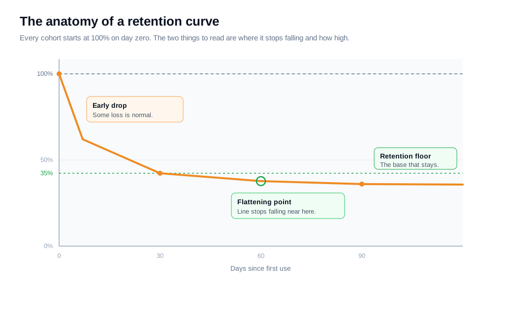
Here is a worked example. Say 1,000 users first use your product in a single week. You count how many are active in each following window: 620 on day 1, 480 by day 7, 410 by day 14, 380 by day 30, 360 by day 60, and 355 by day 90. Divide each by 1,000 and you get a curve of 100%, 62%, 48%, 41%, 38%, 36%, and 35.5%. The drop between consecutive points shrinks from 38 points in the first week to half a point between day 60 and day 90. That shrinking gap is the curve flattening, and the 35.5% it settles near is the number that matters most.
What are the common retention curve shapes?
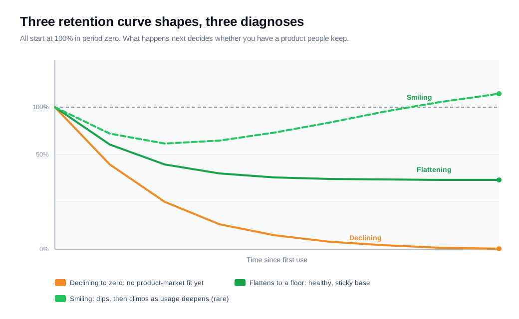
Three shapes recur, and each is a different diagnosis: a declining curve that heads toward zero, a flattening curve that settles on a floor above zero, and a smiling curve that dips and then climbs. The shape tells you more about product health than any single point on it.
A declining curve never stops falling. Sequoia frames this shape as the signature of a product that has not found product-market fit: users sample it, none of them form a lasting reason to return, and the line dwindles to very few or zero. No amount of new acquisition fixes this, because every fresh cohort leaks out the same way.
A flattening curve drops early and then holds along a horizontal line above zero. That plateau is the healthy pattern. It says a segment of users tried the product, found durable value, and built it into a routine, so their line stops falling. The height of that plateau is the whole story, and it gets its own section below.
A smiling curve is the rare one. Retention dips, flattens, and then starts to rise as lapsed or lighter users come back and use the product more. Andreessen Horowitz reports this shape in some AI-native products, where the product keeps getting more capable and pulls churned users back. In their data, ChatGPT's month-12 desktop retention sits near 50%, roughly double Gemini's, and Gemini's own curve dips early then climbs again after about week 10. A smiling curve means a cohort can be worth more a year in than it was at the start.
How do you read a flattening curve?
You read a flattening curve by looking at two things: when the line stops falling and how high it is when it does. The first tells you how long it takes users to either commit or leave. The second is your retention floor, the share of every cohort that sticks for the long run.
The flattening point is the moment the curve goes roughly horizontal. Before it, cohorts are still sorting themselves into people who will stay and people who will not. After it, the group that remains has largely decided the product is worth keeping and built a habit around it. Sequoia's read is that a curve flattening at a level above zero proves the product has genuine active users, and the higher it flattens, the more of them you keep.
Two habits keep the read honest. First, expect an early drop and do not panic at it. Some share of any cohort will leave no matter what you do, so a steep first week is normal, and the question is whether the line asymptotes above zero rather than whether it fell at all. Second, watch the floor across successive cohorts. Stack the January cohort against February against March at the same age, and if the floor is rising cohort over cohort, whatever you changed is working. If the plateau keeps sinking, recent cohorts are worse than older ones and a blended number would have hidden it.
Reading the earlier example back, the curve dropped hard through day 14, then bled only a few points from day 30 to day 90 before settling near 35.5%. That flat tail is the signal. The 35.5% is the base you can count on, the number to compound from, and the level you want the next cohort to beat.
What does a good retention curve look like?
A good retention curve flattens instead of falling to zero, and it flattens at a level appropriate to your business model, because a healthy consumer social floor and a healthy enterprise SaaS floor are nowhere near the same number. Judging your curve against the wrong benchmark is how teams either panic over a fine number or relax over a weak one.
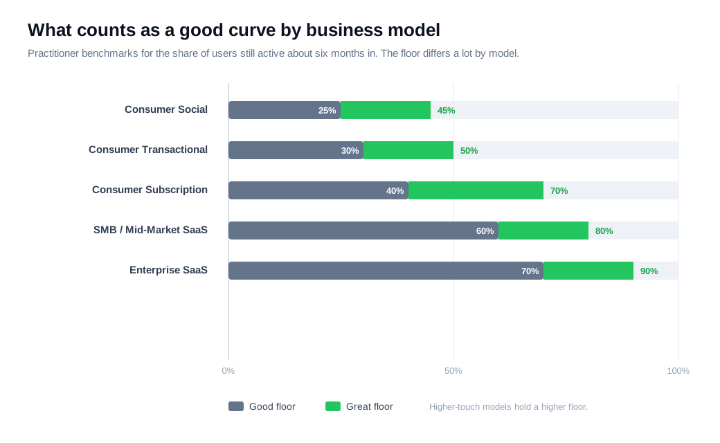
The clearest set of benchmarks comes from Lenny Rachitsky's survey of growth practitioners, later expanded with Casey Winters, which pegs good and great retention roughly six months in by model. Consumer social lands at about 25% for good and 45% for great. Consumer transactional runs 30% and 50%. Consumer subscription sits at 40% and 70%. SMB and mid-market SaaS reach 60% and 80%. Enterprise SaaS holds highest, at 70% for good and 90% for great. The pattern is that higher-touch, higher-commitment models hold a higher floor, so a 40% floor that would be excellent for a social app would be a warning sign for enterprise software.
For consumer products measured earlier in the life of a cohort, Andreessen Horowitz treats day-30 retention above 30% as a strong signal for a new app. The caution on all of these is that the shape outranks the single number. A curve that flattens at 25% and holds beats a curve that starts at 45% and keeps sliding, because the first has a base to build on and the second is a countdown. Use the benchmark to set expectations for where your floor should be, then use the shape to judge whether you are actually reaching one.
How do you improve the retention curve?
You improve the retention curve by working its inputs, activation, engagement, and resurrection, rather than chasing the retention number directly, since retention is the output of how quickly and reliably users reach value. You cannot pull the curve up by wishing the floor higher. You raise it by moving the things that feed it.
Activation is the input with the biggest payoff, because early retention sets the ceiling for everything after it. The faster a new user reaches the product's core value, its aha moment, the more of that cohort survives the first drop, and lifting the earliest points on the curve raises every point that follows. That is why onboarding is a retention lever, not a first-day nicety. Greet a new account with a welcome message flow that points it straight at the first useful action instead of a blank screen, and cut every setup step that does not lead toward value. When someone stalls at a specific step, reaching them in that moment with live chat or a quick screen share clears the sticking point while they still care, which an email sent the next day rarely does. Speed of help is part of the same inbound motion that speed of value is, and both bend the early curve.
Engagement and resurrection work the later stretch of the line. Engagement deepens the habit for users who have already activated, which raises the floor the curve settles onto. Resurrection wins back users who lapsed, and it is the mechanism behind a smiling curve, since every returning user pushes a flattened line back upward.
Put numbers on it. A SaaS product signs 2,000 new users a month, and its curve flattens near 30% by day 60. The team charts where the early drop is steepest, finds most of the loss on a setup step buried behind optional fields, and makes three changes: they trim the setup path, add a welcome flow that starts users on the first real action, and trigger a live chat prompt when someone idles on the setup step. Day-30 retention climbs from 40% to 48%, and the day-60 floor rises from 30% to 37%. On 2,000 signups, a 7-point floor lift is about 140 more retained users from every monthly cohort, and because those users compound while the acquisition spend stays flat, the gain repeats each month. The figures are illustrative, but the method holds: find the biggest early leak, remove its friction, help at the point of the stall, and watch whether the next cohort's floor sits higher than the last.
Key takeaways
- A retention curve plots a cohort's active share over time. It starts at 100% on day zero and shows where the drop-off stops, which a single blended retention figure can never reveal.
- Define "active," then pick a counting method. N-day, unbounded, and bracket retention answer slightly different questions, so match the method to how a healthy user actually behaves and hold it steady.
- The shape is the diagnosis. A declining curve means no product-market fit, a flattening curve means a sticky base, and a rare smiling curve means lapsed users are coming back.
- Read a flattening curve by when it levels and how high. The flattening point is where habits form, and the plateau height is your retention floor and long-term ceiling.
- Good depends on the model. Practitioner benchmarks run from roughly 25% for consumer social to 70% or more for enterprise SaaS, and a lower curve that holds beats a higher one that keeps sliding.
- Lift the curve by lifting its inputs. Faster activation raises the whole line, in the worked example three onboarding fixes moved the day-60 floor from 30% to 37% and kept about 140 more users per cohort.

Written by
Nilas MylerCo-founder & CTO, Glimpze
Nilas is the co-founder and CTO of Glimpze, an inbound sales tool that turns high-intent website visitors into live conversations. A former SEO consultant for some of the largest companies in Denmark, he writes about speed-to-lead, inbound sales, and conversion rate optimization — the technical and operational mechanics of turning traffic into pipeline.