On this page
A visitor fills in a checkout form, reaches the billing address field, and pauses. Should they type the address where they live now, or the one their bank has on file? They guess, the payment bounces, and they leave.
Nothing on the page was broken. One missing sentence cost the sale.
That sentence is microcopy, the small and easy-to-miss text on buttons, labels, hints, and error messages that tells people what to do and what to expect. It rarely wins design awards, and it is one of the cheapest conversion levers a team has. A few words in the right place can recover sales that a full redesign never touches.
This post covers what microcopy is, why it moves conversion numbers, where it appears on a page, how it strips out friction, and how to write and test it so the gains are real.
What is microcopy?
Microcopy is the small, functional text in a user interface that guides a person through a single moment: a button label, a field hint, an error message, or a line of reassurance next to a call to action. It works at the scale of a phrase, and its whole job is to help someone finish the task in front of them.
The term comes from designer Joshua Porter, who wrote a short 2009 post called "Writing Microcopy" and defined it as "that tiny copy (often shorter than a sentence) that helps clarify, explain, reduce commitment, or otherwise assuage someone performing (or considering) a task" (CXL).
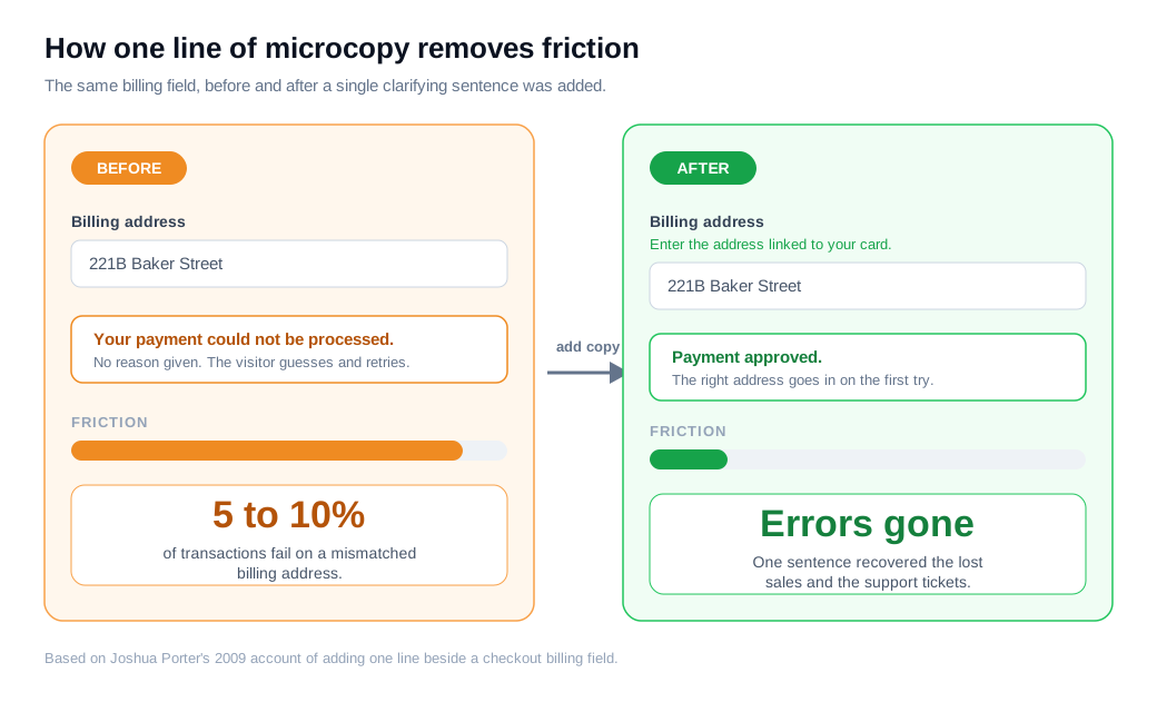
The post grew out of a real problem. On an e-commerce checkout Porter built, 5 to 10 percent of transactions were failing because people entered the wrong billing address, and each failure meant a lost sale and a support ticket.
He added one line beside the field, telling people to enter the billing address associated with their credit card, and the errors stopped (UX Writing Hub).
It helps to separate microcopy from the marketing copy around it. Marketing copy works to bring people to a page and make them want what is on it. Microcopy takes over once they are there and need to act, naming the fields, labeling the buttons, and catching the mistakes (Built In).
One persuades a stranger to arrive. The other makes sure a decided visitor can actually cross the finish line.
Why does microcopy matter for conversions?
Microcopy matters for conversions because it sits at the exact points where people hesitate, and clearing a moment of doubt at those points turns intent into action.
The words are cheap to change and they act on the highest-intent traffic you have, the visitors already trying to buy, sign up, or check out.
The best-known example is a case Jared Spool documented for a large retailer. The site forced shoppers to register before completing a purchase, and usability testing found that first-time buyers resented the demand while repeat buyers could not remember which email and password they had used.
Replacing the "Register" button with a "Continue" button and a short reassuring line, telling people they did not need an account to buy and could create one later, lifted purchases by 45 percent. That worked out to about 15 million dollars in the first month and roughly 300 million dollars over the year (Center Centre).
Smaller wording changes move numbers too. CXL's roundup of tests reports:
- A button that read "Shop Medicare Plans" drawing 192 percent more clicks than a generic "Get started now."
- A single supporting sentence lifting click-through on the Visit Norway site by 26 percent.
- Yoast raising checkout conversions by 11.3 percent after adding a "no additional costs" note and a continue-shopping link (CXL).
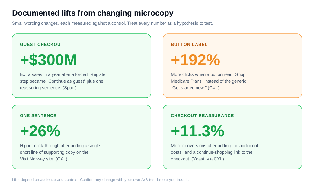
Read those figures as evidence of direction rather than promises. The size of any lift depends on your audience, your traffic, and how bad the original copy was.
The pattern behind them holds up: when a page removes a small point of confusion or worry, more of the people who wanted to act go through with it.
Where does microcopy appear?
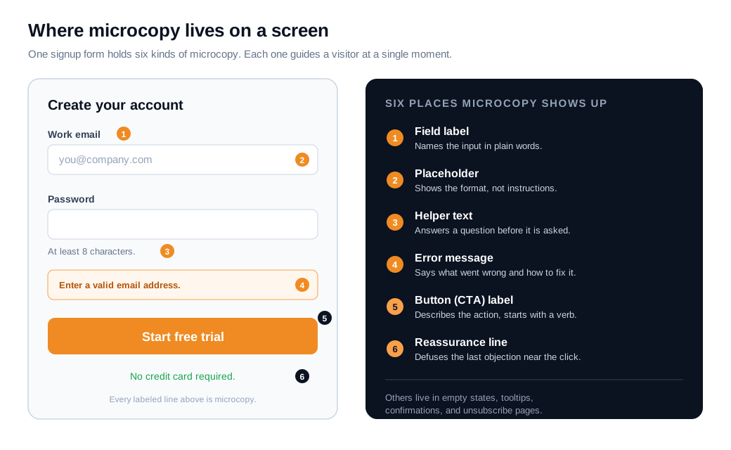
Microcopy appears anywhere the interface has to tell a person something small at the moment they need it, and a single signup form usually holds half a dozen instances. Once you start looking for it, it is on nearly every screen.
The common spots are field labels that name an input, placeholder text that shows a format, helper text under a field that answers a question in advance, error messages that flag a problem, button labels that describe an action, and the reassurance line near a call to action that defuses a last objection.
Beyond forms, microcopy fills empty states ("No projects yet. Create your first one."), tooltips, confirmation and success messages, loading text, 404 pages, and even the unsubscribe screen.
Placeholders deserve a warning, because teams often lean on them too hard. The Nielsen Norman Group found that placeholder text inside a field is harmful when it stands in for a label: it vanishes the moment someone starts typing, so people forget what the field wanted and cannot check their answer, and its light-grey default has poor contrast that hurts readers with low vision, while many screen readers skip it entirely (NN/g).
Use a placeholder to show a format such as "MM/DD/YYYY," keep a visible label above the field, and put anything a person must remember in helper text that stays on screen.
How does microcopy reduce friction?
Microcopy reduces friction by answering the visitor's question at the moment it forms, so they never have to stop, hunt for help, or guess. Every one of those interruptions is a chance to abandon the task.
The work falls into three jobs: clarify, reassure, and recover.
Clarifying is Porter's billing-address fix. A short line beside a confusing field ("Use the address on your card statement") replaces a guess with certainty and keeps the person moving.
Reassuring addresses the doubts that stall a decision, and cost is the biggest one. Baymard Institute's checkout research finds that 51 percent of people who abandon a checkout do so because of extra costs like shipping, taxes, and fees appearing during the process (Baymard).
A line that says shipping is free, or that no extra charges will be added, meets that worry head on. The same research notes that stores show an average of about 14.9 form fields to a new customer when roughly half that many would do, so trimming and labeling fields is itself a friction cut.
Recovering is what error messages do when something still goes wrong. NN/g's guidance is to write error text in plain, human language, describe the problem precisely, offer a way to fix it, and avoid blaming the person, while keeping the message next to the field it refers to (NN/g).
"Enter a valid email address, for example name@company.com" moves a stuck visitor forward. "Error 422" leaves them stranded.
Here is the arithmetic on an ordinary case. A store sends 8,000 sessions a month to its payment step, and 62 percent complete the purchase, which is 4,960 orders. Session recordings show people stalling on the billing field, and analytics show a cluster of failed payments right there.
You add one line under the field, "Use the address on your card statement," and a short line under the pay button, "No hidden fees, the total above is final." Say completion rises from 62 percent to 65 percent, a three-point gain.
That is 5,200 orders a month, 240 more than before, from two sentences and no new traffic. Treat the lift as an estimate and confirm it with an A/B test, because the exact number depends on your audience. The direction is dependable.
Some doubts are too specific for any pre-written line to answer, and that is where a live channel earns its place. A tool like live chat lets a rep step in at the exact field where someone stalls and answer the one question that copy could not anticipate, while proactive outreach nudges can trigger at a step where people commonly hesitate and offer help before they leave.
How do you write and test microcopy?
You write microcopy by leading with the action and its outcome, cutting every word that does not help, and matching the words to how the visitor already talks, then you test the wording against a control before you trust it.
Good microcopy reads as though a helpful person is standing beside the user, saying only what is needed. A few rules cover most cases:
- On buttons, start with a verb and name the result, so "Start free trial" or "Create my account" beats a bare "Submit," and the label should match what the click actually delivers (Shopify).
- In labels and helper text, use plain words and answer the question a person is about to ask.
- In error messages, follow the NN/g pattern of what went wrong, why, and how to fix it, placed by the field and free of blame.
- Near the call to action, name the top objection your audience holds, whether that is cost, commitment, or privacy, and settle it in one line.
Keep all of it short, because microcopy that runs long stops being read.
Testing is where opinions give way to evidence. Because microcopy changes are small and sit on high-traffic elements, they are among the cleanest things to A/B test, so change one line at a time, keep everything else fixed, and let the result decide (CXL). Button labels, error copy, and reassurance lines are strong candidates because they see so many visitors.
Behavior data points you at what to test. Form-field analytics show which field spikes abandonment, session recordings show where people stall or rage-click, and a jump in on-site searches or FAQ visits flags a question the interface should have answered on the spot.
Pair that with a quick usability test where you ask a few people what a label means, and you will find wording that is clear in your head but ambiguous to them.
One caution when you test. Copy that wins on clarity can still fail on accessibility, as a placeholder-only label often does, so check that a change reads well for screen-reader users and holds enough contrast before you ship the winner.
The first microcopy many visitors read is a welcome message, and the same standards apply there: clear, short, and written for the person, not the team.
Key takeaways
- Microcopy is the small functional text that helps people act. Button labels, field hints, error messages, and reassurance lines all count, and their job is to get a decided visitor across the finish line.
- It works on your highest-intent traffic. The words sit at checkout, signup, and form fields, so clearing a moment of doubt there converts people who already wanted to buy.
- Small changes have moved large numbers. A guest-checkout button was tied to about 300 million dollars a year, a clearer button label to a 192 percent click gain, and a reassurance line to an 11.3 percent checkout lift.
- Friction falls when copy clarifies, reassures, and recovers. Answer the confusing field, meet the cost objection early, and write error messages that show the fix instead of a code.
- Placeholders are not labels. Text inside a field disappears on typing and hurts accessibility, so keep a visible label and use placeholders only to show a format.
- Write tight, then test one line at a time. Lead with the verb, match the button to its outcome, and confirm any wording change with an A/B test and real behavior data.
TAGS

Written by
Nilas MylerCo-founder & CTO, Glimpze
Nilas is the co-founder and CTO of Glimpze, an inbound sales tool that turns high-intent website visitors into live conversations. A former SEO consultant for some of the largest companies in Denmark, he writes about speed-to-lead, inbound sales, and conversion rate optimization — the technical and operational mechanics of turning traffic into pipeline.


