
On this page
A visitor reads your pricing page top to bottom, opens the FAQ, weighs two plans, then slides the cursor up toward the tab close button. Half a second later they are gone. Nothing on the page tried to keep them, and your team never knew they were there.
Exit intent is the attempt to change what happens in that half second. It watches for the small signals that someone is about to leave, then offers one last relevant reason to stay or to hand over a way to reach them. Handled well, it recovers a slice of traffic you had already written off. Handled badly, it becomes the popup that everyone has trained themselves to close on reflex. This post covers what exit intent is, how detection works on desktop and mobile, whether the tactic actually moves numbers, what to offer, when a live conversation beats a popup, and how to set it up without making your site worse to use.
What is exit intent?
Exit intent is a set of behavioral signals that a visitor is about to leave your site, paired with a response you trigger the moment those signals appear. The signal is the input. The offer is the output.
The term grew out of popup software, where "exit-intent technology" described the trick of detecting a leaving visitor and showing an overlay before they went. The response does not have to be a popup. It can be a slide-in panel, an inline banner, a chat invitation, or a change to the page itself. What ties these together is timing. Exit intent fires at the end of a session rather than the start, so it targets people who have already seen your content and decided, for whatever reason, not to act.
That timing is the whole appeal. A message shown two seconds after arrival interrupts someone who has not formed an opinion yet. A message shown as they reach for the close button interrupts a decision that has already gone against you, which is a far cheaper moment to interrupt.
How does exit-intent detection work?
Exit-intent detection works by watching for browser events that reliably come just before someone leaves, then firing a response the instant the pattern matches. The mechanics differ by device because the underlying signals differ.
On desktop, the classic signal is the mouse cursor leaving the top edge of the page. A small piece of JavaScript listens for the mouseout (or mouseleave) event on the document, checks whether the cursor is near the top boundary and moving upward, and treats that trajectory as a move toward the browser tabs, the address bar, or the back button. More careful implementations add corroborating signals so a single stray flick does not fire the trigger: rapid scrolling back to the top of the page, the cursor drifting toward the back control, or a sudden drop in activity.
On mobile there is no cursor to track, so detection leans on different, noisier proxies. The common ones are the hardware or gesture back button (caught through the browser's popstate event), a fast upward scroll (velocity above a set threshold, since a hard swipe to the top often means someone is done), an inactivity timer of 20 to 30 seconds with no taps or scrolls, and a tab or app switch detected through the Page Visibility API. That last signal is the cleanest one available on a touchscreen.
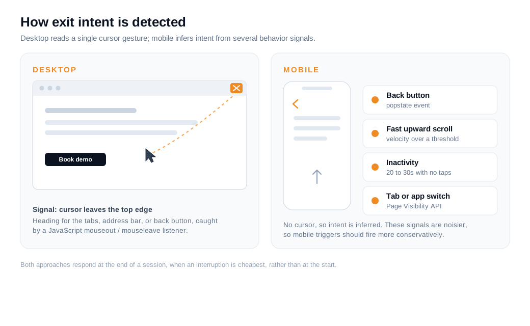
The Page Visibility API fires a visibilitychange event and exposes document.visibilityState, which flips to hidden when the tab is backgrounded or the user switches to another app. That does not always mean the person is leaving for good, so treat it as a soft signal rather than a hard exit. The practical takeaway is that desktop detection reads a clear physical gesture, while mobile detection infers intent from behavior, which is why mobile exit triggers should fire less aggressively and forgive more false alarms.
Do exit-intent tactics actually work?
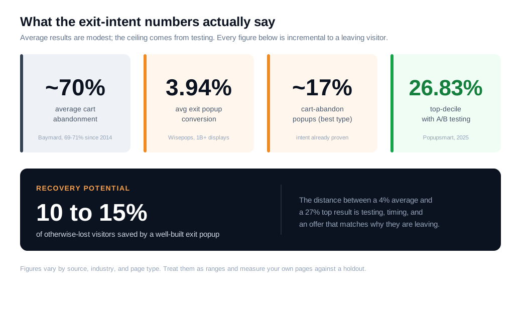
Yes, for a measurable minority of leaving visitors, though the average result is modest and the strong results come from testing rather than from switching the feature on. The honest framing is that every recovered visitor was already on their way out, so anything you capture is incremental.
The benchmarks land in a consistent range. Analyses of exit-intent programs credit a well-built popup with recovering somewhere around 10 to 15 percent of visitors who would otherwise be lost. Conversion rates on the popups themselves are lower and more sobering: a Wisepops dataset drawn from more than a billion popup displays puts the average exit-intent conversion near 3.94 percent, with cart-abandonment popups performing best at roughly 17 percent because those visitors have already shown purchase intent. The ceiling is much higher than the average. Popupsmart's 2025 benchmark of more than 10,000 campaigns found that the top tenth of campaigns, the ones running systematic A/B tests, converted at 26.83 percent. The gap between 4 percent and 27 percent is the value of testing, timing, and a relevant offer.
There is a real cost on the other side of the ledger. Nielsen Norman Group's usability research has repeatedly placed popups among the most disliked things on the web, with roughly 95 percent of study participants reacting negatively to them. So the tactic works, but only if the lift from the small group who convert outweighs the irritation felt by the much larger group who dismiss it. That trade is what the rest of this post is about.
A worked example
Picture a B2B pricing page that draws 2,000 visitors a month. With no exit handling, suppose 4 percent book a demo, which is 80 demos, and the other 1,920 leave. Most of those are not lost causes so much as people who had a question you never got to answer.
Now add an exit trigger on that page aimed at the leavers. Say it opens a short conversation for 6 percent of them. That is about 115 chats a month. If a fifth of those chats end in a booked demo, you get 23 more demos, taking the page from 80 to 103. Same traffic, no extra ad spend, one trigger on one page, and a lift of roughly 29 percent in booked demos. Those percentages are illustrative, so treat your own measured rates as the real answer, but the shape holds: the gain comes from the people who were leaving, not from squeezing the ones who were already converting.
What should you offer when a visitor tries to leave?
Offer the single most relevant next step for the page the visitor was about to abandon, tied to the reason they came. A generic "wait, don't go" with a newsletter box is the version everyone ignores. The offer earns attention when it answers the hesitation of that specific page.
The right offer depends on your business model. For ecommerce, a first-order discount or free shipping is usually the highest-return option, and showing it only on exit means you protect your margin from buyers who would have paid full price anyway. Cart pages convert best here: the visitor has already chosen a product, so a small nudge closes a nearly-made decision. For SaaS and services, the equivalent is a free trial, a demo, a short consultation, or a genuinely useful resource like a template or a comparison guide. For content and publishing, the natural offer is more of what they were already reading, packaged as a download or a subscription.
A few rules travel across all of these. Keep the copy to one headline, one short supporting line, and one obvious action. Make the value concrete, because "The exact onboarding checklist we use with new customers" beats "Sign up for updates" every time. And match the offer to intent: a discount makes sense to a shopper at checkout, while a demo makes sense to someone stuck on a feature comparison. Cart abandonment across ecommerce sits at roughly 70 percent by Baymard Institute's long-running measurement, and their data ties much of it to unexpected costs and friction, so an exit offer that removes a real objection will always beat one that just interrupts.
Exit popups vs. exit chat: which should you use?
Use a popup when the visitor's hesitation can be settled with a simple offer, and use exit chat when their hesitation is a question that a static message cannot answer. The two solve different problems, and picking the wrong one is why many exit programs underperform.
A popup is a one-way statement. It works when the objection is known and the fix is a fixed thing: a code, a coupon, a download, a reassurance about shipping. It is cheap to run, needs no staff, and scales to every visitor at once. Its limit is that it cannot handle a follow-up. If the real reason someone is leaving your pricing page is "I can't tell whether this supports SSO," a 10 percent discount does nothing, because price was never the blocker.
Exit chat opens a two-way door instead. When a high-intent visitor on a demo or pricing page signals they are about to leave, a well-timed live chat invitation lets a rep or an AI assistant answer the actual question before the tab closes. On complex or high-value purchases, that difference is large, because the objection is usually specific and unscripted. For the highest-value accounts, some teams escalate straight to a live video call or screen share rather than trading typed messages. The trade-off is coverage: chat needs someone (or something) ready to answer, where a popup never sleeps.
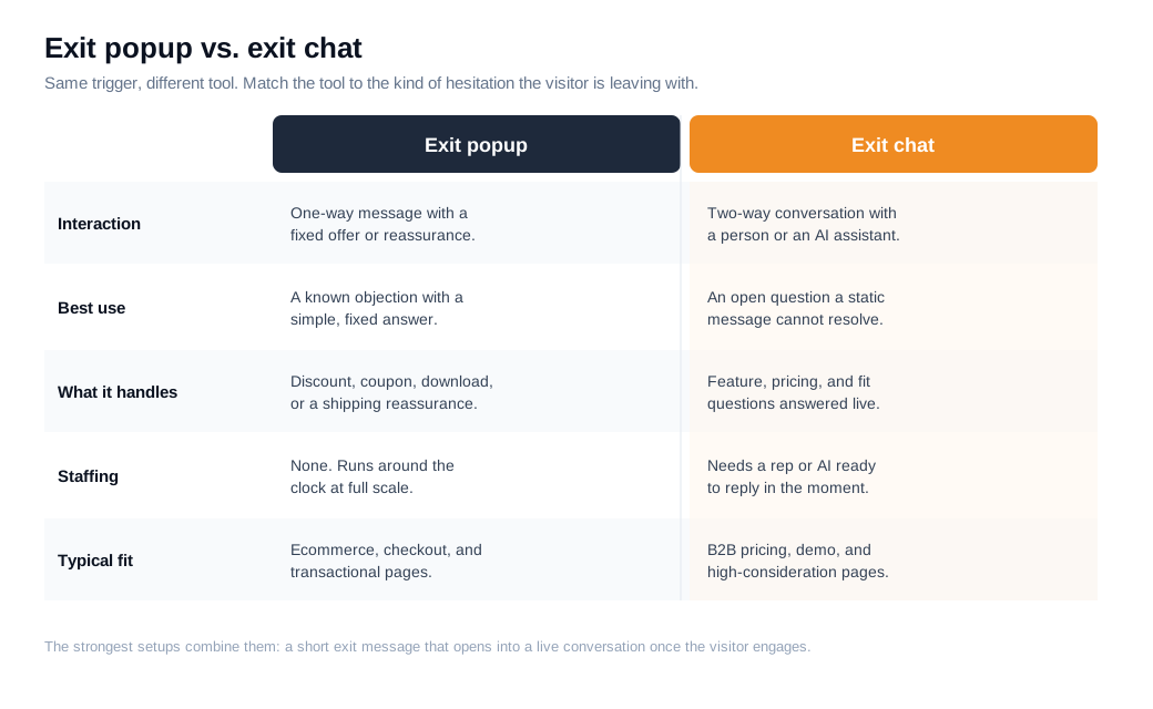
In practice the strongest setups combine them. A leaving visitor sees a short message, and if they engage it opens into a real conversation instead of a dead-end form. That pattern fits inbound teams especially well, where the goal on a sales page is to catch a buyer at the exact moment of doubt and keep them talking. Guidance on building these behavioral nudges lives in the proactive outreach guide, which covers matching the trigger to the message so the invitation reads as help rather than noise.
How do you set up exit intent without hurting UX?
Set it up by firing only on genuine exit behavior, on pages where leaving actually costs you, once per visitor, with an easy dismiss and copy tied to the page. Nearly every complaint about exit popups traces back to breaking one of those rules.
A workable sequence:
- Pick the pages, not the whole site. Start with pages where an exit has a clear cost: pricing, checkout, cart, demo, and high-intent product pages. Blanketing every blog post with an exit overlay is how you earn the 95 percent negative reaction Nielsen Norman Group measured.
- Trigger on real exit signals. On desktop, fire on the cursor leaving the top edge. On mobile, use the back button and fast upward scroll, and forgive false positives by requiring a stronger signal. Never fake exit intent with a plain timer, since a countdown that fires while someone is still reading is just an interruption.
- Cap it at once per visitor. If someone dismisses the message, do not show it again that session. Repeat overlays are the fastest way to turn a mild annoyance into a bounce.
- Write for a five-second read. One headline, one line, one action, one visible close button. Respect the person who is browsing and just wants out.
- Match copy to the page and the moment. A checkout exit gets a shipping or discount reassurance. A pricing exit gets an offer to answer a question. A blog exit gets the related download. You can borrow the same page-aware logic from your welcome messages so the greeting and the goodbye feel like one system.
- Measure against a holdout. Run the trigger on part of your traffic and keep a control group without it. Watch the real conversion rate of the page rather than the raw count of popups shown. If conversions climb, keep it. If they stay flat while dismissals pile up, the trigger is interrupting rather than helping.
The through line is restraint. Exit intent earns its place when it treats a leaving visitor as someone worth one honest, relevant attempt to help, and it wears out its welcome the instant it becomes a reflex you inflict on everyone. Build it for the moment of genuine exit, keep the offer specific, and let the numbers tell you whether to expand it or pull it.
Key takeaways
- Exit intent pairs a leaving signal with a response. It watches for the behavior that precedes an exit, then shows an offer or opens a conversation at the one moment interruption is cheapest.
- Detection differs by device. Desktop reads the cursor moving toward the browser chrome; mobile infers intent from the back button, fast upward scroll, inactivity, and tab-switch signals, so mobile triggers should fire more conservatively.
- The tactic works, but modestly on average. Well-built exit popups recover roughly 10 to 15 percent of leaving visitors and convert near 4 percent on average, while tested top-decile campaigns reach almost 27 percent.
- The offer has to match the page. A discount fits a cart, a demo or trial fits a SaaS pricing page, and a content upgrade fits a blog post; a generic message tied to nothing is the version people dismiss.
- Popups and exit chat solve different problems. Use a popup for a known objection with a simple fix, and use exit chat when the hesitation is a live question that needs a person or an AI assistant to answer.
- UX discipline decides whether it helps. Fire on real exit behavior, on high-cost pages, once per visitor, with an easy dismiss, and measure against a holdout so you keep only what lifts conversion.
TAGS

Written by
Nilas MylerCo-founder & CTO, Glimpze
Nilas is the co-founder and CTO of Glimpze, an inbound sales tool that turns high-intent website visitors into live conversations. A former SEO consultant for some of the largest companies in Denmark, he writes about speed-to-lead, inbound sales, and conversion rate optimization — the technical and operational mechanics of turning traffic into pipeline.


